The Picture of Everything Else #2, out today from Vault Comics, pulls the reader in and asks the question: can old friends still be trusted?

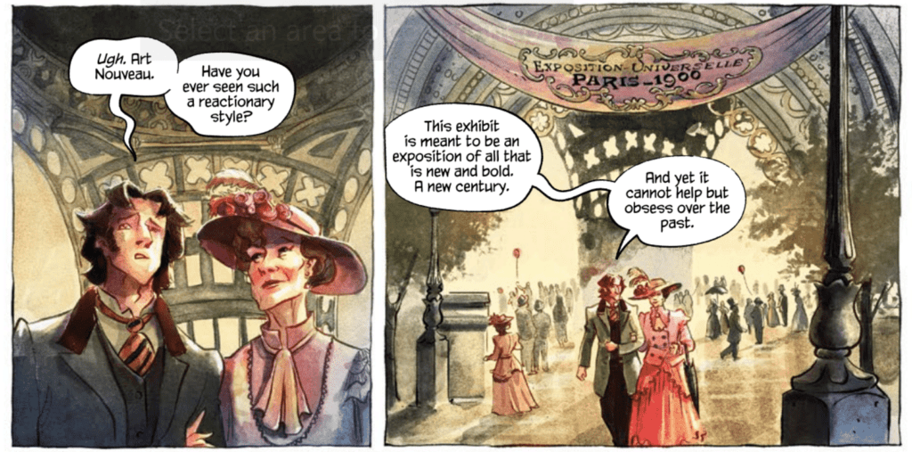
The Picture of Everything Else #2 continues to follow Marcel as he is haunted by his previous encounter with the monstrous painter Basil Hallward: a name fans of Oscar Wilde’s novel The Picture of Dorian Gray should recognize. Dan Watters’ writing utilizes many techniques that make the issue a thoroughly entertaining read. The first is the introduction of characters the reader is most likely familiar with. The first issue introduced us to Basil Hallward, and this issue introduces another character that is sure to pique readers’ interests. The dialogue also flows smoothly throughout the issue, and the elevated manner of speaking that many of the characters possess gives an almost lyrical quality to the writing.

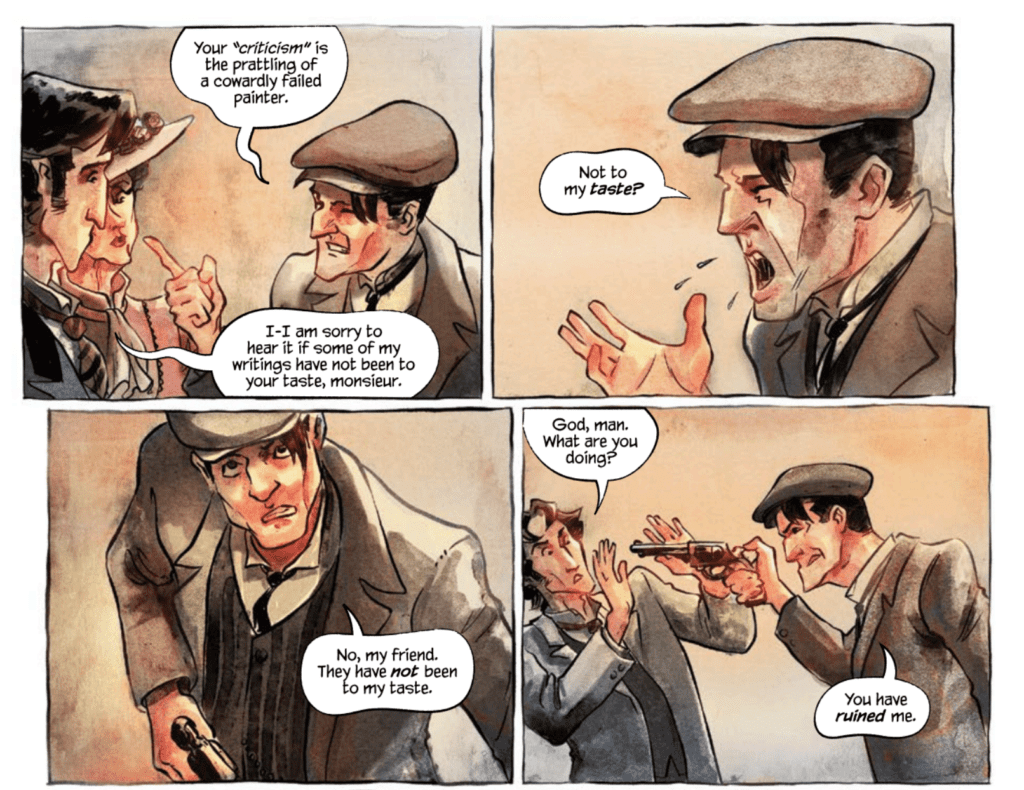
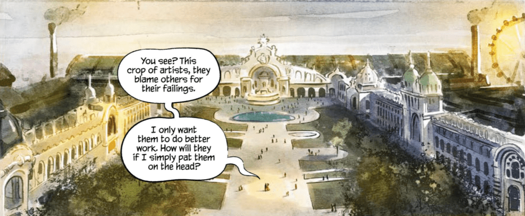
Kishore Mohan’s art and colors of The Picture of Everything Else #2 are gorgeous. The stylized way Mohan draws the issue fits so wonderfully with the story, and the choice of having the borders of panels being hand-drawn lines rather than perfectly straight makes the entire issue feel more organic. The colors of the issue shift to a bright red when violence occurs, which stands out against the rest of the color palette and makes the moment horrifying. Mohan also creates many scenes with dramatic lighting, which gives them a stunning aesthetic.
The Picture of Everything Else #2 features one of the most impressive caption placement uses that I have seen in a long time. Lettered by Aditya Bidikar, the issue’s speech bubbles and captions direct the reader’s line of sight without trouble. There is never any confusion on order, and it works with the art spectacularly. The most stunning case of this is a single page featuring several tall panels stretching the page’s length. The panels depict an artist chiseling away oil from the surface of a painting and the chips of oil fluttering to the ground. The captions on the page are diagonal across the page, so as you read left to right, your eyes fall down the page, just like how the oil chips fall down the page. It is a subtle yet effective technique that turns the stagnant panels into a moving moment that submerges the reader in the scene and makes the caption’s words seem more dramatic.

The Picture of Everything #2 is an issue you will not want to put down after picking up. The story is always twisting and introducing new characters and events to hook the reader, the art is utterly magnificent, and the lettering takes steps to enhance the read. There are so many reasons to love this issue and so few reasons not. The series is one I would definitely recommend putting on your pull list.

