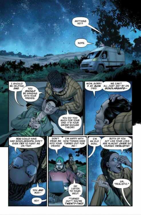
The Domain #1 from Image Comics is a wonderfully meta idea from writer Chip Zdarsky, artist Rachael Stott, colorist Eren Angiolini, and letterer Jeff Powell. It’s a spin-off of Zdarsky’s Public Domain series, with The Domain being the comic-within-a-comic that the characters in Public Domain end up creating. This series is mostly separated from its parent series, but there are some stylistic choices to be found and appreciated throughout the issue that reference Public Domain.
The issue starts with the three main characters, Destiny, Liz, and Max, making friends with each other in high school after a fight with a bully. It then fast forwards to the current day where the three are still friends and sit outside together, tracking things in space. Their world is completely turned upside down when a spaceship lands and an alien emerges, fighting them. They fight back against the robot, gaining some sort of power that can be shared between the three of them in the process.
WRITING
Zdarsky creates an original story here, but with an interesting setup that feels fresh and new. As a comic-within-a-comic, while The Domain is written by Zdarsky, it’s actually “written” by Zdarsky’s characters from Public Domain. Because of that, a lot of their personalities really shine here.
Not only can you guess which ideas came from which character, but also where the characters start to disagree on how to tell this story. If you’ve read Public Domain, then you likely know what this issue will be about. It’s outlined there, but the execution here is interesting. In the most recent issue of the parent series, the team at Dallas Comics decides to split the character of The Domain between three protagonists. While it’s not widely agreed upon in that comic, it happens here. Because of that uneasiness though, you can almost feel how that part specifically is a little rushed along with the explanation of how exactly the plot mechanic works. Having the power shared between three characters is interesting, but you don’t really know how they figure that out or how it works at all. Of course, this power is still new to them, so there’s also just still a lot to learn there. Overall, Zdarsky crafts a familiar story that’s really made more interesting by the context, and thrives because of that.

ART
Stott draws this issue entirely, whereas in Public Domain she’s had a couple of credits as “Art Assist.” Her biggest strength taking lead in The Domain is character design. While the characters are given rough outlines in PD, they’re fully fleshed out here and really become something tangible. Each character has their own style. Liz is more fashionable, while Max just wears whatever’s comfortable to him at the time. Destiny is a businesswoman, so her clothes are more professional. That doesn’t really change from the flashback in the beginning to the present day later. You can physically see how these characters grow, and what that says about them.
The alien ship later in the issue looks good, but there’s nothing that really stands out about it. That’s not to say work didn’t go into drawing it well, but the design itself just leaves something to be desired. It should reflect the civilization it hails from in some way, but it just doesn’t seem to. The alien lifeform itself, however, looks unique and not like something from modern comics. There’s personality to it through its design. It’s not just the generic big eyed and gray aliens you typically see. It has these almost horn-like things on the top that almost loop together again, but don’t quite connect. It’s a creative look. The actual Domain suit is interesting as well; it transforms to account for who’s wearing it, which further solidifies the personalities of these characters.

COLORS
Angiolini colors the issue, and she does a great job of giving it a specific feel. The mood is really cemented through the issue’s darker color scheme. The entire issue uses a darker palette, so you get more comfortable with these characters, almost as though you’re sitting and watching the stars with them. Even when it seems like it should be brighter, it’s still almost muted because of this all taking place at night. Lighting is important here because of the story taking place at night, and Angiolini really blends everything together naturally through that. The explosions and fire from the spaceship is just enough to light the characters, but none of it is strong enough to change the feeling from night. It’s really well done.

LETTERS
Powell’s letters in the issue aren’t just confined to regular speech bubbles, but also text messages and the way the alien’s speech bubbles look. Text messages are seen pretty early in the issue, and the perspective of them follows each character’s color scheme. We don’t see Max’s, but Liz’s are orange, and Destiny’s are blue. The placement of them is also great, specifically Destiny’s messages. They look like texts, but are placed right in front of the character.
Later in the issue with the alien’s speech bubbles, they’re not just the regular white bubbles. The alien’s are yellow and give off the impression that its voice is sort of raspy. The bubbles aren’t smooth, but instead scratchy and seem like the alien is struggling. It’s a smart differentiation.
CONCLUSION
The entirety of the issue is an interesting spin-off from Public Domain, but isn’t at all unoriginal. It forms its own story that Zdarsky, Stott, Angiolini, and Powell all work hard to enhance through each of their respective talents. The setup is intriguing, and it’s a solid first issue that’s sure to hook any new readers, or those coming from Public Domain.

