THE DEATH OF NANCY DREW #1, available from Dynamite on April 1st, begins a new story arc for Nancy Drew and the Hardy Boys. We follow Joe Hardy on his quest to find out how and why Nancy Drew was killed. Was she murdered? Did she die in an accident? Is Joe Hardy on a wild goose chase? Let’s find out.
Cover
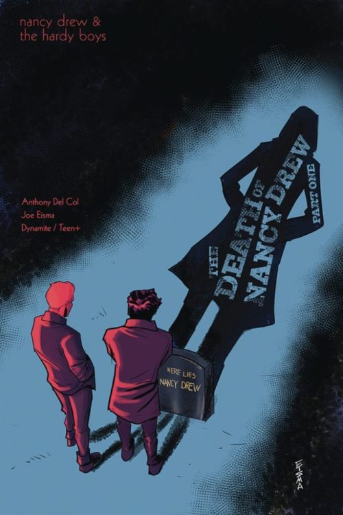
Joe Eisma sets the tone right from the start with his cover. It’s a classic play on minimalist light and tons of shadow that hearkens back to old detective noir films. Eisma lets you know what kind of story you’re in for with his cover, and in particular, Eisma’s stenciling on Nancy’s shadow is excellent work.
Writing
Anthony Del Col has written a near pitch-perfect detective noir story in the spirit of Philip Marlowe and Mike Hammer. If you enjoy those brands of stories, Del Col’s writing is right up your alley.
Joe Hardy has convinced himself that Nancy Drew’s death is not an accident. We see our young detective chase down clues and question unsavory characters in his search for the truth. Many such detective stories play with the idea of obsession and how the detective’s personal feelings lead to risky, or even dangerous, behavior. Joe Hardy is no different, and that obsession puts him at odds with his friends, family, and the police in dramatic fashion.
Another trope of detective noir is the first-person narration of the detective. Del Col deftly pays homage to the smoky language used by a hard-boiled detective while working a case. It mostly works here, but there are a few spots where the copious amount of narration slows down the pace. Del Col could have improved the pacing by letting some of the panels speak for themselves through the artwork.
Coloring
Salvatore Aiala masters the coloring for this issue. Most fans recognize detective noir through black & white films, and Aiala uses the full spectrum of color with a muted palette to give the reader a sense of black and white. Aiala made great use of Sepia filtering on a few select panels to distinguish between flashbacks and now. Overall, nice work using color in a traditionally colorless genre.
Lettering
Crank! did something here with the lettering that you don’t see too often, and it works well with the noir style. Several of the narration boxes use a grimy Times New Roman font that simulates small snippets of a newspaper. The snippets are torn out and placed strategically on some of the panels. That torn out newspaper design is a nice touch that adds depth through style.
Pencils/Inks
Joe Eisma drew the interiors in addition to painting the cover. Overall, the art style is adequate, but the artwork is, unfortunately, the weakest part of this book.
When drawing a noir style, you absolutely must get the shadows right. Within the noir aesthetic, the emotion of a scene is strongly told through the placement and direction of a shadow. Shadows are almost another character.
Here. Eisma’s shadows work in some places and fall short in others. Eisma’s shadow work on the cover nails the noir aesthetic. The light source draws out the shadow to an obscene length, and its composition gives you the impression that Nancy Drew is standing there when the shadow *should* be in the shape of the tombstone (another noir trope).
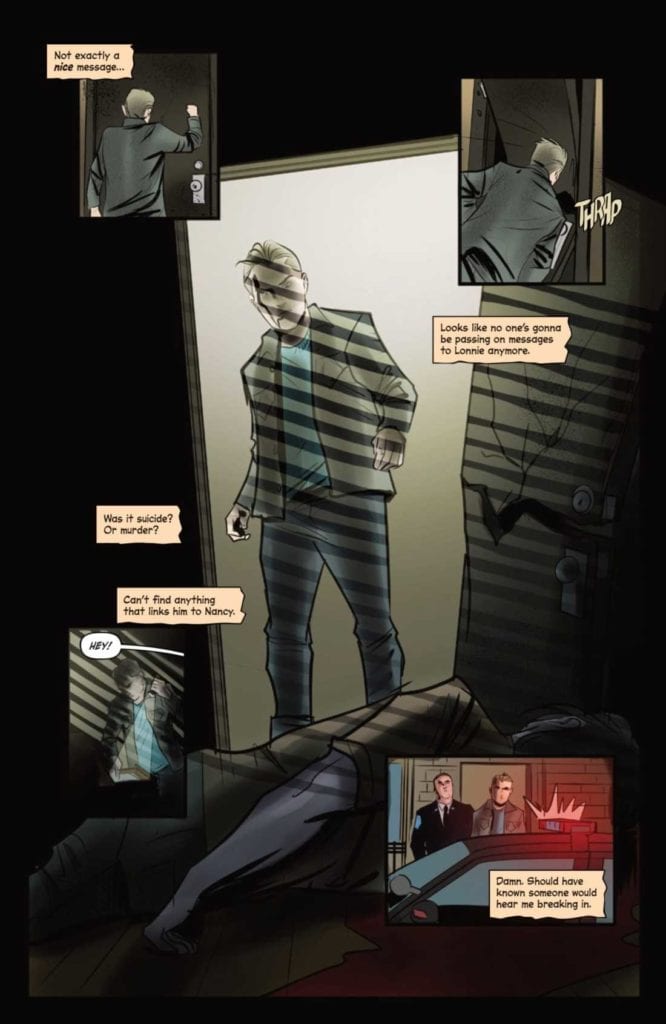
On page 15 (sample below), Joe discovers a dead body. In the scene, you have a backlit hallway with Joe lit on his left side. Light casts into the room from an outside streetlamp, throwing shadows from the window blinds on the whole panel. The lighting design has so many conflicts that the eye is not drawn to where it needs to go (the body) and lacks any emotional impact. This could be fixed by eliminating the window blind shadows, casting Joe completely in silhouette to match the hallway light, and casting the remaining light from the hallway above Joe’s head on the body in the shape of the doorway. That would darken Joe to match the grimness of his discovery, cast a harsh light on the body to amplify shock, and also focus the reader’s eye on where it needs to go.

Favorite Page/Panel: Page 21 is our favorite for this issue. It’s a pristine encapsulation of the grizzled detective, walking in the rain, flashing through different conversations in his mind. Everything a reader looks for in classic detective stories is summed beautifully.
Conclusion
THE DEATH OF NANCY DREW #1 gives the reader a taste of classic detective mystery in a modern setting. The story is well written, and both the coloring and lettering compliment the story well. With a few tweaks to the shadows in the artwork, this is set to be a top-notch detective story.
Writer’s Note: Local Comic Shops (LCS) are going through a tough time right now with the pandemic outbreak of COVID-19. Comics fans of every flavor that care about his or her LCS should try to do what they can. So, here’s my part:
If you’re in Northern Delaware, South East Pennsylvania, or Southern New Jersey area, please take a moment to visit Captain Blue Hen Comics in Newark, DE. Say ‘hi,’ pick up a book, order a book (they’re on Comichub.com), and let them know you support them.
If you’re nowhere near that area, please find YOUR LCS using Comic Shop Locator and lend your support.
Thanks, and stay safe.


