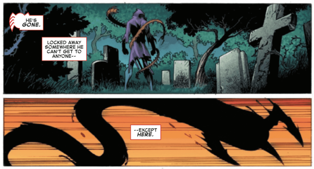
The Amazing Spider-Man #60, out now from Marvel Comics, is an intense, emotional issue that heavily delves into the inner turmoil that Peter Parker faces.

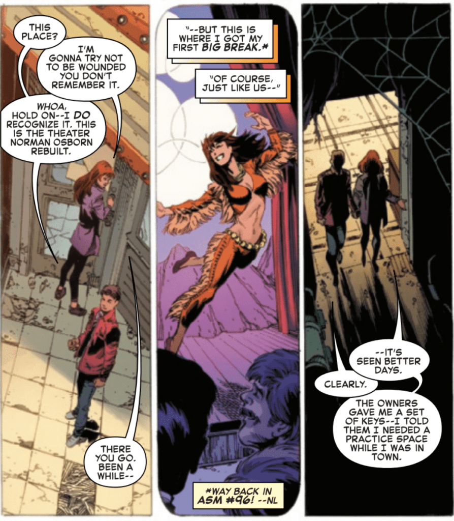
The Amazing Spider-Man #60 is an intriguing issue, to say the least. Most superhero comic book series are focused heavily on action and portraying a visual spectacle, but Nick Spencer takes an entirely different route in this issue. Mary Jane takes Peter to a theater stage she has been using to practice and guides Peter through a therapeutic exercise to work through the emotions he has been experiencing recently. Spencer’s dialogue is powerful, touching, and helps make what Peter has been struggling through in recent issues more evident. The raw emotion that is shown more than makes up for the lack of action in the issue. Spencer also employs techniques such as showing flashbacks and what the characters are imagining to prevent the entire issue from being nothing but images of Peter and Mary Jane’s faces.

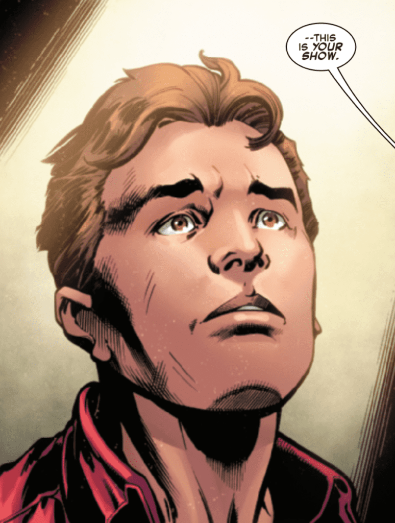
It is difficult to make an issue composed of little action and lots of facial expressions visually appealing. Yet, Mark Bagley, John Dell, and Andrew Hennessy are able to accomplish this and then some. With Bagley’s pencils and Dell and Hennessy’s inks, The Amazing Spider-Man #60 is a beautiful issue. Peter’s facial expressions and body language pair spectacularly with the accompanying dialogue and make the issue tug on your heartstrings. Silent panels say more than words could ever, and it’s thanks to the magnificent art from this creative team.
While the pencils and inks weren’t necessarily hampered by Spencer’s choice to set most of the issue in one location (since different poses and angles could vary the art), the coloring definitely was. When the source of light does not change, the colorist is left with very few options. This causes the scene taking place on the stage to be stagnant in terms of the palette. Still, Rachelle Rosenberg delivers some absolutely stunning colors for the other scenes in The Amazing Spider-Man #60. One panel of Spider-Man swinging across the city is especially beautiful and reflects the classic Spider-Man tone that we know and love.

VC’s Joe Caramagna’s lettering in The Amazing Spider-Man #60 does wonders to help the issue’s emotionally tense moments get across. The placement of speech bubbles is perfect and never once interferes with the flow of dialogue, which helps immerse readers in the story. Caramagna also uses techniques such as emphasizing certain words and giving some otherworldly characters a unique font and speech bubble. These both give readers more information on how dialogue is spoken, which is critical in a purely visual medium.
The Amazing Spider-Man #60 is a very different issue than what superhero fans expect — and that’s a good thing. The writing gives us an in-depth look at Peter’s emotional state, which is much needed after the traumatic events he has recently experienced. Bagley, Dell, and Hennessy create some gorgeous facial expressions that work phenomenally with the dialogue. The coloring also sets the right mood for the extended scene, even if variety in the color palette isn’t possible.

