The Amazing Spider-Man #55 is where everything begins to come together but is still so far from concluding. Out now from Marvel Comics, this issue is a page-turner that will keep your heart racing, as the multiple storylines that we followed all culminate into one outstanding tale.

The Amazing Spider-Man #55 is some of Nick Spencer’s finest work in the entire series. After we have been following the stories of Kindred and Peter, Norman and Mary Jane, and the Order of the Web for the majority of the “Last Remains” arc; we finally get to see all of them connect in a scene so tense that you will be unable to stop turning the pages. The dialogue in the issue is superb and allows for scenes that effortlessly tug at the readers’ heartstrings. The dialogue is so heavily tied to the characters’ emotional connections, and we already care so much about all of the characters involved, that it is easy to become invested.
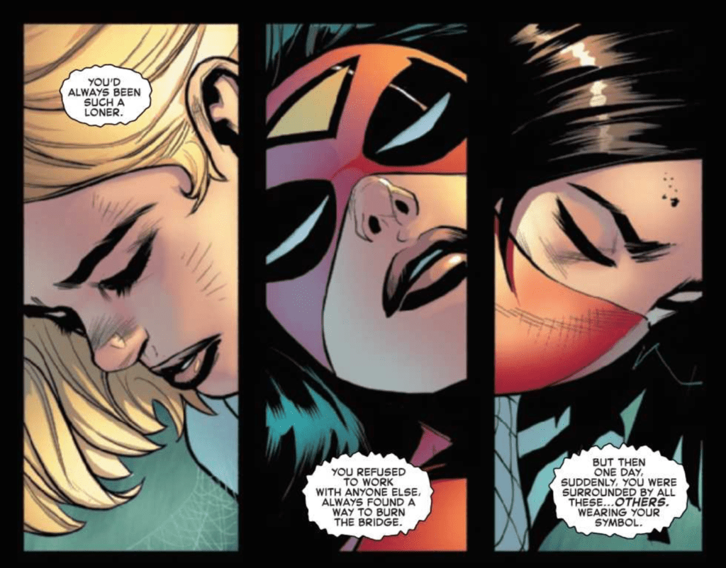
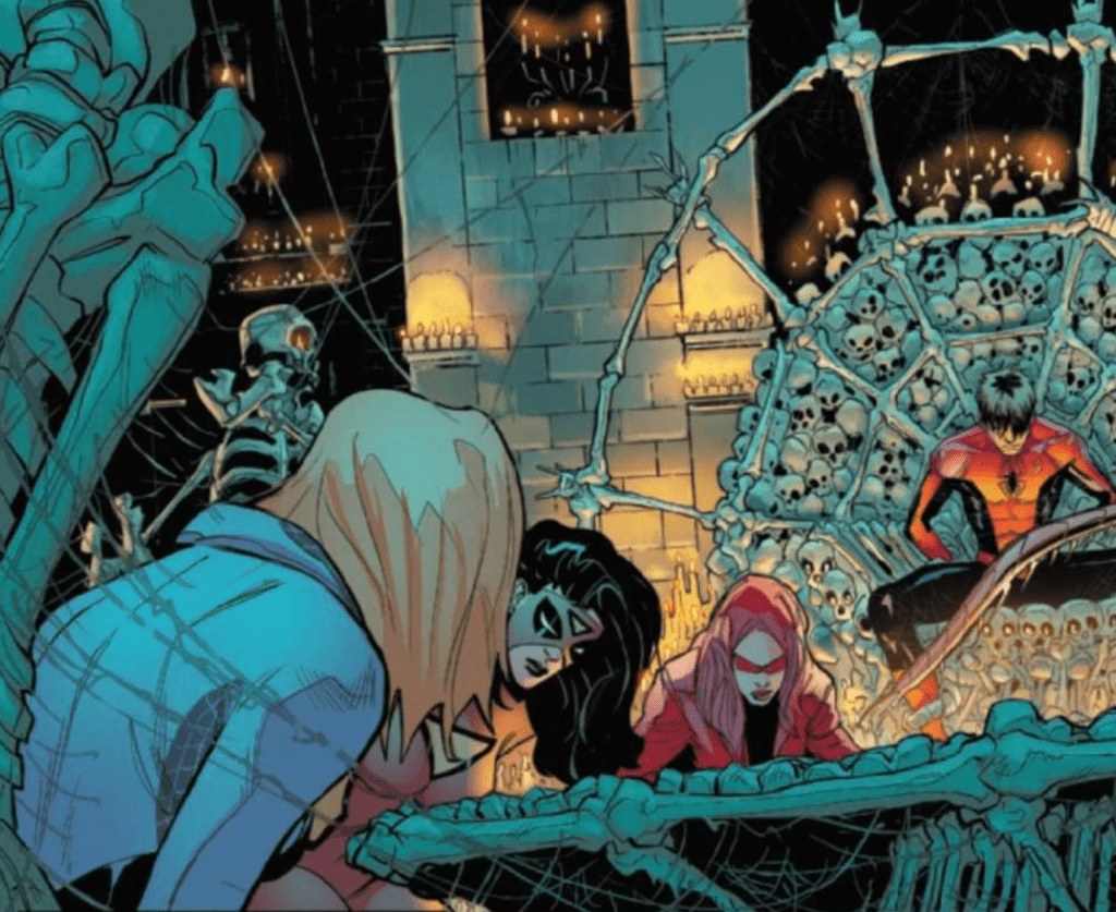
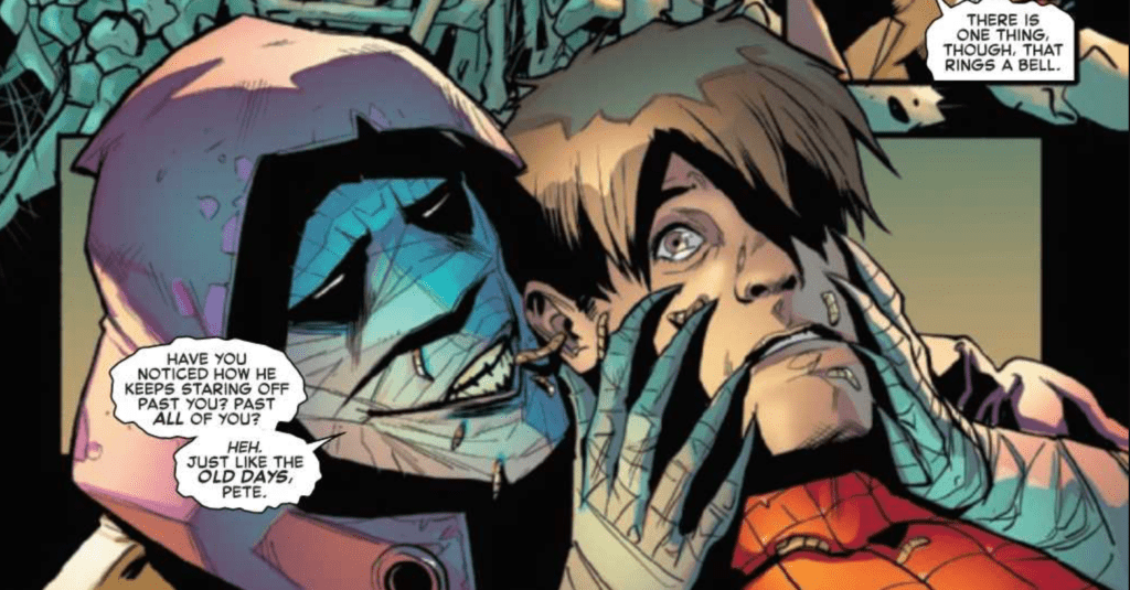
The best response I can give to describe Patrick Gleason’s art in The Amazing Spider-Man #55 is WOW. Just WOW. His work in some panels is incredibly intricate, and his characters’ faces perfectly capture the emotional scenes of the issue. The experience of reading the issue is one of flying through pages as you take in Spencer’s phenomenal story and then having to pause at the stunning artwork presented by Gleason. His depiction of Kindred is disturbing, the setting establishes a creepy tone with ease, and the action is some of the most intense I have ever seen. Gleason also uses some unconventional panel framing that adds to the eerie tone of the beginning of the issue, which helps tell Spencer’s story.

Edgar Delgado provides fantastic coloring in The Amazing Spider-Man #55, which reinforces the issue’s themes. Since the issue has a very dark tone, Delgado makes sure to reflect that in his color palette choice. However, he does not let the colors be too dark or dreary, which would result in a bland color composition, but instead finds a delightful middle ground. The colors still represent the tone, but there is still plenty of color that makes each page pleasant to look at. Delgado also provides some excellent gradients for the characters’ faces, which helps them come across as realistic.
The Amazing Spider-Man #55 features VC’s Joe Caramagna’s brilliant lettering talent, and it drastically improves the issue. Bold fonts and vibrant colors give sound effects a deeper impact and cause the blows inflicted to seem more brutal. Caramagna’s positioning of word bubbles also allows for the story to flow smoothly, which is vital for a tense issue such as this.

The Amazing Spider-Man #55 is a nearly perfect issue that had me deeply engaged the entire time. The art is jaw-dropping, and the story had me dying to turn the page and discover what happened next. The coloring helps the creepy art disturb the reader, and the lettering adds weight to the action. I really couldn’t recommend this issue enough. It had everything I wanted and more with combining the separate storylines that we followed in The Amazing Spider-Man.LR issues. I am eagerly waiting to see where the following issues will take the story.

