

THAT TEXAS BLOOD #1, available from Image Comics on June 24th, is the latest neo-Western series from Chris Condon and Jacob Phillips. Sheriff Joe Bob Coates is feeling the weight of age and the end of his career in the sleepy Texas county of Ambrose. What starts as a day-in-the-life profile of a Texas sheriff ends in a violent gut punch. Ambrose County harbors ghosts of regret and bloody secrets, and it’s not done with Sheriff Joe Bob just yet.
Cover Art
True to the genre, Phillips’ cover work is reminiscent of every Sergio Leone spaghetti western poster from the 1960s. Sheriff Coates is painted in great detail while the background is fiery red paint strokes. This style keeps you focused where it matters, squarely on the main character in his Hell on Earth. Phillips’ cover is a gorgeous piece that foreshadows the series perfectly.
Writing
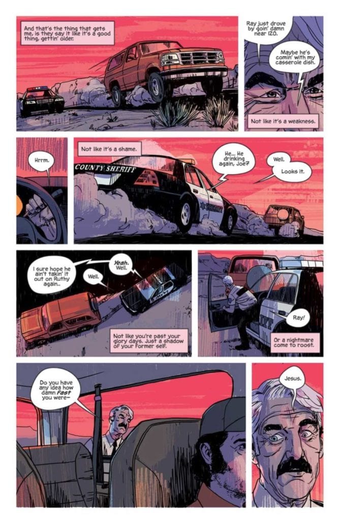
Condon sets up a profoundly oppressive – almost crushing – sense of dread on nearly every page for this story. Sheriff Coates goes about his daily routine as he tries to forget it’s his 70th birthday. The gruesome acts of violence he’s witnessed in his career haunt him, and he increasingly thinks about how there’s less life ahead than behind. In many ways, Sheriff Coates’ story is about wanting to forget the bad things in life and how life finds ways to bring the painful past back.
As you can imagine, not everyone or everything is as peaceful as they seem in Ambrose County. Condon creates a world that’s slowly simmering underneath with anger and violence that keeps building through the issue. The publisher’s description makes comparisons to No Country For Old Men (2007) in tension and tone, and that would be accurate.
Pencils/Inks
Phillips’ art excels where it counts most for this type of story: the faces. The interior is much less detailed than the cover, so every panel Phillips draws is focused on the facial expression of the characters. There’s not a lot of action here, and when the violence happens, it’s brief, albeit no less shocking. So the weight of each panel is carried by the characters’ emotions. Sheriff Coates’ eyes are expressive, especially the wrinkles around the eyes that betray the tiredness he’s trying to hide. Without realizing it, you intuitively understand that every line and every wrinkle and every bruise is deliberately placed to let you know what the characters are feeling.
Favorite Page/Panel: The last panel on page 23 stood out as the favorite because it’s the only real bit of humor in the whole issue. The Sheriff radios to his wife that he has her casserole dish (you have to be there to get it) and the juxtaposition between the Sheriff’s comment and the events of the scene is both surreal and brimming with black humor. You know, at that point, that you’re in for a wild ride.
Coloring
Consistent with the poster, colors are a red-hued spectrum that immerses the reader in the heat and oppression of this Texas setting. In another story, the colors would look flat and garish. Combined with the artwork here, the colors become feverish and tense, adding to the slow burn of the story.
Lettering
Since this is more a character piece than an action book, there’s a heavy emphasis on the dialog. Specifically, you have a county where folks who’ve known each other forever interact in short phrases and casual chit chat. The dialog needs to feel authentic and real, and the lettering completely works on that level with the artwork. The short, clipped phrases spoken by each character are executed just right to make the reader feel like they’re witnessing a conversation that can happen on any street corner or grocery store of some old town.
Conclusion
THAT TEXAS BLOOD #1, available from Image Comics on June 24th, is a slow burn that packs a punch at the end. The writing builds tension almost to the breaking point, and the artwork convinces you there are ten years of history behind every glance. THAT TEXAS BLOOD #1 is a must-read book for neo-Western fans.
Author’s Note: Local Comic Shops (LCS) are going through a tough time right now with the pandemic outbreak of COVID-19. Comics fans of every flavor that care about his or her LCS should try to do what they can. So, here’s my part:
If you’re in Northern Delaware, South East Pennsylvania, or Southern New Jersey area, please take a moment to visit Captain Blue Hen Comics in Newark, DE. Say ‘hi,’ pick up a book, order a book (they’re on Comichub.com), and let them know you support them.
If you’re nowhere near that area, please find YOUR LCS using Comic Shop Locator and lend your support.
Thanks, and stay safe.