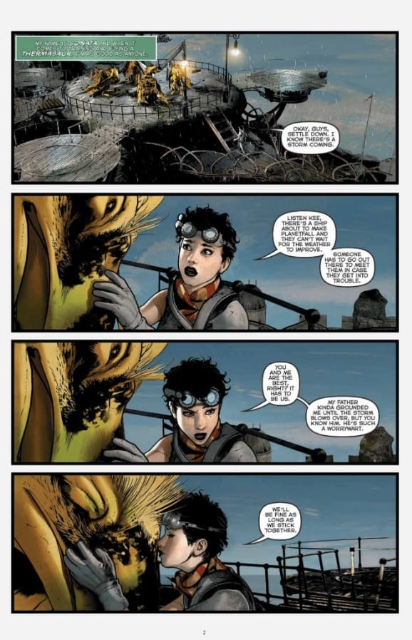
Sonata #1 by creators David Hine, Brian Haberlin, and Geirrod Van Dyke serves as a sweeping introduction to an impressive new science-fantasy story from Image Comics.
This first chapter lays out a clash between two cultures. At issue: a planet which both see as the key to their species’ respective futures. Our protagonist, Sonata, hails from the peaceful Ran, who come into conflict with the aggressive Tayans after the latter dams their shared water supply.
The Writing
Sonata #1 is an impressive opening from writers Hine and Haberlin. The title character is enjoyable as a protagonist, and characters feel believable and engaging. The worldbuilding, though, is one the story’s strongest assets.
From the beginning, the writers manage to exposit without resorting to info dumps. We have a good grasp on who are characters are, why they’re here, what they’re doing, and even the relative complexity of their technologies in comparison to one another. Then, add in some fascinating ideas, like a species of ghoulish-looking monsters called the Sleeping Giants, and a deeper layer of the planet’s mythos uncovered by the issue’s end. It’s rich, colorful, and inventive storytelling.
The stakes in the story are also laid out very clearly from the outset of Sonata #1. The colonial mission which brought the people to this planet is a one-way trip. Survival is on the line; thus, if the two can’t coexist, they could face mutual extinction.
The only real minor complaint here is the black-and-white nature of their conflict. One society is peaceful, living harmony with nature, and maintains good relations with the planet’s indigenous people. The other is violent, seeks to dominate nature, and views others as primitive and inferior. On one hand, there is some precedent for the Tayans’ stark colonialist worldview if you look at human history. On the other, it sets up a pretty clear dichotomy of “good” versus “evil,” with little space for ambiguity. Both ultimately feel a little one-dimensional as a result.
That notwithstanding, Sonata #1 opens multiple avenues for the plot to explore, and makes for a very compelling opening chapter overall.


The Artwork
Haberlin provides pretty stellar art for the book. From the opening pages, the illustrations are eye-catchingly stunning.
There’s an impressive level of detail on display, from the alien settings to the character designs. It’s all presented with a vibrant, lively sense that makes the work leap off the page. Each panel on each page feels carefully-planned and constructed. While the work often remains pretty tightly-focused on the characters, from time to time Haberlin provides a full-page illustration or wide shot that absolutely blows the reader’s mind.
Of course, Van Dyke’s colorwork on Sonata #1 really helps bring the work to life. It’s incredibly rich and vibrant, giving each page the level of life it deserves. The colors are really beyond reproach here.
Final Thoughts
Sonata #1 may be one of the strongest debuts of 2019. It’s a compelling, well-constructed story with intriguing worldbuilding and eye-popping artwork. You’ll definitely want to add this one to the pull list.

