Writer James Tynion IV and artist Werther Dell’Edera, along with Miquel Muerto on colors have created the start of what could go on to be a new classic in comic horror with Something Is Killing The Children. This first volume from publisher Boom! Studios collects the first five issues, which is more than enough to grip any horror fan. The unique plot, excellent character writing, and nailbiting presentation are sure to excite, intrique, and scare the hell out of you.
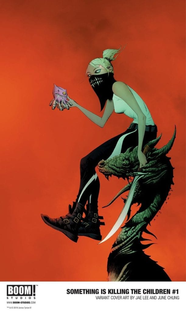
“When the children of Archer’s Peak—a sleepy town in the heart of America—begin to go missing, everything seems hopeless. Most children never return, but the ones that do have terrible stories—impossible details of terrifying creatures that live in the shadows. Their only hope of finding and eliminating the threat is the arrival of a mysterious stranger, one who believes the children and claims to be the only one who sees what they can see. Her name is Erica Slaughter. She kills monsters. That is all she does, and she bears the cost because it must be done.”
Writing & Plot
James Tynion IV attacks a specific weak point most people have in Something is Killing The Children by making kids almost exclusively the victims. The disappearances and brutal fates many children face in this comic hone in on the discomfort of watching kids get the axe. However, while this element is certainly unsettling in the story, it’s never done with any kind of “edgy” malice. The horror here is not just in the deaths, but the Lovecraftian circumstances behind their deaths. Tynion exploits children’s imaginations and irrational fears to create the monsters in Something is Killing the Children. The unique circumstances by which the monsters exist is the springboard for both the characterization in the comic as well as the lore that gets quietly spread throughout the pages.
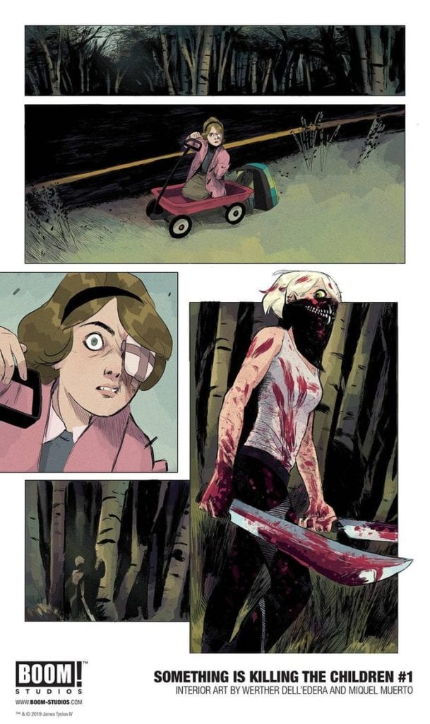
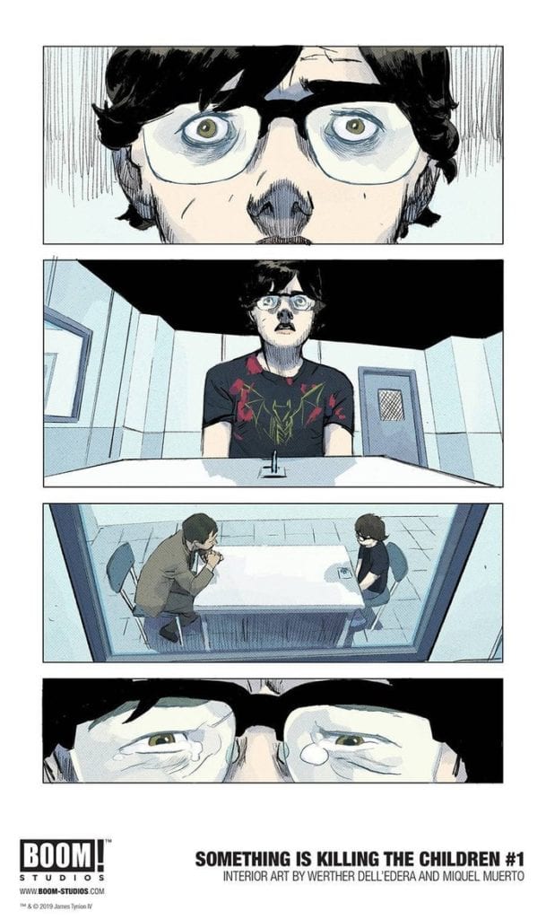
The two main protagonists – James, the lone survivor of the opening massacre, and monster hunter Alice Slaughter – are honed as characters through very different means. James has to respond to the trauma he’s experienced completely alone, while also facing the adversity of suspicion due to the fact that he was the lone survivor. Alice, on the other hand, is built almost entirely on mystery. She’s the quiet expert, the one who knows exactly what’s going on but keeps her mouth shut to keep others safe, but also because no one would believe her anyway. There’s a slew of engaging lore under the surface that Tynion teases, but never explains. There are silent panels disclosing Alice’s past exploits, but the wise choice is made to stay in the present and string the audience along for the ride if they want to find out more. The concept that these first five issues at but the precipice of a much larger world grows with every chapter, and it’s an enticing treat to uncover these mysteries as the series continues.
Visual Direction
Arguably more than any other genre, horror needs a distinct and memorable visual aesthetic to sell its atmosphere. The art style of Werther Dell’Edera has an unmistakeable look that is just perfect for Something is Killing the Children. Dell-Edera uses sharp character detail with a sort of unrefined linework to craft a distinctly offputting look. There’s an almost crayon-esque look to the lines, which is actually poignant given the chosen victims in the story. This is in no way a jab, as again it’s a stellar and unnerving fit for the comic. The monster design is roughly reminiscent of Mike Mignola’s work in its high contrast/low details. The contrast with the character detail pushes the questionable existence of the monsters themselves. The environmental design is eschewed in favor of more focus on the characters themselves, but this works to make the world more threatening and oppressive. Everything from the school to the woods surrounding the town feel haunted. This is also due to the work of Miquel Muerto’s colors, whose palette ranges from muted daytime colors and foggy grays to deep blacks when the monsters arrive. Red too. He gets to use a lot of red. The high contrast/low detail in the physical design is what keeps away any notion of the gore or violence being over-the-top. There’s a simplicity to the design that works in conjunction with great character detail and atmospheric color choice that creates the signature visual style this horror comic needs.
Something is Killing the Children Vol. 1 is the start of what could go on to be a classic among horror comics. The unique premise, teased lore, methodical pacing, and pitch-perfect visuals make this a series primed to deliver stellar stories and scares for the chapters to come. If your local comic shop can provide, be sure to order this trade paperback when it releases to the direct market on 5/20.

