SEA OF SORROWS #1, available from IDW Publishing on November 18th, follows a salvage crew to the ocean floor, where they search for sunken treasure and find something worse. Written by Rich Douek, this first issue is a great story to a historical fiction epic with creepy monsters thrown in for good measure.
Cover Art
Alex Cormack’s cover sets the stage and the mood for the entire issue – the inky black unknown. Unfortunately, the cover spoils the mystery (it’s a mermaid), but the fear of unblinking, soulless monstrosities waiting in the dark speaks to a primal fear that’s hard to shake. There’s an almost Lovecraftian feel to the cover that I like a lot.
Writing
In the modern era of decompressed storytelling and forever on-going series, it’s nice to enjoy a story that has a clear setup and takes the reader somewhere. Douek establishes the characters as a rough, ragtag collection of privateers and gangsters on an expedition to recover a sunken U-Boat laden with Nazi gold. Douek’s story excels in how well the world is established, and backstories are told for several of the key players in a very short window. It’s effective, efficient storytelling at its finest.
Douek’s introduction of the main monster is also told with speed and efficiency that leaves you questioning whether or not she (it?) is a friend or foe. That simple question makes for a very clear cliffhanger that left me curious about what happens in the next issue.
Pencils/Inks
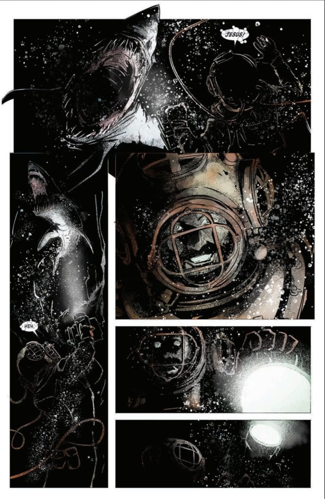
Alex Cormack carries the inky blackness from the cover all the way through the issue for maximum drama. Every character and setting is cast in deep, dark shadows – even during the day – to swath the issue in a constant state of dread. By turning up the darkness to an almost absurd degree, you feel like every character is about to do something wrong, has been wronged and carries the weight of it with them, or is about to have something terrible happen to them. Cormack’s use of shadow builds anticipation perfectly for a horror comic.

What about the mermaid? Yes, it’s a great design. The creepy, solid-white eyes give it the quality of a predator, indifferent to remorse or sympathy for its prey. There’s something shark-like in its empty stare that suits the horror style of this book well.
Coloring
Cormack’s coloring work is deceptively good in this issue. Except for a few bright spots, such as the briefly presented gold bars, the entire issue is almost entirely black and white. However, Cormack makes great use of tinting in flashbacks to reflect the nature of the threat. A WWI battlefield is illuminated with red signal flares at night. A disaster below decks tinges the air with green ammonia gas. In effect, every threat or element of danger pops with its own color to amplify its impact—great work here by Cormack.
Lettering
Justin Birch does an excellent job seamlessly integrating lettering into the art style. The book is heavily dependent on darkness and shadow, and Birch mutes and slightly darkens the fill in all the word balloons to give the lettering a hint of shadow. This is an excellent example of adjusting the style of lettering to match the art by Birch.
Conclusion
SEA OF SORROWS #1, available from IDW Publishing on November 18th, forces you to hold your breath while reminding you to be afraid of the dark. The art drowns you with a moody atmosphere, and the storytelling is brutally efficient. This is a must-buy for horror fans.

