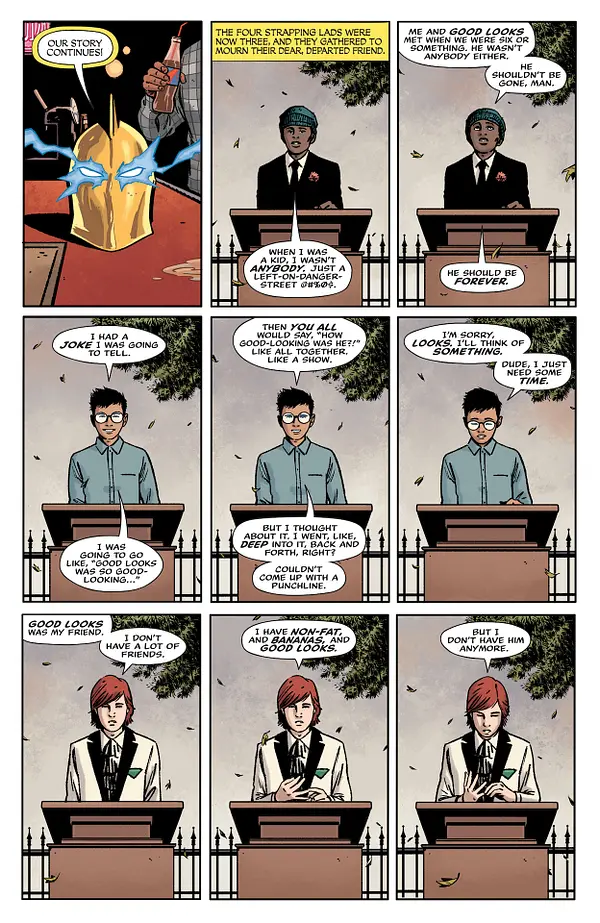
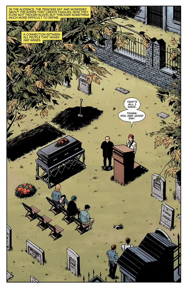
“The sky is falling.” That’s what a crazed Atlas yelled at our characters in the closing moments of Danger Street #1. And that’s exactly how that ending felt. It felt like the sky had fallen, and our hearts fell along with it. Danger Street #2 starts us off in the quiet, heartbreaking aftermath of that chaos. As the rest of the Dingbats of Danger Street eulogize their fallen comrade, writer Tom King, artist Jorge Fornes, colorist Dave Stewart, and letterer Clayton Cowles show us that this series has as much heart as it does action.
Writing
Much of Danger Street feels like it is fueled by a bewitching kind of entropy. All of our characters feel as though they’re on a collision course with each other, and their many spectacular crashes into each others’ worlds is the source of our drama. But there’s also a clear rhythm to King’s writing. Danger Street #2 has as much downtime as it does action. In fact, much of this chapter shows our characters trying to figure out how life goes on after the events of the last issue. King drives home each emotional beat with beautiful subtlety.
We see the Dingbats trying to come up with something to say at Good Looks’ funeral. None of them really seem to know what to say. King shows us, as they grasp about trying to communicate what they’re feeling, that none of them are equipped to deal with a loss like this. They all felt that they would live forever. Similarly, Starman and Warlord try and figure out how to put what happened behind them. Each time Starman tries to bring up his guilt, Warlord compares what they’re facing to his many fantastical adventures in a mythical kingdom. Dinosaurs and evil wizards he knows how to deal with. But grief? Guilt? He has no damn clue.
Art
There’s a real conversational feeling to the way Fornes sets up these pages. Much of the issue, we follow Lady Cop as she tries to uncover details about Good Looks’ death. Throughout, we get patterns on the page of bouncing us back and forth. Fornes either does it in rows or columns, showing her interviewing people. On one page, Lady Cop’s face is in one long panel that takes up a whole row. The row of panels beneath it show three people she interviews. The next row is her face again, but her expression has changed. Then another row of three people, and the page ends with her face one more time. Fornes makes us feel a lot of movement through this. It’s like a tennis match of looking over at one half of the conversation to the other, back and forth. We see this in Starman and Warlord’s conversations, too. We see it when the Creeper interrogates someone.
This sets up a norm for the pacing in Danger Street. So when the pattern is broken, that scene is really highlighted. When Highfather meets with Darkseid, Fornes keeps us mainly focused on Darkseid. The third page of their encounter has Darkseid in every panel. It slows us down. It feels like we’re savoring this moment. This interaction means something different. It sticks out. Fornes uses this variation in pacing brilliantly to build tension and focus us in on the details of these characters that get more room on the page.
Coloring
Much of Stewart’s color palette is quite muted, despite the colorful nature of these characters. Even when we see the Creeper in his yellow, green, and red uniform, Stewart casts the whole get-up in a shadow that combats the brightness. Most of the scenes in this issue feel quite real. Nothing is too flashy or vibrant. But there are two major exceptions to this. The few times we see Doctor Fate’s helm, it stands out in glorious gold. And every time we see Starman, his blue skin pops right off the page. Stewart seems to be highlighting both Fate’s helm and Starman as things that don’t quite “belong” in this world. Fate’s helm, at the center of the carnage of last issue, is otherworldly and too powerful to be contained. And Starman is from another planet. The way that he doesn’t seem to fit in, gives you the distinct impression that he wishes he was back home.
There are other subtle variances in Stewart’s colors, too. The Green Team, child aristocrats with no soul, have decked themselves and their headquarters out in their favorite color. You see the dark green table cloth where they play poker, the emerald color of the lamp on their desk, and their suits of deep cadmium green. But only a couple of pages later, we see the Dingbats, still hanging out around Good Looks’ grave. They lie on their backs on the faded grass. Stewart juxtaposes these two groups. One group is surrounded by richness and wealth. The other group is surrounded by death and things that fade.

Lettering
Cowles’ letters bring a lot of life to the script. From the old-timey style of Fate’s narrations, to the cracked “KA-BOOM” of a ship blowing up in the ocean, there’s a ton of variation to what Cowles is doing. Cowles also tends to fight against the mood of certain moments, creating a kind of balance. We hear the screams of someone being tortured shown in big, bold, yellow block letters. While the letters do have a scratchy look that shows us the desperation of the noise, there’s still a strangely fun feel to the vibrant letters. We see the same thing with explosions, gunshots, and maniacal laughter. It punches up those moments of action and gets you ready for the next big “BANG!”
But there’s a really lovely quietness in these pages, too. We see the small letters of Starman barely being able to articulate what he’s done. We see the same minute lettering when a god is – perhaps for the first time – at a loss for words. In all the pandemonium and havoc, Cowles tunes us in on the lines that matter the most.
Conclusion
DC Comics’ Danger Street lures you in with the madness of its plot. But you stick around because of the wonderfully human and heartbreaking characters. King, Fornes, Stewart, and Cowles are creating a work that is somehow electrifying and deeply compassionate at the same time. There’s a gorgeous balance that this series strikes. It’s easily one of the best books on the shelves. Don’t miss out on this fantastic series, out now at a comic shop near you!

