Radiant Black #7, out today from Image Comics, marks the beginning of the series’ second arc and begins to show us what this series is all about.
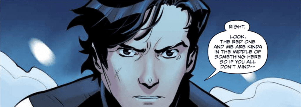
 Kyle Higgins made the first arc of the series’ an unforgettable beginning, and he’s on track to make this second arc just as high-quality. Radiant Black #7 shares many aspects that made the previous issues so great, such as light-hearted dialogue and glimpses of the larger world we have yet to explore. The dialogue becomes especially important as we meet new characters, and the jokes and quirky things they say both humanize and endear them to the reader. This issue introduces us to new elements of the world but brushes them aside as they are not vital to the immediate story. This keeps readers engaged as they wonder when all these questions that are arising will be resolved.

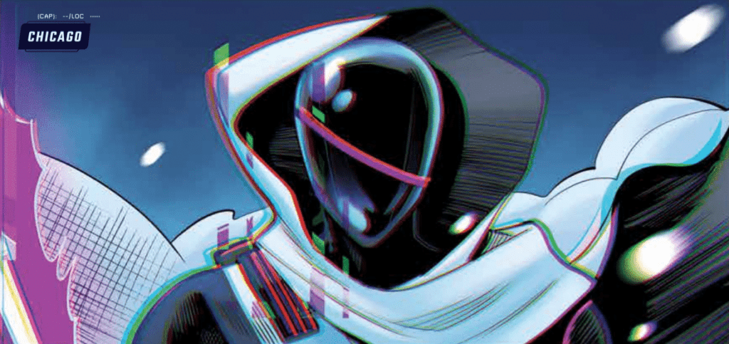
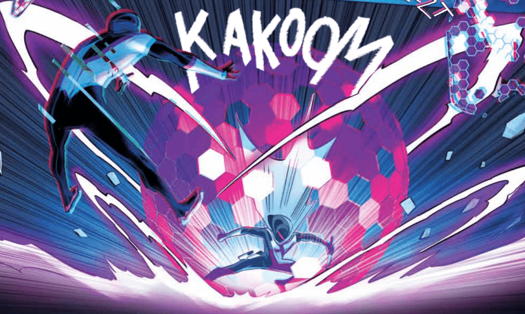
Radiant Black #7 is full of fast-paced action, which allows Marcelo Costa to show off. The issue is full of breathtaking spreads that highlight Costa’s incredible abilities. He utilizes techniques such as action lines and blurring a figure to show the intense speed and energy of the fights in the issue. This is all without talking about the incredible designs of the newly introduced characters, which are all as iconic as superheroes that have stuck around since the Silver Age.
Natália Marques does a fantastic job of making the fights stand out in Radiant Black #7. The issue’s color palette is also extremely broad and bright, making the reading experience seem more fun than dramatic, which is a nice change of pace since this is the first issue that isn’t addressing intense emotional conflicts. Marques also does a phenomenal job of coloring space when it’s a backdrop. Space in the issue is much more than a black void, and is full of the greens and blues that you would see if you were looking at images from a satellite.

Radiant Black #7 features some fantastic lettering that provides in-depth detail into how the characters speak. Becca Carey will make a word bold or give a red outline on a speech bubble to add emphasis to specific phrases, but she will also use less common techniques such as changing the shape of part of a speech bubble to show a change in the line delivery. The font choices for the sound effects do a splendid job of capturing the intensity of the battle, and Carey provides excellent lettering all around for the issue.
Radiant Black #7 is a start to the new arc that will not disappoint and retains the fun and engaging feel that has made the series so enjoyable to read in the first place. If you enjoyed the first arc, you will not want to miss this issue, where the series begins to come together into the Power-Rangers-like experience we were promised. Pick up Radiant Black #7, out from Image Comics August 18th, at a comic shop near you!

