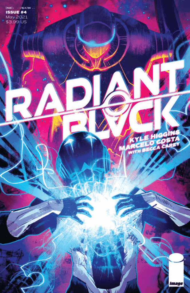
Radiant Black #4, out now from Image Comics, drastically changes the course of the series’ story, and nothing will be the same again.

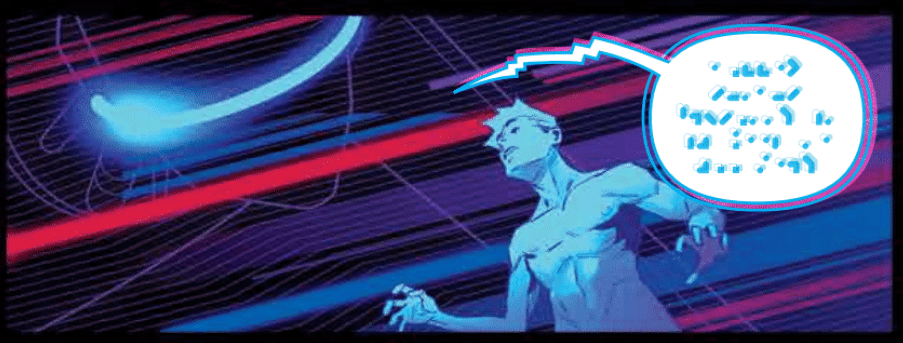
There is so much to say about Kyle Higgins’ writing in Radiant Black #4, although the best parts of the issue would be difficult to describe without spoiling it. Do yourself a favor and pick up this issue at your local comic book store today. The issue begins with a dream-like sequence that raises questions and instantly hooks the reader. We also get more character development for both Nathan and his friend, Marshall, as well as an intense action scene that makes Radiant Black #4 an incredibly well-rounded issue. One of the best parts of Higgins’ writing was how he hinted at past events in a single line of dialogue. It was clear the name-dropped was a painful memory for Nathan, and it is not elaborated on, leaving the reader desperately questioning what happened.

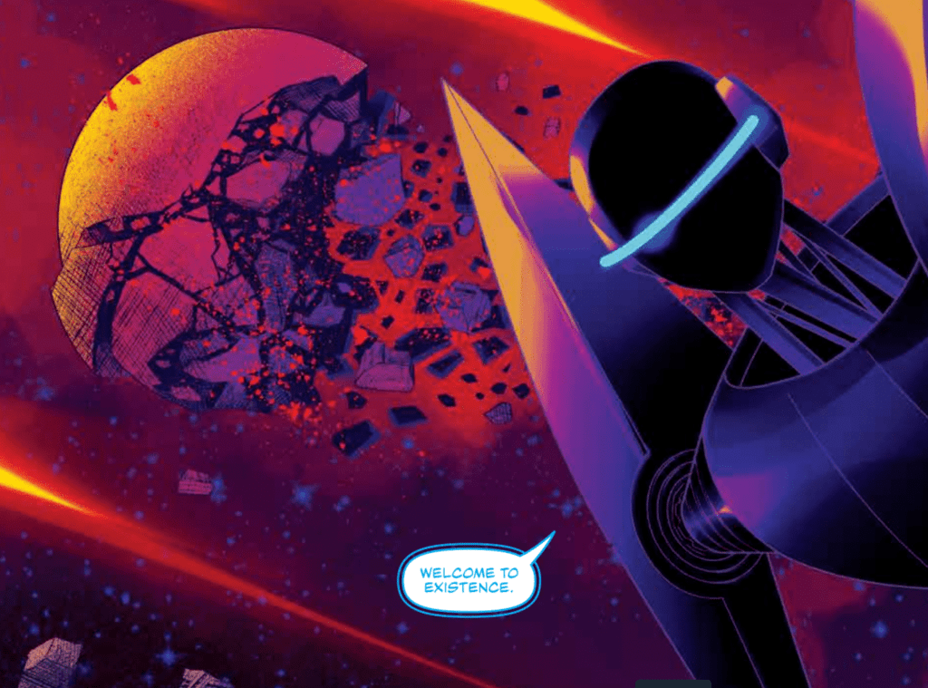
Marcelo Costa’s art in Radiant Black #4 makes the book feel like a seamless experience. While the writing also assists in making the issue feel more immersive, the gorgeous double-splash page early on wows the reader and instantly draws them in. Characters’ faces are so expressive that empathizing with them becomes easy, and the action scenes are so dynamic it’s near impossible to tear your eyes away from the page. Costa also employs techniques such as characters overlapping the borders of a panel, action lines, and a trail of dust to show a character’s motion.
Costa’s colors, along with the color assistance of Rod Fernandes, turn Radiant Black #4 into a gorgeous issue. The dreamscape scenes are especially stunning, and starting with one so early on is a great way to capture the reader’s attention. The snowy scenery of the town was a great way to desaturate the palette, so when it changes during the intense fight scene, there is a stark contrast. Costa and Fernandes do a brilliant job complementing the art of this issue.

Radiant Black #4‘s lettering fits perfectly with the issue’s art. Becca Carey uses standard techniques such as making specific sound effects small and giving them a color that matches their surroundings to indicate their low volume and employs tactics that make her lettering stand out from the rest. This can be seen when an otherworldly being is talking to Nathan, and Carey gives them a blue ring around their speech bubbles, which helps cement their alien nature to the reader.
Radiant Black #4 is an issue that changes everything. It’s been a long time since I’ve seen a series that has made such a drastic shift so early on, and any fan who has enjoyed any of these issues will not want to miss this epic moment. Higgins, Costa, Fernandes, and Carey all put forth fantastic work that makes the issue worth much more than its selling price.


