PROTECTOR #4, available from Image Comics on July 1st, follows Mari and her escorts on their way to the Fortress, dealing with insurrection and alien traps along the way. Simon Roy and Daniel Bensen’s story wrestles with primitive notions of myth and prophecy while confronted with alien technology advanced enough to be mistaken for magic.
Cover Art
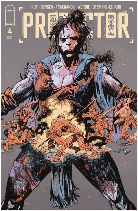
Vlad Legostaev’s cover work is gritty. The use of blues and greys give off a stone-like feel that matches the primitive setting for the story. Luo, the central figure on the cover, projects the serious demeanor of a warrior, which strongly matches her personality in the pages to come. I would be keenly interested in seeing what Legostaev could do with style when adapting a horror book along the lines of Frankenstein.
Writing
The story by Roy and Bensen is simple until it isn’t. Mari and her group are rafting through the rapidly evolving wilds of a terraformed Earth on their way to the Fortress. Luo, being the strong Hudsoni warrior firmly entrenched in believing what she can see and touch, questions Mari’s elevated status as the “Chosen One.” When the group encounters an alien satellite that tries to spirit Mari away, Luo seizes the opportunity, and chaos ensues.
The actions and dialog of Luo, Slaver, Mari are simple on the surface. Still, there’s a deeper meaning in this story about our deference to technology, that we largely don’t understand, for guidance and protection. The traditions of the old resist against quickly evolving changes of the new. That resistance, unaddressed, boils over in violent outbursts.
It sounds like this issue is a brilliantly deep and thought-provoking read, and it may be. Or, it could be a weird story that accidentally opens up the opportunity for the reader to consider ideas you hadn’t thought of before. Either way, it’s fun to dig deeper into this story when you read it more than once.
Pencils/Inks
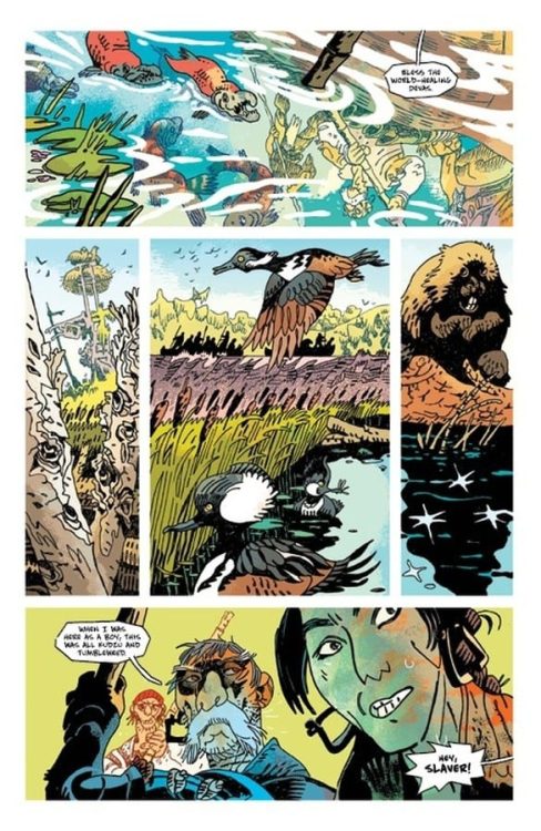
Artyom Trakhanov’s art style is heavily stylized, and that’s putting it mildly. There’s no adherence to anything resembling consistency or anatomy. At times, it was difficult to understand what was going on in some panels. You could make the case that the art style (at least consistent with Trakhnov’s other works) looks like doodles in a junior high schooler’s composition notebook.
But here’s the critical difference.
Trakhnov’s work adds to layers of depth to the themes in the written story specifically because it looks primitive and amateurish. The common themes in the story of legends and prophecy clashing against new tech resemble, in a way, ancient drawings or cave paintings to emphasize the narration from the Hudsoni’s perspective. To be fair, Trakhnov’s art will not be everyone’s cup of tea, but I appreciate that it’s a good match for the type of story Roy and Bensen are telling.
Coloring
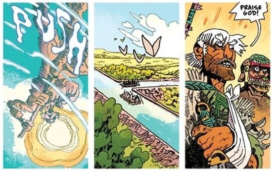
Jason Wordie’s coloring and Hassan Otsmane-Elhaou’s lettering save this issue from being just a weird oddity and turn the book into something more. How do you color in the lines when the lines have no rhyme or reason? How do you add texture and shading to a figure that makes no anatomical sense? Wordie answers these questions with pure, brilliant execution. The figures are shaded, sometimes with Mario Bava-esque tones, to emphasize the animalistic emotion in each scene. This is most apparent during the big battle towards the end of the issue, and Wordie takes drawings, that risk looking ridiculously cartoonish in black and white, and turns them into powerful punches of energy.

Lettering
Otsmane-Elhaou’s lettering takes the saving grace of Wordie’s coloring and bumps it up even further with amazing lettering technique. On its face, it’s silly to see sound effect lettering that spells out ‘STAB’ or ‘DRIP’ or ‘CHOMP,’ but again, this is an example of an expert letterer changing the typical into the atypical to marry the lettering style with the art and color. The sound effects are overly simplistic to the point of amateurish, by design to match the primitive perspective of the storytellers and the rough, raw style of the art. This is a stellar example of the letterer adopting a style that’s not his own in service of the overall aesthetic.

Conclusion
PROTECTOR #4, available from Image on July 1st, is a simple story that’s anything but in execution. Everything about this issue is rough, raw, primitive, and if you look deep enough, possibly very thought-provoking. It won’t be to everyone’s taste, and maybe that’s a good thing.


