If you’ve ever picked up an X-Men comic in your life, there is a good chance you’ve read someone saying “Wolverine is the best there is at what he does.” He’s a good hunter and fighter, he’s durable, and he’s almost unkillable. We’ve held onto those beliefs for decades. But what happens when he comes up against a hunter that is just as skilled and less remorseful? That’s exactly what writer Benjamin Percy hopes to answer in Predator Versus Wolverine #1. Joining Percy on this issue are Ken Lashley and Greg Land on art, Juan Fernandez and Frank D’Armata on colors, and Cory Petit on letters.
WRITING
If there is one current X-writer who is a Wolverine fanatic, it’s Benjamin Percy. Not only is he writing the solo Wolverine series, he was also writing the character in X-Force. It makes sense for Percy to tackle Predator Versus Wolverine. Percy doesn’t start us off with a knock down drag out battle just yet; instead, we are treated to some backstory in this opening issue. Percy builds up a history between Logan and the Predator. They had fought before, a couple of times actually. This works simply because Wolverine is a character that has been through so much, and as readers, we never know the full history of all his battles. Percy details a story of a young Logan who seeks to help out a man who had his son captured. This leads to a meeting with the Predator.
Now, Percy makes sure to give fans what they want with this introductory chapter too. Lots of action and lots of violence. This should not be a clean book by any stretch of the imagination. It’s great to see Wolverine unleash and go berserk on a creature that deserves it. The end of the issue will only pique your interest more as different characters get involved in the battle. Benjamin Percy has delivered an intriguing story that will meet all of your reading needs.

ART
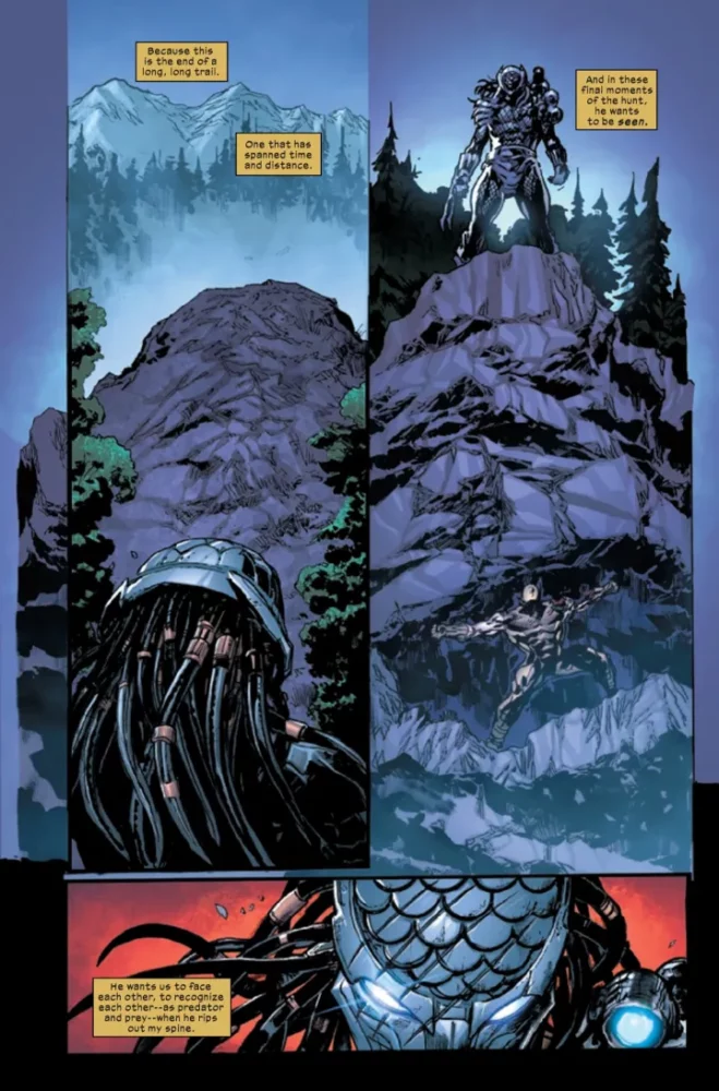
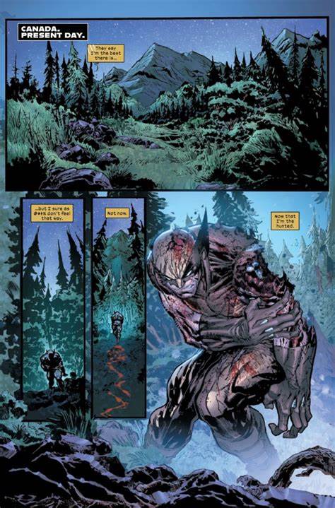
The pencils for this issue are split between Ken Lashley, who does the art in the present, and Greg Land, who does the pencils in the past. Lashley starts us off this issue with violent images of an injured Wolverine. We’re used to seeing Logan beaten and bloody, but it’s good to see Lashley giving us some images that are gruesome. This is definitely an adult book and not for children. Most of the issue is handled by Land, who gives us the background story between Wolverine and the Predator. Land’s style has a very realistic feel to it. This allows the Predator to look almost as if he’s going to jump off of the page and attack the reader. The action sequences are done well by both Lashley and Land. With a bottle smashing into a bar patron’s face or someone losing a hand, the pencils pop with energy. Lashley does an amazing job of replicating the Predator’s vision. As the alien hunts Logan, the lay of the land looks great. It seems like we’re wearing the helmet this issue. The pencils from both artists compliment one another. This allows for the reader to enjoy the issue all the more.
The colors are split between Juan Fernandez, who does the present day work, and Frank D’Armata, who does the flashbacks. Fernandez is integral in the color department because he is responsible for replicating what the Predator sees. His bright orange and yellow when the creature sees Wolverine has to be perfect. Fernandez nails these panels, as well as the vibrant blood from Wolverine as the Predator tracks. Frank D’Armata handles the colors in the past. He works with Land, so his style is lighter with more realistic tones. D’Armata uses some dark reds for blood when guys get clocked in the face or lose a hand, but for the most part the colors are duller. The backgrounds in the bar are a simple brown that reflect the times. There are some vibrant panels when a gun fires or flayed corpses are hung from trees. The colors by D’Armata and Fernandez pack a lot of punch for this issue. They allow the pencils to jump off the page at the readers. Both colorists do a wonderful job and allow the reader to feel like they are in two different time periods.
Cory Petit puts the work in on lettering, as there are many sound effects as Wolverine and the Predator clash. Of course Petit gives us the classic “SNIKT” as Logan unleashes his bone claws, but a huge “BLAM” that is used as the background on a solid white page as Logan gets shot is not only awesome, it’s also very effective. There is also a well done panel where both Logan and the the Predator scream at the same time. Petit combines the word bubble over both panels; this is almost like a bridge between both of the hunters. Petit’s work on this issue goes hand in hand with the art, elevating the work overall.

CONCLUSION
Predator Versus Wolverine #1 is a slam dunk of an issue. Benjamin Percy delivers on tone and violence to pit these two killers after one another. The art illuminates the story and gives fans the visuals they’ve been dreaming about. Predator Versus Wolverine is available at your local comic shop!

