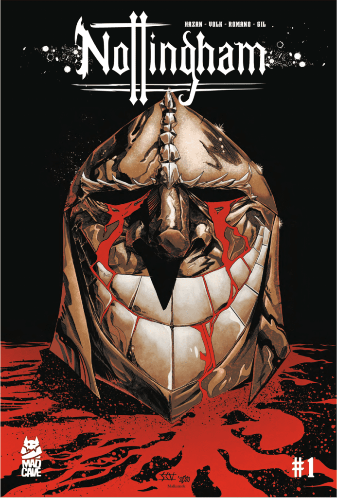
Nottingham #1 begins a grimdark depiction of Robin Hood from Mad Cave Studios. Writer David Hazan and artist Shane Connery Volk showcase a dour atmosphere throughout the issue, something that colorist Luca Romano and letterer Joamette Gil heighten with their roles. The issue will be available to pre-order on December 29th with a slated release on March 6th, 2021.
The Grimdark Of Nottingham #1
Hazan sets a mood for Nottingham #1 where the reader roots for the least despicable character. Throughout the issue, the reader sees the brutality on all sides of a political conflict. The Merry Men sing tunes of charity as they commit heinous murder, even as victims beg for their lives. The sheriff Blackthorne is hardly a step up, threatening Maid Marian and not seeming to be very popular even among his own men. That leaves Robin Hood, who can act kindly while hiding in plain sight. Even then, though, he is as ruthless as everyone else in this series, more willing to assassinate than fight. He’s just the most professional of the bunch by tying up loose ends to see his goal through.
Three Acts Atmosphere
Volk’s art has a very clever use with three-act structures within Nottingham #1 to convey small moments in sequence. The first pages demonstrate the character traits of the Merry Men and how they operate. In the first depiction, one of the Merry Men shows himself to be extremely ruthless and sadistic by mercilessly stabbing a helpless victim. That introduction gives the reader a good idea on what the mood is. The brutality of the act distracts readers to the point where they assume this Merry Man speaks for the rest. Within another segment on the next page comes a reversal: Another Merry Man employs a less brutal but still deadly kill. When the reader learns that this later Merry Man is Robin Hood, it sets up a heavy contrast between him and his followers. Just how his cloak flows in the shadows makes him more akin to a phantom which makes him twice as threatening in practice.
Romano’s coloring provides a glimpse into the plot’s activities: Bright lights evoke information sources. This leads either directly towards the Sheriff’s brutal interrogations or Robin revealing himself from a Merry Men mask. As for the lettering, Gil smartly reuses SFX to link moments in the readers’ minds and help develop characters and themes. The only confusing piece of lettering in Nottingham #1 is when a flash of lightning strikes over the sheriff and Merry Man clashing swords, and what comes is a simple “shing!” sound when you would expect an explosive “boom!” It’s just a minor distraction, though.
Give Nottingham #1 A Try
Nottingham #1 has the makings of an interesting grimdark fantasy with morally questionable characters and a mood to match. Right now things are just beginning, so only time will tell where this all leads.
What do you all think? Is this just going to be another attempt at an edgier Robin Hood like Russel Crowe’s movie? Or is there something about this depiction you just can’t let go of? Leave your thoughts in the comments.


