

NINJAS & ROBOTS #1, out this week from Keenspot Entertainment, follows the ninja, Yuki, as she’s forced to endure the trials that will restore her lost memory and reveal her path to the Light. Writer/Artist Erik Klaus and Artist Katy Amacker have constructed a post-apocalyptic fable brimming with ninjas, robots, prophecies, intrigue, and a fair bit of wit.
Cover Art
Klaus’ cover matches the internal pages perfectly. The lines are rough-to-blotchy, the anatomy is stylistically exaggerated, and the overall aesthetic has a graffiti tag vibe to it. But you can’t help but see that cover and think, “Oh, this is going to be interesting.”
Writing
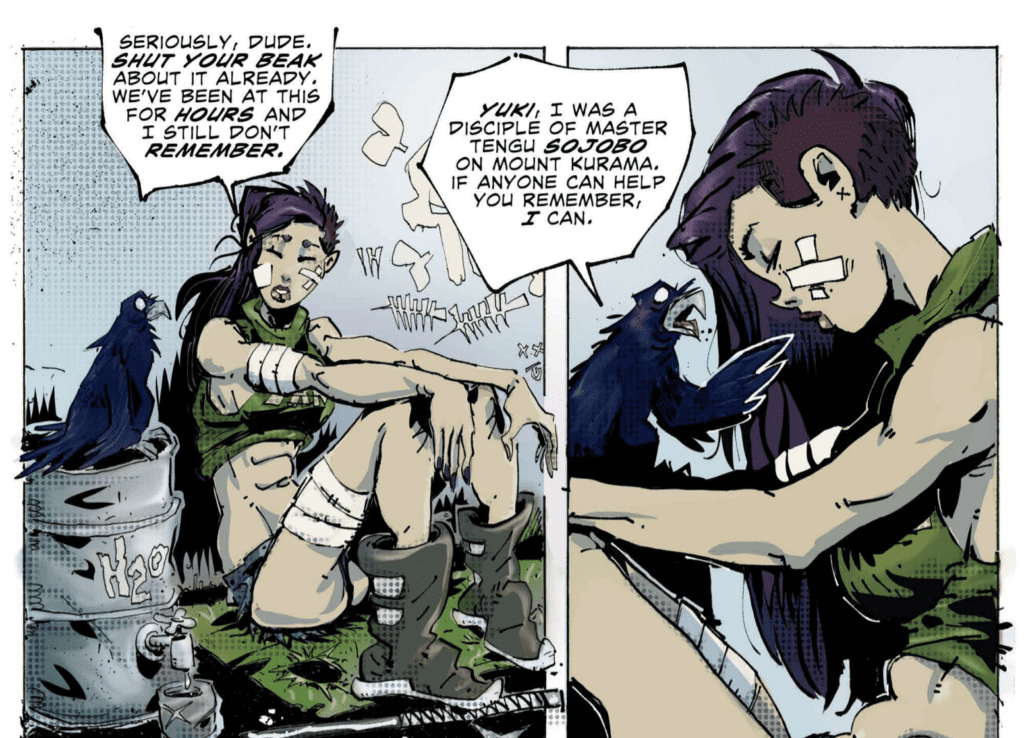
Klaus’ story is the type of indie comic a reviewer hopes to find. It’s rough, make no mistake, but there’s a spark of pure imagination and genuine fun. Yuki, the main character, is a ninja who awakens trapped in an unknown location. She has no memory of who she is (except for her name), where she is, or what her purpose is. With the help of a talking crow and a flying, teleporting android, she’s put on the path to reclaim her memories and fulfill her mission.
Klaus fills in some of the blank spots with well-constructed flashbacks and conversations between side characters to give the story a broader scope than the setting implies. For a 24-page comic, there’s quite a lot of story to unpack, and that maybe it’s biggest flaw – too much, too soon, all at once. If Klaus can slow down the data dump in subsequent issues, this will be a memorable indie run.
Pencils/Inks
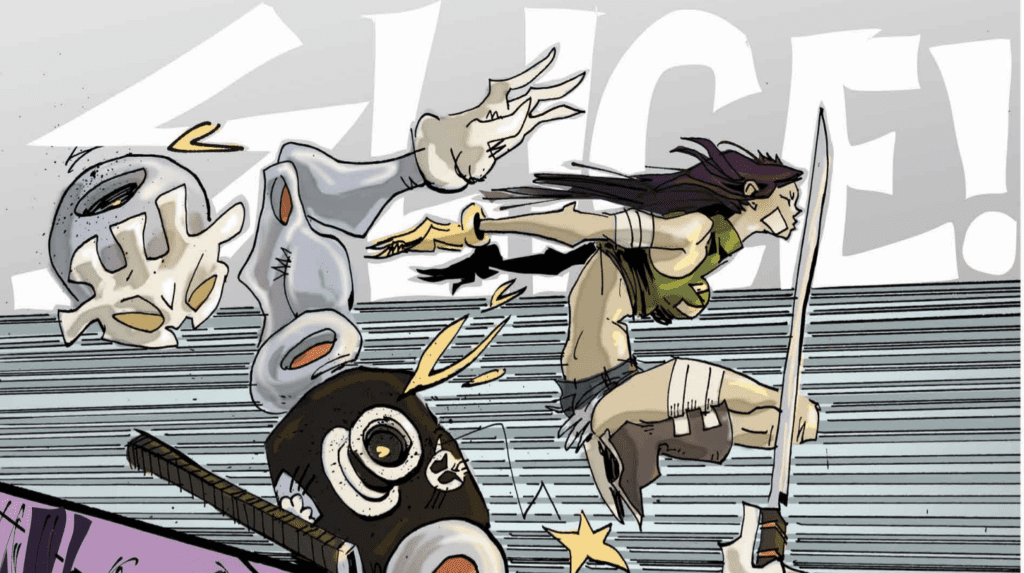
Klaus’ art is equally rough to match the story, but the crudeness gives the comic a certain charm. The ink work is sketchbook in style with thick lines, and the anatomy of the characters is over-the-top, but it all fits together in a very stylistic way. I found myself being reminded of the art style from Aaron McGruder’s Boondocks comic strip but less clean, which incidentally gives this book a slightly urban flair.
By contrast, Klaus takes special care not to be crude with the characters’ facial expressions, particularly the eyes. In other words, the lines and detail are there when it counts for the characters to convey emotion, focus, and intent.
Coloring
Amacker’s coloring work is the glue that holds the art of this issue together. It’s precise and pristine. When most of the characters are loosely rendered in a sketchbook style, Amacker keeps all the colors tightly in the lines to give the art a surprising level of pop. Plus, Amacker’s shading technique is on point, giving the anatomy of every character depth and weight.
Lettering
The lettering is solid throughout the book. As mentioned earlier, you get a lot of information thrown at you, and it’s no small feat to keep the lettering clean while aligning with the rough art. The lettering looks like it matches the art style, which is precisely what it should do. The one area that didn’t quite work was the occasional use of bright white for onomatopoeias. It tended to get lost in the background.
Conclusion
NINJAS & ROBOTS #1, available from Keenspot Entertainment, is imaginative, fun, and chock full of energy. There are gobs of potential with some fine-tuning. I’m looking forward to the next issue.