

Neon Future #6 from new comic publisher Impact Theory came out Wednesday. With this release came the accumulation of Neon Future’s first arc in spectacular fashion ending with a bang whilst setting up the future.
Impact Theory’s Neon Future wrapped up its first art last week in spectacular fashion, setting up an exciting future for the series.

A History Of Neon
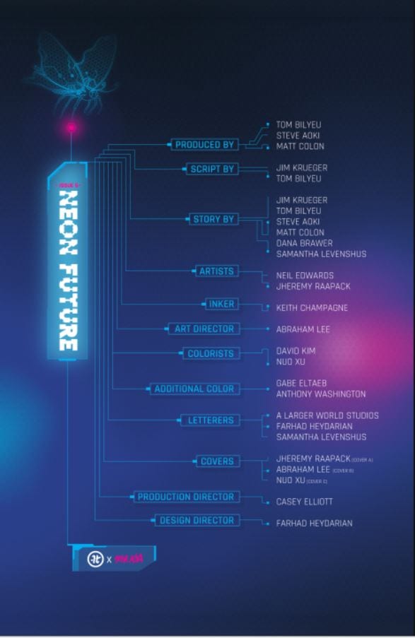
When marketing a new company, the best way to start is with a big name, and Impact Theory did just that with Jim Krueger. The idea of Neon Future formed in the mind of Co-Founder/CEO Tom Bilyeu’s mind when he heard of Steve Aoki’s plan to cryogenically freeze himself after his death. Thus, Bilyeu went on the hunt for a writer. Having coffee with Eisner winner Krueger, he knew who would anchor the project. Neil Edwards and Jheremy Raapack then joined as the series’ pencilers, with inks courtesy of Keith Champagne and colors by Abe Lee.
Krueger and team set out to make a new realistic future with help coming from Steve Aoki himself and Team Aoki. The inspiration from Aoki was so deep that the main character Kita Sovee is the musician’s doppelganger. Neon Future draws heavily from the dozens of recognizable Sci-Fi’s before it but never falls into straight ripping them off.
At the end of each issue, Bilyeu leaves a letter for the reader that shows how much pride and love he has for the company, team, and Neon Future. This letter shows that love and more with his announcement of another arc of Neon Future in the form of six issues. Talk about getting a reader excited!

A Future Made Of Neon
Neon Future starts in the future, thirty years to be exact. Yet it feels much like our recent times with America divided into factions. A.I. and automation are causing mass unemployment, with the government now being under a new authoritarian rule. This rule promises a return to simpler times without advanced tech. They create Article 10, referring to it as ‘The Return’.
This ‘Return’ will bring jobs back to many by removing the technology that caused job loss, but would also put out Augmented humans with jobs. Creating a divide between those with integrated technology (Augmented) and those without (Authentic). Sounds like a lot to take in, right? You could also say it sounds like a possible future for our real world.
The world Krueger builds within the first half of Neon Future shows how much work went into it: its politics and history. We learn much of the lore through character interactions and narration. Diving into a new world may seem like a lot but with great crafting, the creative team weaves in lore masterfully. The series starts with a bang by having recently deceased TV personality Clay Campbell narrate his death/rebirth. As irony prevails, Campbell is captured by the augmented that he hunts, the underlings of Neon Future’s Leader, Kita Sovee.
Kita finds Campbell’s death as a great opportunity to have one of their past nemesis be on their side. Augmenting Campbell, Kita brings him back from the brink of death, allowing him to choose the path of the butterfly or blade. That’s where that awesome logo comes in. Campbell, surprised and frightened, decides on running away.

Following this escape, Krueger writes a dirty future filled to the brim with bigotry, showing Authentics mattering more than those Augmented. In these moments, Neon Future starts to show its heavy-handed cards with scenes showing how divided the population is. Many characters use slang names for people that are Augmented. But fear and hatred goes both ways, with those augmented having names for the Authentics.
The first half of Neon Future relies greatly on Krueger’s world-building while showing the problems happening in the world. Campbell’s first steps with augmentations quickly bring the realization of how the ‘other side’ is treated. Our team of artists paints what seems like a peaceful line of augmented people going home with one becoming singled out and running away just to be shot down.
Through these gorgeous panels nearly void of words but heavy in dark colors, Campbell and the reader learn that the violence we’ve seen previously isn’t just a one-off moment. Although Neon Future has lighter funnier moments throughout, it’s equally balanced. This synergy of humor and seriousness works out well making Neon Future hard to put down.
Each new character introduced feels interesting in their own respects, with none feeling wasted for the story. Not much is known on Kita, but each time he graces the page you want more time with him. As Campbell learns what it’s like for those he hunted, we learn the grizzly facts along with him. In Neon Future, there is no easy way or even “correct” way. But for Campbell’s turning point, we have a moment that hits hard.

With the fear of being alone, Campbell gets the help of Kita’s left-hand woman Dee to help him back home, only to learn that hatred can run deep. Even though her son is back, now that he is augmented, Campbell’s mother doesn’t see it as a positive. This pivotal moment is when Campbell seems to start believing in Kita and Neon Future.
From this moment on, Neon Future strays from the plot and starts to focus on Campbell’s character with some Neon Future sprinkled in. One issue focuses entirely on Campbell learning to fight, showing the shift to a singular character story. Then the series moves on to the finale, but this is where we’ll stop. No point in having everything spoiled for you! These last few paragraphs seem like a lot but there is much more in the first three and last three issues of Neon Future’s first arc.
Neon Art/Neon Lights
Teaming for the art department is Neil Edwards and Jheremy Raapack with inker Keith Champagne and colorist Abe Lee. Throughout Neon Future, there are moments with gorgeous, fluid art that flows from panel to panel, where, in other instances when images are brought to the forefront, the lines seem to take a hit. This happens mostly with faces. Some start looking awkwardly mushed towards the characters face like a hand grabbed them forcefully from the back and squeezed.
This isn’t with every face we see, but enough of them that you wish you didn’t see so many conversations. This problem happens with other items, like guns, machinery, and body parts, but they don’t draw as much attention as the faces do. On one fight scene in Neon Future #6, one character, and their enemy looks the same size (as they should be for plot reasons), but in a few separate panels, their sizes change with one growing humongous and the other smaller. Then they’re back to normal. This size-shifting looked quite weird, throwing off what was a great story-driven moment.

Besides those minor issues, Neon Future’s first six-issue arc has fantastic art that flows well with the pacing of the story. The team easily mixes chaotic fights with easy to follow moments that are akin to poetry in moments. With Lee’s colors, the art becomes a living and breathing futuristic world. The darkness is never overshadowed by the bright light. Lee adds that extra layer that helps excel the world the team is building. As the series goes on, additional color artists join the team, such as David Kim, Nuo Xu, Anthony Washington, Gabe Eltaeb, and C’endan Clairborne, with Lee moving into the Art Director position.
Neon Closures
The first six issues of Neon Future are that of a building foundation with more than a few hands on the cement roller. What started as a story of the worldwide ramifications of Article 10 and the division of people the story quickly devolved into a singular focus. This is most noticeable in the last three issues, with Neon Future starting to lose sight of its own story. Within the first three issues, we see a vast world ripe with venues to explore and stories to tell, but starting with Neon Future‘s fourth chapter, our narrative starts to focus singularly on Campbell and his story.
Campbell’s story is a blast to read through, but with how the story is written and plotting forward in it’s first few issues, it feels as it should stick its focus on the world with Campbell being an after story. That just speaks to Krueger’s fantastic world-building and a plot that makes you invested into the world, but when Neon Future opens each issue with an explanation of “The Return,” it feels like the story was shifted in what was going to be something else.
Instead of a story of what may be a future, we receive one focused on a man. The title implies that it’s about our future or the group known as Neon Future itself, but instead, it spirals into the life and times of Clay Campbell. The next arc promises a wider reach into the world, so here’s to hoping that arc keeps the great world building and the world at large story that its first few issues had.

One problem seems to stem from how large the cast of story creators is. We have six people for the “story” section alone, which could’ve been what contributed to the weird shift we saw midway through the series. None of these observations take away too much from how great the story is. At points, it holds its inspirations on its sleeve while not ripping straight from those sources, with Krueger’s writing pushing the story forward with the speed or lack of when the plot calls for it.
The lettering in Neon Future #1 falls upon Clem Robins, but as the series goes on, so does the letterer, with Samantha Levenshus, Farhad Heydarian, and A Larger World taking over.
Following Robins departure we see the lettering team take more chances with some fun encounters happening, making characters scream names like they do in superhero comics. But Neon Future’s lettering only plays with fonts and placement every once in a while but doesn’t try too much, instead of playing it safe and close to the chest.
A factor that does set Neon Future apart from the others: it has recap pages! I’m a sucker for these when I read monthly titles because we all know sometimes you just need a quick recap.
For a debut series, Impact Theory did phenomenal with Neon Future. By the end of the first arc, you will crave for more of the world and its characters. To support Impact Theory, directly purchase Neon Future from their website here!
Side Note: What the hell happened to the internet?
Memorable Quote: “There’s not enough yoga in the world to calm me down with a fucking dragon coming after me, Kita!” – Clay Cambpell.
I can’t even stay calm when a dog looks at me. Good luck staying calm when a dragon stares you down!