MARVELS SNAPSHOTS FANTASTIC FOUR, available from Marvel Comics on March 25th, is part of a series of one-shots that looks at a slice of life with the Fantastic Four. This is not your typical FF adventure story, so is it worth the price of admission? Let’s find out.
Cover
Alex Ross painted the cover showing the Human Torch. If you’re an Alex Ross fan, you will instantly recognize his hyper-realistic style. Ross’ technique makes you believe you can see these fantastical (no pun intended) heroes and villains appear in the street right in front of you.
Where the cover doesn’t work is in the extreme closeup. Johnny Storm flying through the air, is a sight to behold. By zooming in so tightly, the spectacle overwhelms the cover to the point that you can’t appreciate the wonder of it. To be fair, I believe this was an editing misstep and not necessarily on the cover artist. This cover would have been better if the frame was zoomed out more.
Writing
Evan Dorkin and Sarah Dyer have writing credits on this issue. The pacing starts slow, and the story gets a little ugly just past the halfway point, but there’s a surprising twist in the last third that shows me something I’ve not seen before. Let’s set expectations a little bit (without spoilers).
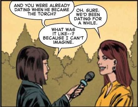
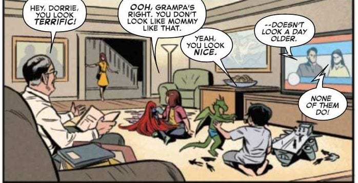
Despite the title, this is not a Fantastic Four story. It’s a story about Johnny Storm/Human Torch attending his 10-year High School reunion. Further still, it’s less about Johnny Storm and more about the civilians who have known Johnny Storm in High School and the years since graduation. Nearly the entire issue is told from the perspective of a news crew covering the event, so you have a lot of Q&A and remembrance storytelling. It’s a unique approach to a superhero title, but again, very little to do with a superhero and mostly people just talking about the superhero. These interviews before the reunion take up the entire first half of the book, which is hard on the pacing. Dorkin and Dyer could improve the story by tightening some of the interviews and shortening to a third of the book.
The reunion is uncomfortable and awkward, so the writers nailed it. Some attendees get drunk and make fools out of themselves. Other attendees either hate Johnny Storm, or they fawn over him like cut-rate groupies. You’re given the impression that Johnny Storm is a conceited jerk, and the town, while appreciative of the fame he brought them, doesn’t like him very much. I was increasingly uncomfortable reading this section, so Dorkin and Dyer succeeded in giving you an authentic reunion experience.
Then, there’s a turn in the last third of the book that starts poorly but sticks the landing. Without spoiling it, the news crew notices something is off. Marcia’s (the reporter) explanation about what she sees feels forced and comes out of nowhere. Dorkin and Dyer could have improved this setup by dropping a few more cues for the reader. That aside, the news crew follows the trail, and they discover a surprise that I did not see coming. It was a pleasant and exciting surprise.
If Dorkin and Dyer could tighten up the interviews in the first half, this would be a more satisfying read. Perhaps, move some of the Q&A interviews into the reunion itself while Johnny is milling about in the background.
Coloring
Jordie Bellaire is the colorist for this book. The colors are bright but extremely flat. Bellaire uses almost no shading or gradient of any kind, and it gives the entire book a 2-D newspaper comic strip look. Bellaire could do more by adding textures and gradients to each surface.
Lettering
Joe Caramagna’s lettering is very good in isolation. If you looked at the lettering by itself, it’s clean, clear, and easy to read. However, the lettering doesn’t match the art because it’s sharper and stands out more, than the artwork it supports. Caramagna’s lettering could be improved if he integrated with the panel’s art more organically. In this issue, it looks like stickers slapped onto the panels.

Pencil/Inks
Benjamin Dewey handled the artwork here, and it’s the weakest part of the entire issue. You can tell the art was digitally drawn because you can see lines are clearly pixelated in several panels. In addition, Dewey draws some panels where the characters are clear and expressive. In other panels, Dewey draws backgrounds and characters with such low detail that they don’t look much better than colored blobs. For the price tag, the quality of the art is lacking.

Conclusion
MARVELS SNAPSHOTS FANTASTIC FOUR is a novel story with an interesting, surprise twist at the end. Unfortunately, the story is almost ten pages too long, and the artwork is sub-par. This book is not worth the $5 price, and it should be given out for free as a digital strip on Marvel’s website or as a supplement on Free Comic Book Day.
Writer’s Note: Local Comic Shops (LCS) are going through a tough time right now with the pandemic outbreak of COVID-19. Comics fans of every flavor that care about his or her LCS should try to do what they can. So, here’s my part:
If you’re in Northern Delaware, South East Pennsylvania, or Southern New Jersey area, please take a moment to visit Captain Blue Hen Comics in Newark, DE. Say ‘hi,’ pick up a book, order a book (they’re on Comichub.com), and let them know you support them.
If you’re nowhere near that area, please find YOUR LCS using Comic Shop Locator and lend your support.
Thanks, and stay safe.

