Killadelphia #11, out today from Image Comics, is another captivating issue where the story takes unexpected turns, and the art is stunning.
Rodney Barnes’s initial choice to have John Adams be the main vampire villain in the series’ first arc was an interesting choice that added an enjoyable historical fiction aspect to Killadelphia. After Adams left the story, Barnes continued to find ways to tie the story to historical elements. Such is the case in Killadelphia #11, which introduces another character that has historical significance.

This issue has the difficulty of navigating between multiple different storylines, which Barnes does with grace. Killadelphia #11 has three separate groups of people that we follow and a flashback for one character. It is a lot to follow along with, especially for only 23 pages, but Barnes has no trouble pulling this off. No scene feels like it goes on for too long or little, and because of this, the entire issue feels incredibly dense with content. The story is always moving, there is virtually no filler, and the issue is a fantastic read.
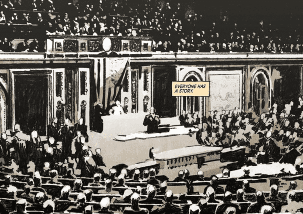
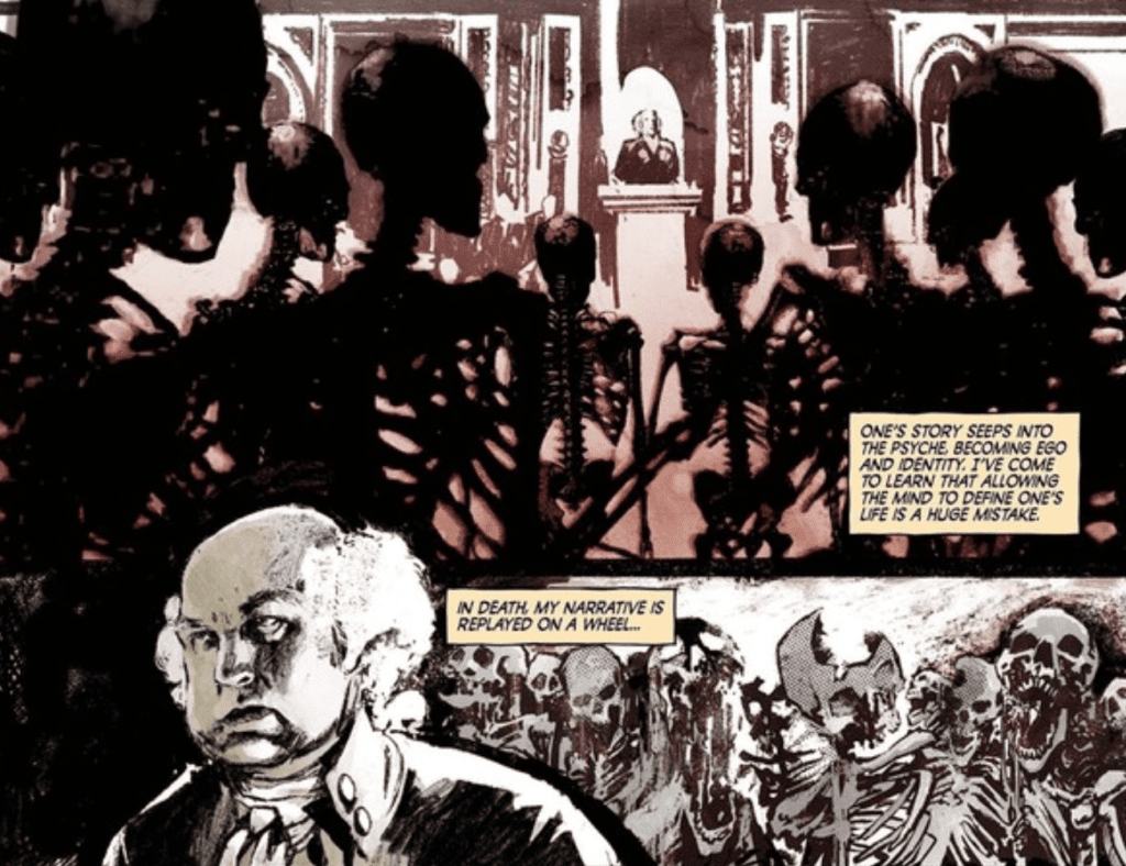
Killadelphia #11 is some gorgeous work from Jason Shawn Alexander. The series is lucky to have him. Alexander’s work has made every issue an absolute joy to read, and Killadelphia #11 is some of his best work in the series. His faces are realistic and expressive as always, and this issue features some unconventional paneling and a full-page splash that allows Alexander to shine. It makes you feel fortunate to be a reader. The issue also features some macabre art that is immensely creepy and disturbing. I hope to see more of this in future issues because the macabre art can make the series even more horrifying.

Luis NCT provides astounding coloring in Killadelphia #11. He makes heaven feel like heaven, and purgatory feel like purgatory. The sepia tones he uses for flashbacks make them easily recognizable as past events, and I don’t know anyone who does bloodshed better. NCT’s work heavily enhances Alexander’s art and causes both the violent and dialogue-heavy scenes to have more impact.

Marshall Dillon’s lettering in Killadelphia #11 has substantial effects on the tone of scenes. For example, the issue features an ultra-violent sequence, but one character has an internal monologue told through captions as that is happening. The sound effects that result from the violence are placed behind the characters involved when most modern comic books would put them in front. This choice causes the lettering to have less impact and helps direct the reader’s attention to the character the captions want the reader to focus on. This makes the transition to a flashback later in the issue easier.
Killadelphia #11 is another breathtaking installment of the series that is sure to become a classic. Alexander’s brilliant art and NCT’s coloring complement Barnes’ fun mix of vampires and historical fiction, and Dillon’s lettering polishes it all. I can’t wait to see where this series will go, especially after this issue took such an unexpected turn.

