John Constantine: Hellblazer should never have been canceled.
The book is one of the strongest series to ever come out of DC Comics this century (2000-2020). Its conclusion, with issue #12, cements that fact. Writer Simon Spurrier, artist Aaron Campbell, colorist Jordie Bellaire, and letterer Aditya Bidikar somehow take a series, cut down in its prime, and whittle all of their plans down to one magnificent final issue. DC Comics John Constantine: Hellblazer began as a slow trudge towards its ending, with each new development carefully teased out. This creative team isn’t scared to break the mold and get the wheels moving in order to bring us a finale that truly delivers.
Writing
There are some obvious downsides to Hellblazer‘s premature cancellation. Spurrier finds himself in the unhappy place of having to move the plot very far, very quickly. That’s nearly impossible to do without being over-explanatory and heavy on the exposition—something Spurrier typically avoids artfully. Hellblazer #12 is, in fact, very expositional. Constantine spends much of the issue describing what’s going on as it happens. But Spurrier doesn’t allow it to feel like he’s preaching at us. The book still feels natural.
That’s because Spurrier never loses John’s voice in all this. Every moment of explanation is written as a kind of “Damn, the poor sod has no clue what I’ve got him into.” The tragedy that is John Constantine is heightened by each confession of what’s really going on. So, despite Spurrier’s captions being essentially a narration of events, they’re not only necessary, they’re brilliantly executed. The reader never feels talked down to. And Spurrier has created enough of a cryptic and subtle plot that John’s explanations are important to hear. This shouldn’t have been possible. But Spurrier condensed what may have been months and months of plans down into one fantastic script, without sacrificing any of this series’ quality.

Art
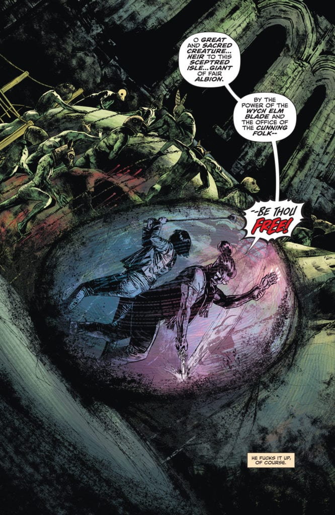
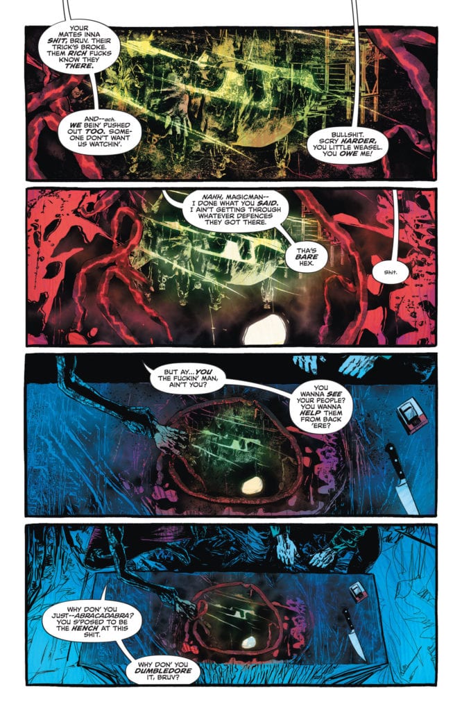
So much of Campbell’s art in this chapter focuses almost claustrophobically on John. Occasionally we see K-Mag, Noah, and the others, but there’s an artistic jostling of these characters. It’s as though Constantine, himself, is pushing them off to the sidelines. After K-Mag has been scrying, it’s not long before Constantine has taken over, pushing K-Mag out of the way. And while Tommy and Nat are busy dealing with their own fight elsewhere, Campbell sets up the conflict and then keeps us from the action. Instead, we see Constantine trying to put a stop to it from miles away.
The only other character that gets quite the same amount of attention from Campbell is, well, John Constantine. This Constantine being the older version. Campbell makes two things clear with this: this is the showdown we’ve been waiting for, and Constantine is too scared to get attached. It’s as though John can only look at his enemy or stay focused on himself because he knows there’s going to be collateral damage. He doesn’t want to have to face those getting caught in the crossfire.
Coloring
Bellaire begins our journey, back where she left us. In the same rotting cesspool of green where the last issue finished. But soon, we’re back with John, miles away. Bellaire colors John’s scenes in a bluish haze. Except for a few vibrant moments, even the blood in these scenes looks dull. Bellaire’s coloring works in tangent with Campbell’s art. It’s a window into John’s soul. He can’t allow the true nature of what he’s doing to sink in, so he keeps everything at arm’s length. The blood, which he’s covered in up to his elbows, blends in with the rest of the scene because John won’t allow himself to think about it.
Later, when John Constantine, the older, gives our own Constantine a call, Bellaire highlights the difference between them. In a nine-panel grid, set up by Campbell, Bellaire shows the human colors of John Sr. along the diagonal. The older Constantine actually looks human; his flesh looks fleshy, while the younger Constantine is still blue and distant. This is John’s worst nightmare. A version of himself that lets his guard down and experiences everything around him, no matter how horrific.

Lettering
Bidikar shows Constantine’s own discomfort with each new revelation. John Constantine is typically a very confident man, but this issue shows he may be in over his head. As the issue progresses, we see the difference between John’s confidence and his fear through Bidikar’s text boxes. Most of John’s narration is easy to see. Bidikar places these captions in orange text boxes that stand out. But occasionally, John seems a little like he doesn’t want to be telling us his thoughts. He talks about why he came back to K-Mag, admitting that he’s got no other options, and the narration is placed outside of a text box. It’s just lettering up against the art. It feels less confident and almost as Constantine wants us as readers to miss this bit.
Bidikar does this several times throughout the issue. It’s the moments when John loses his confident tone. “Bugger. All” is a prime example of his panic setting in. But it’s also the important moments of John letting his guard down for a second. Bidikar brilliantly highlights these moments by not highlighting them. The captions stand out because they’re trying to blend in with the page. It’s a brilliant step into the mind of the character. John Constantine is exactly the kind of man who would mutter the world’s truths under his breath.
DC Comics’ John Constantine: Hellblazer #12 has no right being this good. It’s too many brilliant stories, smooshed into one issue, with incredible grace. Spurrier, Campbell, Bellaire, and Bidikar have created a beautiful finale, against incredible odds. This issue may deliver, but it only makes it harder to say goodbye to this series and leaves one wondering what could have been. Pick up John Constantine: Hellblazer #12, out from DC Comics on the 24th of November, from a comic shop near you!

