HELLFIGHTER QUIN #2, available from Mad Cave Studios on June 10th, follows Quin through the first round of the tribunal. Every combatant wants the orbs power to defend their clan, and Quin forms an alliance to get it. Deadeye and Glass Assassin join the fight in an issue packed with fighting action.
Cover Art
Atagun Ilhan’s cover is coming at you with a dynamic action pose for Glass Assassin and Deadeye. There’s a risk using a solid blue background that you wind up with too much negative space. But Ilhan mitigates that problem by filling the voids with arrows and the characters’ limbs in forced perspective. It’s an exciting cover.
Writing
Jay Sandlin brings the competing warriors together to form an alliance in an “enemy of my enemy is my friend” scenario. The fellowship’s formation didn’t feel forced or rushed, and Quin goes along with his allies with enough awkwardness to make it feel believable.
There’s a lot of new pieces of information introduced in this issue, and despite it only being #2, the story doesn’t overload you with too many labels or jargon or context. Sandlin’s world-building feels very smooth and organic. I could follow the story and take in new bits and pieces about this world easily. The reader shouldn’t need to take notes to keep track of what’s going on, so Sandlin succeeds here.
Pencils/Inks
Atagun Ilhan drew the interiors as well as the cover, so the artwork is consistent, inside and out. There’s a lot of fight scenes in this issue, as you would expect for a battle tournament. Ilhan adds in plenty of violence without getting gratuitous. Every character looks like they’re constantly in motion to give the issue a rapid pace. This is a high energy issue.
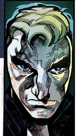
The one area that doesn’t quite work in Ilhan’s art is the detail, especially with faces. On several panels, the faces look warped and ill-defined. This could have been a result of rushing due to lack of time, but the result is sub-par. For future issues, more attention is needed to getting details in the faces proportioned correctly, consistent and cleaned up.

Colors
Maria Santaolalla has a difficult task. Almost the entirety of this issue takes place in an underground labyrinth. Effectively, stone walls and darkness. Sanataolalla used a fairly wide spectrum of blues to maintain the sense of darkness while still giving illumination on the visual interest points in the background to give you something to look at. When blood flows, Santaolalla makes the reds pop without looking fake or out of place.
Combined with the critique about Ilhan’s work on the faces, the skin tones from Santaolalla are equally off. In several panels, the faces appear to be two-tone. It looks like it was an attempt to imply deep shadow, but the result looks more like the characters are wearing caked mud.

Lettering
Justin Birch’s lettering is the most exemplary art of the entire book. Birch’s choice of reverse-bolding with white letters contrasts well against the largely dark panels. The pop of red in the word box background anchors the continuity of Quin’s inner monologue all the way through the issue, and the red is a nice touch to pair with the gore of the situation.
Conclusion
HELLFIGHTER QUINN #2, available from Mad Cave Studios on June 10th, packs a ton of action and world-building into a brisk 21 pages. It’s easy reading with lots of visual interest. If the art team tightens up the minor issues with faces, this will be a very enjoyable series.
Author’s Note: Local Comic Shops (LCS) are going through a tough time right now with the pandemic outbreak of COVID-19. Comics fans of every flavor that care about his or her LCS should try to do what they can. So, here’s my part:
If you’re in Northern Delaware, South East Pennsylvania, or Southern New Jersey area, please take a moment to visit Captain Blue Hen Comics in Newark, DE. Say ‘hi,’ pick up a book, order a book (they’re on Comichub.com), and let them know you support them.
If you’re nowhere near that area, please find YOUR LCS using Comic Shop Locator and lend your support.
Thanks, and stay safe.

