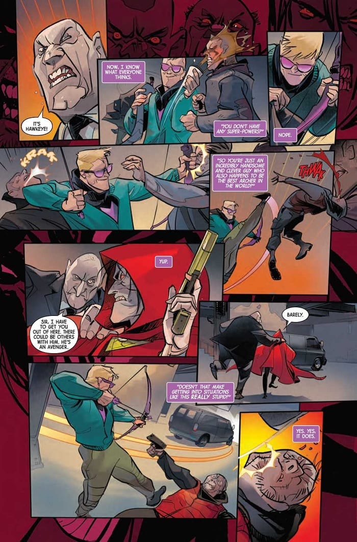
Somebody’s wearing Clint’s clothes in Hawkeye: Freefall #1, out this week from Marvel Comics. No, not his hawkeye costume; rather, someone’s lurking in the New York underbelly in his old Ronin outfit. The titular archer has his hands full with trying to clear his name and save the day in this engaging new title.

The Writing
The writing by Matthew Rosenberg is snappy and well-paced throughout Hawkeye: Freefall #1. We have Clint serving as a narrator to externalize his own internal monologue throughout the book. While this could easily grow dull and exposition-heavy, Rosenberg manages to avoid those pitfalls and keep the reader’s attention.
The book manages to engage the reader with a fun tone and well-pointed dialogue. Clint is likable and fresh, narrating the book with sarcasm and personable wit. Even for those who aren’t regular readers of the character, this book offers plenty of charm to win one over.
From a thematic standpoint, there is some light social commentary about wealth polarization and its relationship to criminal justice in Hawkeye: Freefall #1. The theme is well-keeled, delivering Rosenberg’s point while never feeling too heavy-handed. It’s always nice to see these themes appear, and specifically, to see them handled well.
Although this is a Hawkeye book, a few other familiar heroes turn up, too. While their presence doesn’t add too much to the story, they provide some good banter and back-and-forth with Clint. As the series progresses, it will be interesting to see how this group dynamic plays out.
Overall, Rosenberg’s work is very engaging. The final pages of the book provide enough of a hook to keep readers coming back for the next issue.

 The Artwork
Artist Otto Schmidt’s character designs in Hawkeye: Freefall #1 are sleek. They are simultaneously refined, yet just a little sketchy. The angular designs can make the work feel a little stiff at some points, but overall, the style works well alongside the action.
Speaking of dynamism, the page payouts vary widely throughout the book. It hits the story beats effectively, but can be a bit overwhelming at times. There are some points at which it’s not immediately clear where the artist want to focus the reader’s eye.
Schmidt is very selective about the level of detail employed in the book. The backgrounds feel more fleshed-out and grounded in the slower, quieter moments. He lets the environment fall away, though, during the more kinetic action sequences. The viewer’s attention is focused primarily on the characters, which works well for a story that tends to be so character-driven.
That said, many of the backgrounds throughout Hawkeye: Freefall #1 tend to be on the duller side. We have lots of gradient colors, with little actual scenery. While the coloring is admittedly skilled, it’s not the most exciting presentation. While it may sound a little contradictory regarding the above comments about the art feeling overwhelming at times, it would be nice to get a little more detail in the world of the book.

Final Thoughts
Hawkeye: Freefall #1 is an intriguing new series. Fans of the character and newcomers alike should both find plenty here worth reading.

