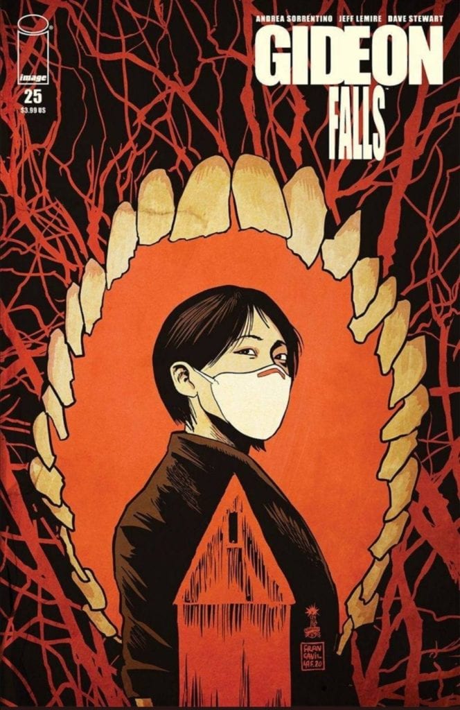
Written by Jeff Lemire, with art by Andrea Sorrentino, colors by Dave Stewart, and letters by Steve Wands, Image Comics’ Gideon Falls #25 gets ready for the end by going all the way back to the beginning. Opening with a twisted creation myth, this issue gets you freaked out about the whole concept of evil. It begins to answer some questions we didn’t know we had and leaves all the most tantalizing answers to the final two issues.
Writing
It’s pretty difficult to talk about Lemire’s writing in this issue. Hell, this whole series is something that pretty much evades description. We’ve followed an undefinable demon from world to world in a multiverse. Yet, somehow, Lemire manages to take a step even further back and get even more ethereal. Lemire talks about creation and evil’s place in the multiverse. His mythology is so enticing; it’s hard to fault. But Lemire risks losing some of the humanity in this chapter. We begin to realize that so much of the last few issues have focused on the undefinable bad guy that’s tracking down the characters, that we don’t know the main characters as well as we once did.
Lemire has crafted a beautifully mysterious story. With time travel and multiverses, we are constantly guessing at what’s really happening. The only downside to this is it sometimes makes the story feel impersonal. The stakes get a little too big to really be processed. But as this issue comes to a close, Lemire brings us back to the true stakes at play. The people. Angela meets with someone after the chaos of her getaway. The man she finds looks unsurprised by what she’s just witnessed. “If you tell me I told him this would happen, I’m going to punch you in the face,” she says. We get back to humanity here. We’re no longer talking about multiverses and time travel, but about how all this makes Angela feel. In a dimly lit room, with five characters in close quarters trying to save the world, Lemire promises to get back to the intimate story he’s been telling all along.

Art
Sorrentino’s art has been breathtaking all along. In the opening moments of the issue, Sorrentino’s splash pages depicting the multiverse prove he’s an even better artist than we thought possible. And later, as the Bishop and Angela fight their way to safety, the page mimics the chaos. As the Smiling Man’s minions surround them, Sorrentino makes it, so their panels are surrounded too. He places panels haphazardly onto the page, looking as desperate as Angela and the Bishop. And in the background of the panels, we see more smiling people, their jaws gaping wide. Then, as they seem to be lost in the danger, Sorrentino changes the page structure again. Each panel becomes a circle within another circle, getting closer to the danger. Angela feels like she is getting pulled into the chaos, torn between running and trying to help, and the page feels like a vortex.
Coloring
Stewart shows us what it means to have evil in the world. On the first few pages, we see reality as it should be, without evil getting in the way. Stewart colors the page beautifully. The multiverse looks vibrant and full of life. But when the black of evil begins to ooze its way in, the color scheme changes drastically. First, we get reds and blacks to show evil’s influence, but then Stewart changes most of the page to black and white. There are spheres of color around each multiverse, but they’re held back. So when Stewart brings us back to Gideon Falls, we notice the lack of color. We get reds, greys, browns, and blacks, but nothing else. We’re seeing the effects of evil taking over, and it’s draining existence.

Lettering
Wands makes it so that the discussion of evil leaking into reality is something we see in every aspect. First, we see text boxes talking about the light and the dark. The text boxes talking about the light, the good, are white with a clear outline. The boxes that talk about the dark, the evil, are in black boxes that have tendrils reaching out. With these text boxes, Wands shows us evil’s hunger. And when we finally hit reality, the difference between the Times New Roman style font of the creation narrative and the scratchy pencil-like lettering for character dialogue is really noticeable. It makes it feel as though these characters are scrappy and like reality is no longer as simple as it was at creation. It has become messy, and the lines are less clear.
Image Comics’ Gideon Falls #25 is not just interested in scaring you; it’s interested in the nature of fear itself. This creative team ties the spreading reign of the Smiling Man to evil’s need to consume. Adding this mythological element to the character makes him scarier than ever, which should have been impossible. If you want some great thrills and chills, pick up Gideon Falls #25, out from Image Comics Wednesday, September 22nd, at a comic shop near you!

