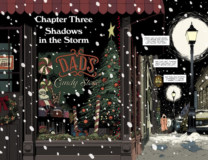
In Brubaker’s letter section, aptly named “Thank God It’s Friday,” he spends some time talking about the behind the scenes of this particular issue. The major takeaway is that the end of Friday #3 was meant to be the end to Friday #1. But then the characters took over. It’s clear that writer Ed Brubaker, artist and letterer Marcos Martin, and colorist Muntsa Vicente are just getting started.
Writing
It takes guts to let go of the reigns. When Brubaker describes his original plans for Friday #1, one can picture what he’s talking about. A tight script with a cliffhanger ending. Brubaker is good at those. But instead, Brubaker let his characters tell the story. Kings Hill and all of its charming occupants took us the long way round. In this chapter, things begin to feel faster. Friday has always seemed a little awkward. We can see how she feels out of place, like she’s too big for Kings Hill. Now, we see her beginning to feel at peace. She starts to see that growing up isn’t about getting too big for some things, it’s about being at peace with never outgrowing your home. It’s a beautiful development for the character, which Brubaker punctuates with a complication. As Friday crouches in the snow, her life goes up in flames around her. And maybe, just maybe, that brief moment of peace only made things feel worse. It’s a heartbreaking moment that was beautifully led up to by all of us taking the long road.

Art
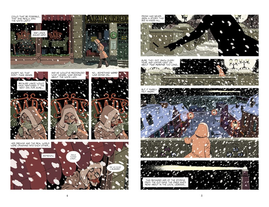
This is a pretty emotional issue. But Martin achieves that by playing down the emotions on the page. Friday is a rather stoic character. She has a tough exterior. She doesn’t smile much, but she doesn’t look melancholy either. Most of the time, Friday looks concentrated. Her brow is knit, her eyes are focused. So when she grins, even slightly, it’s huge. There’s a fantastic moment on one of the pages where Martin has three panels of Friday’s face, side-by-side. The first is covered in shadows, but what we can see of her face makes her look a little sad. Then, we see her smile, just a little. “And feeling like herself for the first time since the summer,” the words say above her. In the final image in that row, she’s frowning. “Being a person was so stupid and frustrating sometimes,” the next panel says. It’s a beautiful moment. The very fact that something made Friday smile is what makes her sad. This small, innocuous row of images shows the emotional depth of the writing and art. It shows us that these characters are complex. So complex, they even confuse and infuriate themselves.
Coloring
Vicente’s coloring is downright intriguing in this issue. In the last issue, Vicente used the color yellow to show Friday’s childishness. When we first met her, she was in a big yellow sweater, and as she grew up we saw her in less and less yellow. It’s telling, then, that when Friday goes to visit Lancelot Jones, his room’s light looks yellow through the window. Lancelot represents, to Friday, her childhood. He was her childhood friend and partner. It’s because of him that she seems to feel guilty about growing up. As she goes back out into the night, the colors of adulthood take over. The cool blues and dark purples of the forest. But then, we get one last dazzling show of yellow. Vicente colors one fateful scene almost entirely in yellow. It feels like the bright, dying moments of her childhood as Friday sits, heartbreakingly aware that she is undoubtedly an adult now.

Lettering
Martin’s letters are just as much a work of art as his pencils. Sound effects are worked into the artwork seamlessly, often splashing across the background of a panel, with the cause of the noise in the foreground. Martin gives us a sense of how a character is feeling by the size of their dialogue. Friday yells at Lancelot’s window. When he doesn’t answer she says “God damn it,” in small letters. It’s under her breath and full of rage. She talks to herself often, actually. When she looks for a sled in a dark shed “… Tell me they didn’t get rid of… no…” she says quietly. She follows up with “There you are,” in big letters. This isn’t a comic you think about reading, it’s a comic you just read. You hear every moment in your head, never thinking twice about how it would sound. Martin masterfully leads readers through this issue.
This is just the end of the first arc for Friday. Hell, it was supposed to be the end of the first issue. But that means that we have lots to look forward to. This creative team continues to do beautiful work. Get your copy of Friday #3 at Panel Syndicate. This fantastic site lets you pay what you want for each issue. If you can spare a few dollars, please do! That way we can keep reading this wonderful series for a very, very long time.

