Defenders #4 is out December 15th, and serves as the most attention-gripping issue of this remarkable Marvel mini-series. Why? Because it delves into the very essence of comic books in terms of ideas and art. Mainstream superhero comics have a reputation of resisting change; but maybe looking at how this issue deconstructs the central elements of the Marvel Universe can inspire new ideas.
Background
The ragtag group of Defenders are chasing rogue scientist Cario Zota through previous Marvel multiverses. After a close encounter with primordial magic, they come upon a bizarre world.
Defenders #4 On Comic Patterns
Writer Al Ewing has a lot to say about comic books in this issue. Through the POV character, Cloud, readers witness comics’ foundations in the Fourth Cosmos. There’s something so appealing about experiencing the abstract caricatures that represent modern Marvels. These archetypes comment on the central ideas surrounding Marvel’s most popular characters and how they interact in the main Marvel universe. Co-plotter Javier Rodriguez makes this extremely relevant with a spread that evokes similarities to Marvel’s Civil War promotional material. For all of the eye-catching character designs, they feel secondary to the nostalgic tone that Rodriguez is creating. Which goes into a Defenders #4 theme about patterns and how they can limit expression.

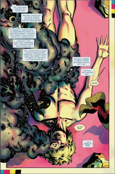
Cloud’s character development via pattern recognition serves as a highlight. After many issues of just being a background element, this underutilized character finds a way to express themselves. Cloud shifting their appearance into a new form feels hopeful; the way they interact with the Fourth Cosmos feels like inspiration, enlightenment, and a coming out moment all at once.
Art’s Not Just Patterns
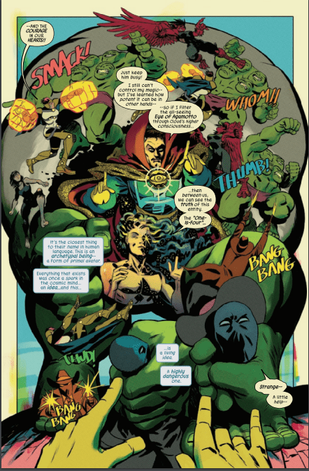
 Rodriguez’s larger-than-life art is so complex it’s mesmerizing. The way most of Defenders #4 has a pale yellow background evokes the nostalgia of aged comic books. There are also instances where panel layouts get so abstract, it feels like perspectives are warping. Take for example the Defenders fight against the Hulk Archetype “One-Is-Four.” The reader gets a genuine feeling of how much of an immovable wall he is with how characters transition across the page. Readers could be so used to reading comics a certain way that instances like this inspire the idea of The Fine Art of Comics.
Joe Caramagna’s lettering also assists in this surreal setting. The way “Four-As-One” speaks in colors adds a sense of minimalism. Even as the archetypes start speaking in full words, the multiple colored words showcase the archetypes’ inability to speak in full sentences. The simpler fragments they utter make them feel primitively alien.
Defenders #4 Goes Beyond Perspective
Defenders #4 is so far the best issue of this entire mini-series. After so many developments, this issue’s absurd art doesn’t just keep attention, it gives new perspectives. Readers are guaranteed to walk away with more of an appreciation for the craft of comic books. This awe-inspiring story is perfect for readers who feel like they’re experiencing superhero burnout.

