Captain America #22, published by Marvel Comics this week, is the third part in the “All Die Young” arc and features Captain America fighting Selene from the Power Elite for a fragment of Sharon Carter’s soul. The epic battle comprises most of the issue and builds up to a stunning conclusion.

About the book:
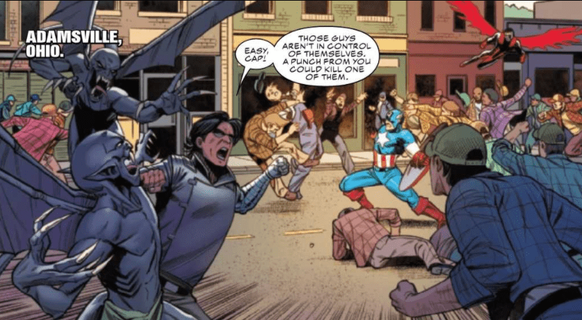
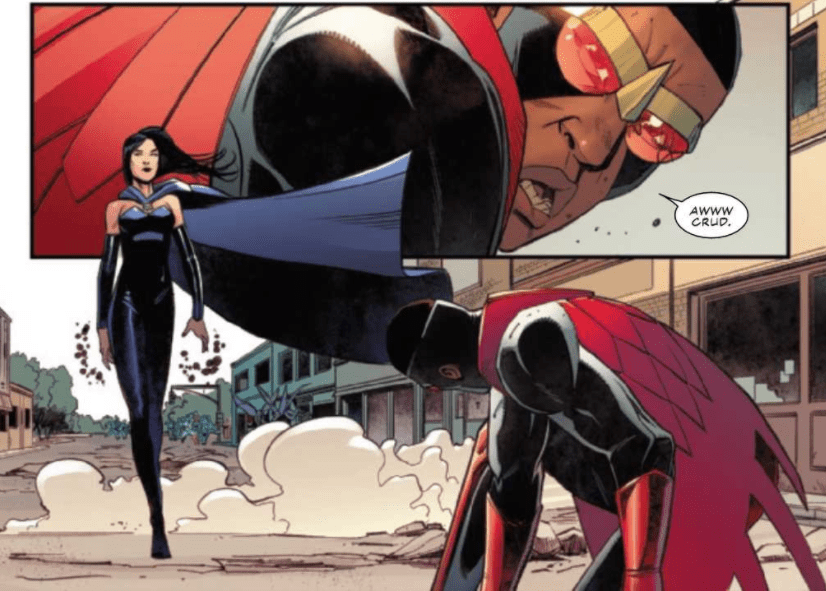
A new threat called the Power Elite framed and imprisoned Steve Rogers for the murder of Thunderbolt Ross. He was later freed by Sharon Carter and the Daughters of Liberty. After finding out that Selene from the Power Elite stole a bit of Sharon Carter’s soul, Captain America, along with Falcon and the Winter Soldier, went undercover in the town of Adamsville, Ohio, where Selene is currently based. Eventually, Captain America and his allies broke their cover to stop Selene. She, in turn, dropped her own disguise and set a mob of controlled men against them…
With writing by Ta-Nehisi Coates, art by Bob Quinn, colors by Matt Milla, and lettering by VC’s Joe Caramagna, Captain America #22 is built to be a thrilling, action-packed issue. The battle between Selene and Captain America’s team has begun by the time we start the issue, so we have an entire comic to enjoy the epic battle.
Captain America #22 Story
Captain America #22 is split between two main scenes: one where Captain America is fighting Selene, and another where Sharon Carter is talking with Thunderbolt Ross and colleagues of hers. The issue changes back and forth between these two settings multiple times, and Coates uses captions to further the sense that these scenes are happening concurrently. Dialogue from a previous scene will overlap actions happening in another, which helps the reader to understand that these scenes are occurring at the same time and not one after another. Time is important because characters in one scene only have a small space to act, and captions are an incredibly effective way to drive this point across.

This issue of Captain America focused mainly on action, which allowed for some stunning art, but the story lacked slightly in substance. While the arc itself may be an exciting story, this particular issue seemed to do little more than build up to a reveal that will have consequences in the following issues. The reveal itself was exciting and motivates the reader to continue following the arc, but the rest of the comic seemed somewhat dull.
Art
The art of Quinn allows the story to flow easily and also provides incredibly expressive characters. The forms are always dynamic, creating some profoundly stunning action scenes. Much of the issue focused on the battle between Captain America and his crew against Selene and her controlled goons, so the fantastic work of Quinn stood out.
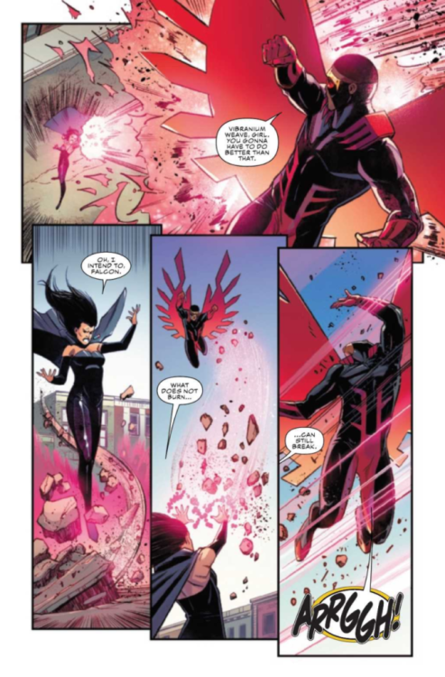
Milla’s use of color in Captain America #22 adds much to the issue. Many explosions, costumes, and backgrounds are quite striking. An interesting aspect of the coloring appeared in some action panels, where a background was omitted so that the reader could easily focus on those fighting. Milla chose bright background colors for these panels that did not match any of the items in the setting. By doing this, not only does it give energy to these combat-focused-panels, but it also provides a stark contrast to the main focus of the panel. This causes the characters to pop out even more than they would have with just a plain, single-colored background.

Captain America #22 was lettered by Caramagna, who does a spectacular job; the dialogue goes along with the flow of the story. The most interesting technique done by Caramagna in this issue was to have words expand past the borders of their word bubble. This was done whenever a character was screaming in agony and was incredibly effective. The words exceeding the space in the balloon gives the impression that the noise made was both loud and difficult to contain. This makes sense because this technique was used only when characters made an involuntary shriek of pain.
Conclusion
Captain America #22 is a beautifully put together issue that lacks slightly in terms of story. It is much stronger when looking at it as a piece of the arc being told, but standing alone isn’t very substantial in terms of story. However, the art of Quinn and colors of Milla more than makes up for any lack in story, and certainly make the issue worth purchasing, especially if you have been following along with the arc. It would be difficult to read this issue and not be excited about what is to come, and the ending is sure to excite many readers.

