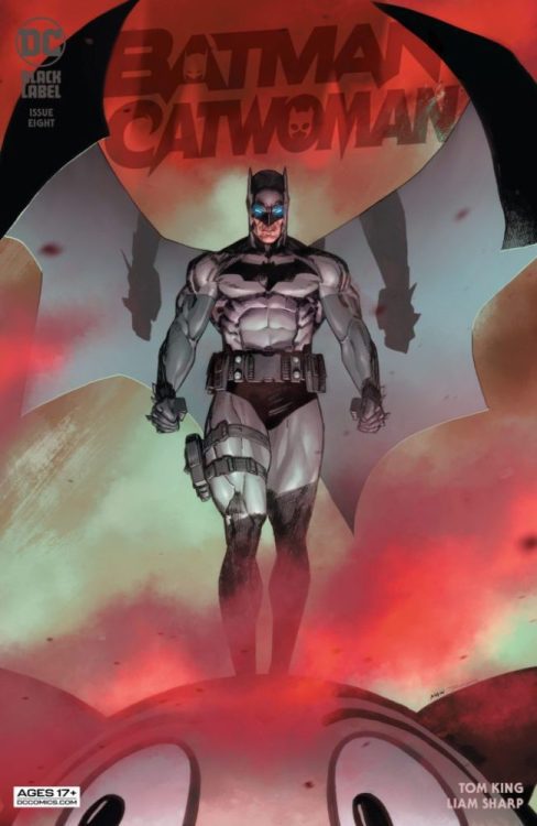
When DC Comics’ Batman/Catwoman began, it was a love story, with some dark undertones. Now, Batman/Catwoman #8 verges on being outright horror. Writer Tom King, artist and colorist Liam Sharp, and letterer Clayton Cowles take us down a dark new path in this chapter. It’s riveting and terrifying.
Writing
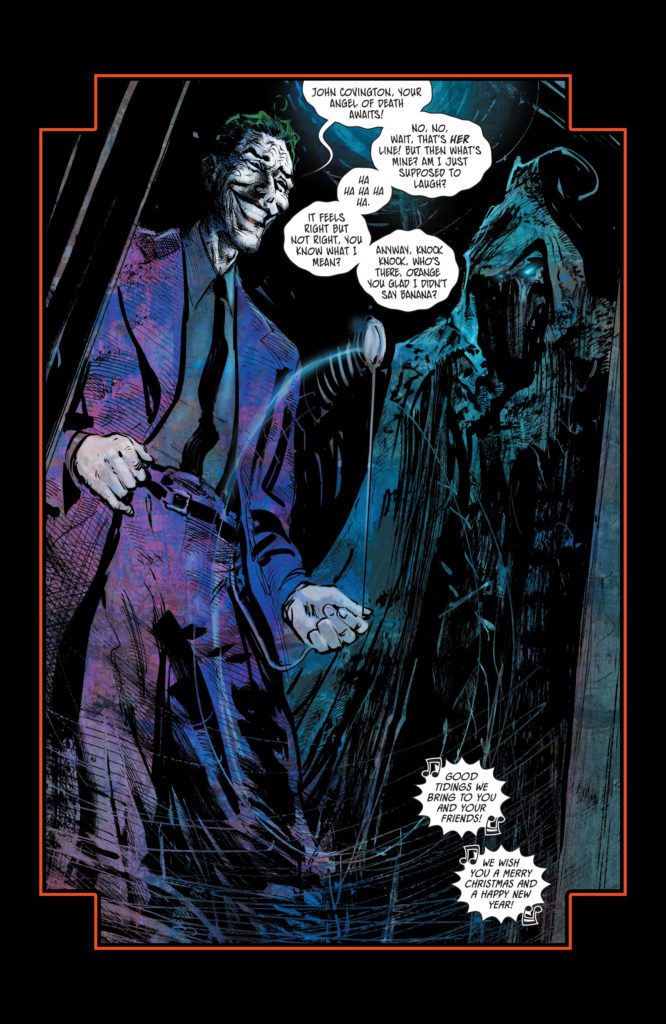
A lot of King’s writing changes in this issue. We aren’t dealing with the happy couple from issue one. But what’s even more unnerving about this issue, is how much of King’s style stays intact. The same nonchalance we’ve seen Selina have in previous issues is still on full display. Only now, she’s surrounded by dead bodies and murderers. The Joker is just as giggly, his punchlines are just far more gruesome. It’s the laid back attitude of some of the characters, in the face of great darkness, that actually deepens the horror of what’s happening. When Selina yawns as Batman tries to save someone, it’s disturbing. King leans into the more terrifying corners of this story by holding onto the levity of these characters.

Art
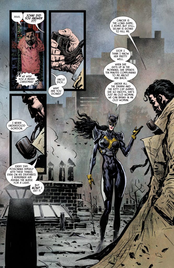
Sharp’s artwork is just as much of an uncomfortable mix of the light and dark. Sharp wants us to question these characters and this world, by switching up his style mid-page. In one scene, we see Selina and the Joker talking. The Joker is a twisted cartoon character. When he and Selina laugh at something, their faces are about as detailed as a character from Peanuts. As the scene continues, the Joker stays that way. The linework on his face is simplified, the colors are exaggerated. But soon, Selina looks fleshed out. Her face is almost three dimensional, full of detail and realism. Sharp joyfully jumps back and forth between these styles, from panel to panel. He captures the complex nature of this story in this scene. It’s a tug-of-war of themes. Batman is a gritty realist, Joker is a cartoon monster, and Catwoman is stuck in between.
Coloring
Sharp gets us back to the color coding we’ve seen in this story. Scenes from different timelines have different hues. That way, when we read the story, we can tell when each event is happening at a glance. But Sharp takes it a step further, deliberately muddying some of the lines between each scene. The grey of a future scene blends into the grey tones of a scene from the past. Sharp is pointing out the common threads of these characters’ lives. He’s pointing to the repetition of what they do, the endless cycle of violence and mayhem. Batman and Catwoman are just small players in a never-ending struggle against evil.

Lettering
Cowles lettering is filled with a simple and effective flair. The Joker’s warped font and word balloons lend him an unearthly tone. The small “shake shake shake” noise of a boy lifting a Christmas present is understated, showing the quietness of the noise. Cowles keeps these details in mind. But on one page, Cowles isn’t trying to show us what the dialogue sounds like, he’s showing us something else. While Batman and Catwoman are fighting, they each stand on either side of the page. They have a lot to say, but their word balloons steer clear of each other. It’s a small thing, but with it Cowles shows the widening distance between these characters.
DC Comics’ Batman/Catwoman #8 is wild. It’s a patchwork of different styles, both visually and tonally. But it captures the complex nature of this story beautifully. This creative team is taking their gloves off to take us to dark new places. Pick up your copy of Batman/Catwoman #8, out from DC Comics October 19th, at a comic shop near you!


