

Batman #2 from writer Matt Fraction, artist Jorge Jiménez, colorist Tomeu Morey, and letterer Clayton Cowles is an incredibly refreshing, heartwarming take on the relationship between Batman and his Robins. While they’re crimefighters by night, it’s easy to see that they’re also a family, and that Bruce Wayne is a father. This creative team works together to highlight that in a very sweet way that’s sure to pull you in (if the first issue hadn’t already).
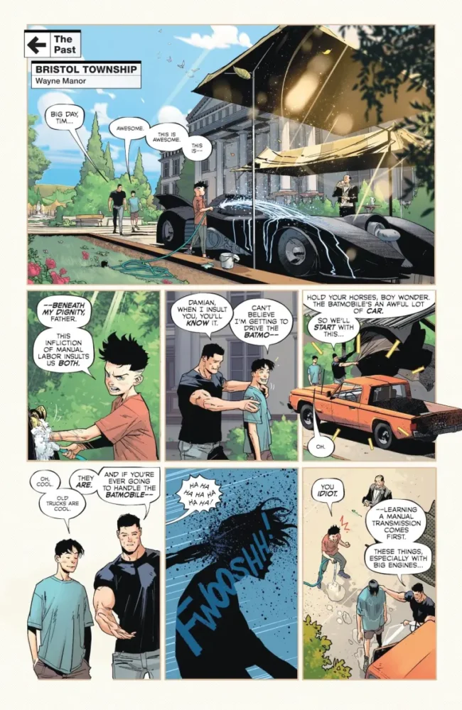
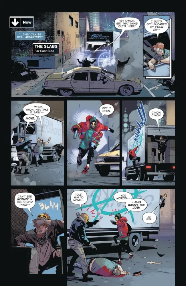
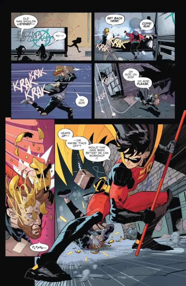
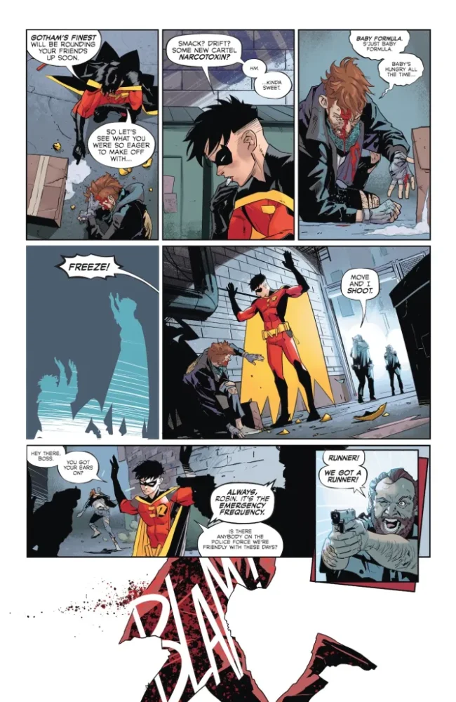
The issue starts with a flashback of Bruce Wayne teaching Tim Drake how to drive a stickshift at Wayne Manor. Tim struggles, and Damian Wayne is constantly making fun of him for it. We return to the present where Tim stops an armed robbery, but is then shot by police officers and is arrested. Alone in a truck full of criminals with grudges, he’s forced to fight to survive.
WRITING
Fraction does something really smart here by fusing the way he tells the story with the main themes present. He tells the story in a mostly linear way, but with flashbacks sprinkled throughout, showing Bruce in a simpler, mostly tech-free environment. In the present, both Bruce and Tim have various gadgets that they use to help them throughout the issue. It’s a fun contrast. It feels like Fraction is sort of trying to fuse the older toyetic nature of Batman with a new way of thinking for the character. The issue also tells you that you can keep trying for something in really simple ways, but it won’t click until you’re really put to the test. It’s a very heartwarming message. It feels like the most politically topical the character has been in ages. He’s clearly against police brutality and for reform, and often uses violence as a last resort. While this isn’t necessarily a peaceful Batman, he is for sure not to shy away from tough subjects like that, and it feels like a necessary thing for Fraction to address considering how many stories just skim over these topics.
ART
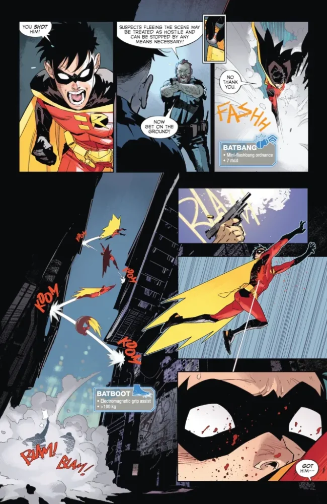
This issue features some of Jiménez’s best paneling work. From when Robin first appears in the issue up to when he gets shot, he’s essentially in full control of each panel he’s in. He stretches out of it, or is just the largest subject in frame. Right when he gets shot though, it’s a simple red background with a black silhouette of him falling with over half of the spread being completely black, boxing him in. Going the simplistic route on it was a great choice, as it sort of displays to us how Robin’s control is gone. Jiménez also gets really creative with the space when Robin is in that truck, having to fight off the other criminals. Robin obviously doesn’t have a whole lot of room to work with, so he’s kicking off the walls and things like that in order to properly attack. Whenever his foot lands on a wall, it lands on the side of whatever panel Jiménez has put the character in. It’s a really fun use of the character’s situation that Jiménez takes full advantage of.
COLORS
For the most part, the first chunk of the book is colored normally with everyone feeling very distinct. After Robin gets shot though, the entire background of the issue turns red with him as a dark silhouette, falling. Morey keeps this going for the majority of the issue. All of Robin in the truck isn’t quite as deep and flat of a red, but it’s still there, tinting everything. It feels like it’s worst when he gets shot, and he spends the rest of the issue recovering as the red slowly fades, showing that he’s getting better. Morey’s storytelling in this issue through color is really special like that. there’s another chunk as well where Batman enters the scene, and the second he does the colors once again return to a dark sky with yellow lights illuminating the city. Morey really excels at all the differentiation of the symbolic colors here.
LETTERS
This issue’s strongest lettering from Cowles come from the location and time cards. He does what he did in the last issue, highlighting every bat-gadget in fun ways with little boxes explaining what they are and what they do. He takes it a step further this time around though with the small boxes telling us where and when we are being incredibly personalized. They’re sort of designed like Gotham street signs. It seems like an average choice at first, but the goal of this run so far seems to be making Gotham feel just as alive as everything else. Cowles makes you feel like you’re a part of the city too, watching and influencing Batman as he does what he needs to do to protect it and us.
CONCLUSION
This issue is a wonderful entry in this new Batman run. In just two issues, this run has displayed more personality than other Batman works since The New 52. Every stylistic choice has amazing payoffs in the form of these incredible character moments that are defining this run early, making us all want to do and be better—to help those around us. This is a hopeful Batman who is intolerant to those that try to do what’s wrong in the face of helping others, and he’s paired with a Robin that’s willing to learn and grow. Batman is a crimefighter and detective at heart, but he’s still a father that has to prepare his children for the world ahead of them. This issue displays perfectly how he can do that in his own bat-way.