Writer Joe Casey and artist Dustin Nguyen craft a Gen-Z inspired modern superhero in “All-America Comix” #1. Along with Brad Simpson on colors and Russ Wooten’s letters, this one-shot unfortunately squanders its inspirational premise with a gross overuse of generational slang, social media cliches, and inconsistent visual work.
“Her last name is VASQUEZ! Her first name…says it all! And when confronted with the hidden secret of the universe, you won’t believe the cosmic truth she uncovers! Brought to you by the Wildcats Version 3.0 team of JOE CASEY and DUSTIN NGUYEN—reunited for the first time in fifteen years!”
Writing & Plot
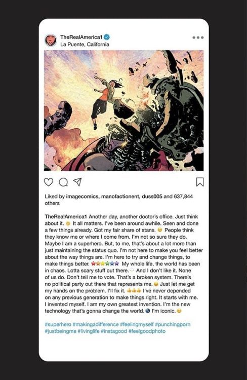
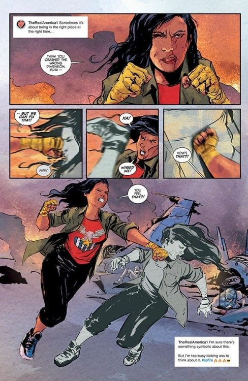
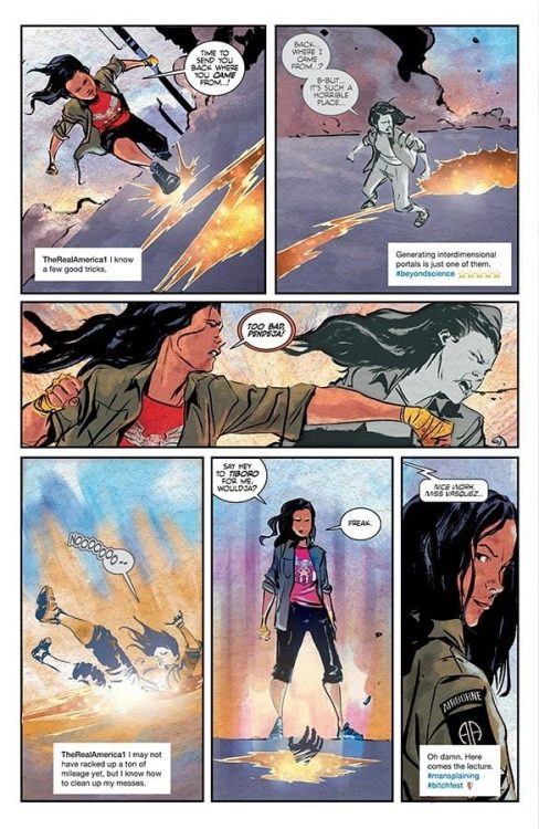
“All-America Comix” begins with a promising – if not cliched – premise. America Vasquez is a young superhero who has decided to reject the classical ideas of patriotism and heroism in favor of a more direct approach to change. This is a blatant and potentially effective appeal to the mentality of the politically frustrated youngest generation. Where this idea loses itself is in its application. As soon as the script starts dropping misused hashtags and contemporary slang, the story’s inspirational focus goes off the rails. The internal narration of this comic is delivered in panels designed like Instagram posts or tweets, hashtags included. While a unique idea, it ultimately undermines any narrative seriousness this comic tries to display and immediately dates the content. As noble a cause it may seem to appeal to the concerns of the current generation by utilizing their terms, it never comes out as anything other than cringey or patronizing when used by an older writer. Completely avoiding social media/slang culture and going specifically after the larger issues with a young protagonist is much more effective (see G. Willow Wilson’s Ms. Marvel). This issue attempts to go after some internal strife for America as well, such as the struggle for identity and purpose most go through at that age (that is amplified even more during these times), but the story doesn’t stick with the thread long enough to give it any meaning. Even well-intentioned misfires are still misfires.
Art Direction
As someone who’s usually a fan of Dustin Nguyen’s art, his work on “All-America Comix” #1 seems a little rushed and inconsistent. He has some great moments, specifically a couple of fight scenes, an interdimensional trip and a fight with a giant robot, but outside of these, the visuals look as though they were drawn just to be finished. The facial details for America’s emotional states are solidly drawn, but the rest of her features and animations are, again, inconsistent. Nguyen and colorist Brad Simpson really get a chance to shine with a lengthy (dialogue-free) sequence involving America falling through an interdimensional tear, and it’s full of inventive panel construction and an incredible array of color-usage. Outside of this sequence, Simpson’s colors carry most of the artistic weight through the issue. Russ Wooten’s lettering may be the single most impressive aspect of this comic. His dialogue balloons are full of an exaggerated take on the classic superhero comic font style, and also offer a wide range of changes based on context. The visual work overall is solid, but nothing to necessarily amaze.
Despite a great concept and the intention of actively appealing to the interests of the newest generation of young adult comic readers, “All-America Comix” #1 falters in its tacky script and lackluster visuals. There’s a message to be made here in regards to the writing: older writers should not attempt to utilize the slang and cultural terminology of younger generations. It never comes out properly, and it typically comes off as patronizing. This comic was apparently supposed to be a full series judging by its cliffhanger of an ending, but the unusual lack of quality from typically highly skilled creators may have killed this one in its crib.

