

Absolute Power #1 is an absolute powerhouse of an issue coming from writer Mark Waid, artist Dan Mora, colorist Alejandro Sánchez, and letterer Ariana Maher. It marks the first official issue in DC’s Summer event, and it doesn’t disappoint. It’s a high stakes rollercoaster that just doesn’t let up.
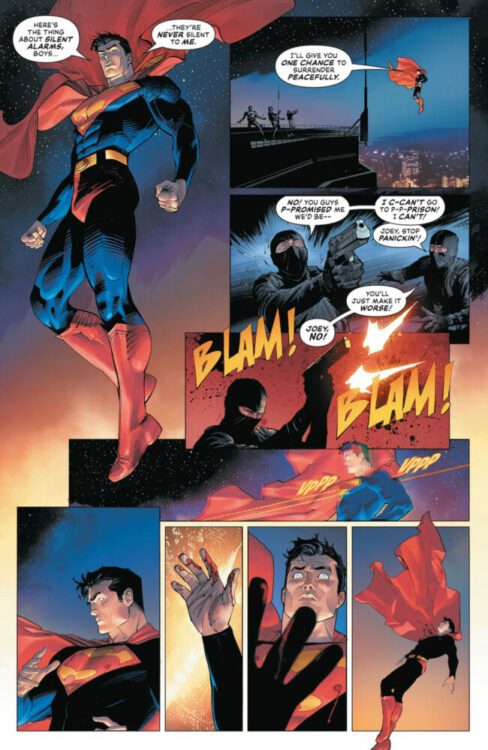
The issue begins with Superman being shot. He’s lost his powers, and he falls to the ground. Then, around the world, people are scared of heroes. Waller has created a false narrative, showing videos of the heroes of the world attacking the general public. People believed it, and are now trying to fight back against the heroes. Waller finally strikes, and that’s all only stage one of her plan. As previously teased, she also has an army of Amazo robots ready to go, one for each member of the disbanded Justice League. With the Brainiac Queen and Failsafe on her side, she’s seemingly unstoppable. She thinks she’s won, and that very well could be the case.
WRITING
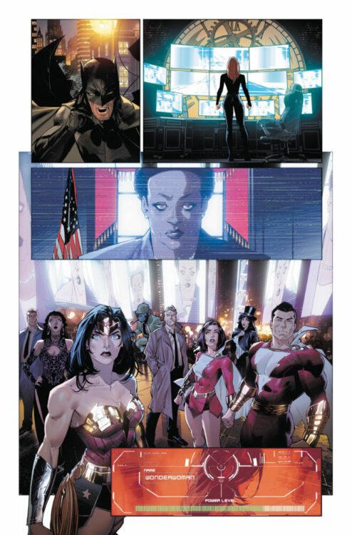
Mark Waid is in his element. He doesn’t waste any time with this one. He knows what has already set up, he knows what pieces are in play, and he showcases that excellently here. His control over this number of characters is impressive and he handles them all well. The only real characterization complaint is his otherwise flat Wonder Woman comparatively, but he himself has admitted to not having fully cracked her yet as a writer. She doesn’t say much, but she was also the character with the least amount of setup coming into the event. It just feels like she should be more important than she is here, like something is missing.
However, the issue truly does feel like it’s pushed forward by an evenly distributed ensemble. Most characters assist in damage control following the release of Waller’s fake videos, and Waid writes that with a sense of confusion and urgency that immediately makes you feel like all might already be lost. The biggest strength of the issue is Waid’s ability to display how hectic everything is—how the heroes should’ve seen this coming, but they didn’t. The pacing of the issue really highlights that. All the cuts to and from Waller and the heroes feel natural. Not only that, but once the Amazos are fully revealed the speed of the issue ramps up. The pot is overflowing, the bomb has gone off. No one can control what’s happening and the pacing reflects that. The stakes are known, and Waid does a fantastic job of making the reader just as worried as the heroes.
ART
Dan Mora is a different beast altogether in this. It’s arguably his best work so far. There’s so much detail to these characters, and a force to each one, in the sense that he perfectly captures the weight of a falling Superman, a panicked Batman, and a battle-ready Wonder Woman. There are a lot of characters in this issue, and each one feels three-dimensional. Mora doesn’t miss a beat. Each character feels like they have their own agency; not a single one really has the same mannerisms as another. For example, in a Justice League Dark group shot featuring Wonder Woman and a couple of members from the Shazam family, you can tell so much about each character’s personality and their reaction to these attacks simply from how Mora has drawn them standing.
Mora’s layouts are also exceptional. Every time we’re focused on the heroes, you feel almost boxed in. However, when you look at Waller and her crew, it’s all mostly closeups where the characters can hardly fit inside of the panel. The members of the Justice League feel trapped, and the tight spaces they’re displayed in really reflect that.
There’s specifically this great spread where the Amazos are revealed for the first time and the detail in those designs is breathtaking. They look like these sinister, robotic reflections of these powerful heroes, and they’re frightening. Not only that, but there are a few pages showing the heroes losing their powers and the amount of emotion Mora manages to fit into one panel in the form of so many different characters is astonishing. This is all without even mentioning Mora’s ability to create the pulse-pounding action of the issue. All the heroes are caught off guard with multiple explosions as they’re raided by the Amazo robots, and he shows them putting up a hell of a fight. It’s a short one though, as Waller has seemingly already won. Everyone has a stake in this, and Mora shows that beautifully with a somber sense of incoming dread.
COLORS
It’s hard to call one specific aspect of this issue the “best” considering the hard and exceptional work of everyone involved, but Sánchez really does come close in claiming that crown. In terms of the issue’s look, Waid serves the ball, Mora sets it, and Sánchez spikes the hell out of it. He solidifies the tone of it, using mostly darker colors. There are a couple of big, bright moments in the issue. The heroes lose their powers and are covered in this glitching texture that looks good enough at first, but is enough to leave you in awe when you realize it looks different for each and every character on the page. Different patterns, different colors, it’s all taken into account. Another moment is when Waller starts her attack, we’re immediately thrust into this bright explosive setting. It’s not comforting, it feels sinister and powerful. She’s taking what she wants by force, and Sánchez reflects that in his coloring of the events. It’s too fast for anyone to process, the world has just been set on fire.
Something to talk about is also Sánchez’s palette. For example, in the group shot involving Wonder Woman, he uses these very visually pleasing shades of red, but doesn’t just keep the same red throughout it. He acknowledges that the different characters look different, but also takes the lighting mostly hitting the center of the room into account. No two things look the same when they shouldn’t; it’s all incredibly detailed and well crafted.
LETTERS
Maher letters this intense issue delicately. Everything is clear and concise and placed to not deter us from what we’re supposed to be looking at. There’s this letter written by Waller that’s placed in these boxes throughout the issue, and it’s formatted like a document. Her name is signed at the end to add authenticity to it, and it was a good call from Maher. There are also these great character introduction boxes that help introduce us to the cast of characters, and they really help—especially for characters who haven’t shown up in a while. Not only that, but outside a couple of those boxes are also small explanations for why a character is where they are currently. It’s really helpful and the way it’s set up is a big win on Maher’s part. It’s solid work.

CONCLUSION
Absolute Power #1 is a powerhouse of a first issue, and one that won’t fly under the radar. It’s filled with memorable art, colors, writing, and letters that are sure to stick with you for the weeks to come until the next issue. Waid, Mora, Sánchez, and Maher all come together to put Waller’s plan into motion. It’s quite a display and feels like a return to what events should be.