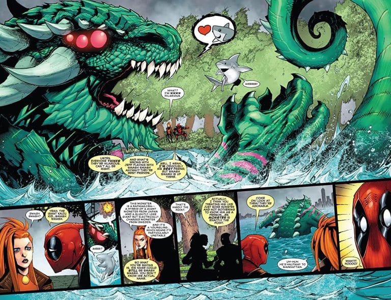
DEADPOOL #5, available in comic book stores on Wednesday, June 10th, brings readers a story of monstrous proportions (which is saying something for the newly crowned King of Monsters). After soundly defeating Kraven the Hunter last issue, Deadpool decides to let his subjects enjoy themselves in the ocean off the coast of Staten Island. But when a Godzilla-sized lizard named Smash Smash escapes from the Island, the people of Manhattan could pay the price.
Story
With Smash Smash making waves on his way to the city, Deadpool and Elsa Bloodstone desperately search for a way to arrive before the monster can destroy anything. Fortunately, Night Wolf suggests the quickest yet grossest solution: teleportation via the monster Hurl’s special pink goo.
Upon arriving mostly unharmed (aside from the disgusting transport vehicle), the two heroes and Jeffrey confront Smash Smash. Deadpool makes it clear he does not want to kill the monster; he feels the weight of his new responsibilities as King of the Monsters and wants to care for his subjects. But when Smash Smash makes it clear he wants to create explosions within the city, our hero may have to make some tough decisions.
Kelly Thompson’s writing is as funny as ever, yet finds a way to fill the narrative with just enough heart. We feel Deadpool’s existential angst over his identity as he tries to avoid killing anyone, a quality he feels has defined him as a character for far too long.
Artwork
Gerardo Sandoval’s penciling and Victor Nava’s ink work provide awesome illustrations of our heroes and the mighty Smash Smash as he wreaks havoc on the sleek, clean New York buildings. This is coupled with Chris Sotomayor’s coloring, which contrasts the bright reds of Deadpool and with Smash Smash’s earthy tones. And VC’s Joe Sabino’s lettering completes the ensemble by matching the color of character dialogue boxes to their own hues.
Conclusion
DEADPOOL #5 is one of the most engaging issues yet in the new line of Deadpool comics. Our hearts laugh, cry, and continually question Deadpool’s sanity as he and Elsa attempt to save Manhattan.
What was the funniest part of this issue for you? Let us know in the comments below!
New Mutants #10 proves that Rob Liefeld may have a good point about modern comics. Perhaps comics have gotten too…verbose. In theory, there’s a lot happening in this issue. I know this because the characters spend A LOT of time talking about it.
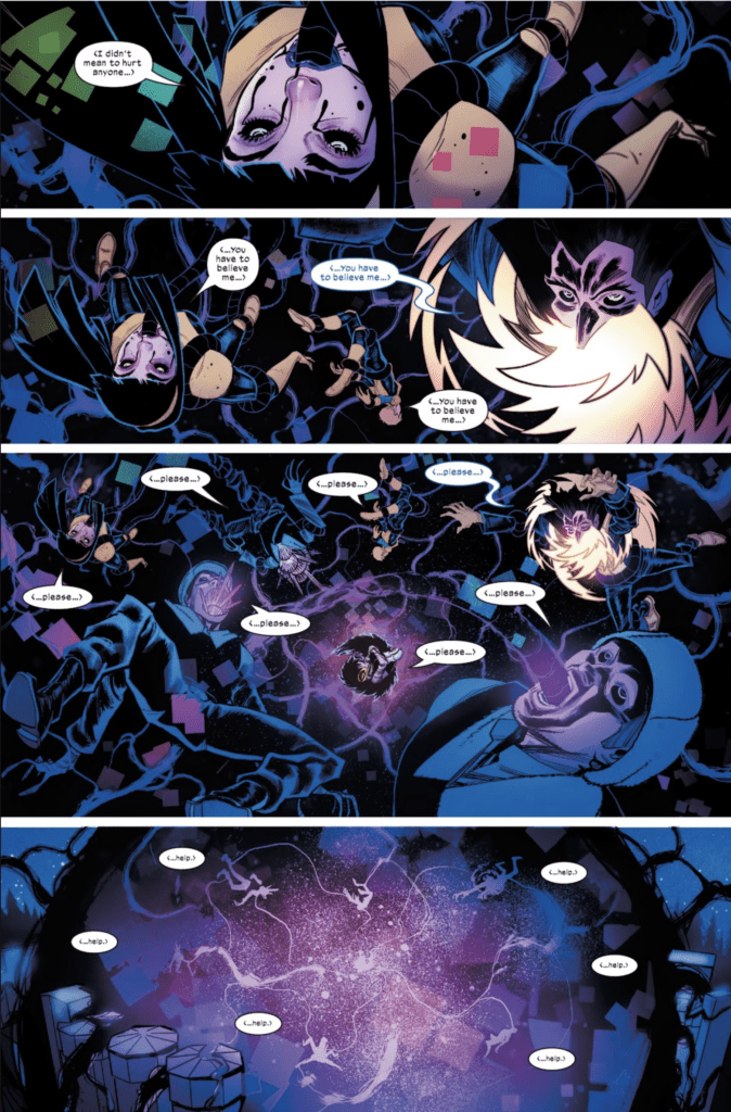
The New Mutants are in the hostile nation of Carnelia, where a young mutant has begun to manifest her powers, drawing the surrounding area into her nightmares, including a few members of the New Mutants. Meanwhile, the prime minister of the country plans on blaming the New Mutants for a problem he thinks they caused as retaliation for not signing a treaty with Krakoa.
I realized about halfway through this issue I was getting a little bored. Ironically, Ed Brisson seems aware of this, with the character Wildside chiming in halfway through the issue: “Is this all you guys do? Stand around, talking. It’s boring. Where’s the action?!”
Given that the character was co-created by Rob Liefeld during his run on New Mutants, perhaps this is a self-conscious nod to the reader on Brisson’s part. Or perhaps a veiled criticism of Liefeld. He has a point though, although frequently the middle of an arc acts as an exposition dump in order to set up a finale. Perhaps that’s what is going on here. We’ll see.
Rod Reis’s cover art helps me to imagine what I wish this comic was – a truly horrifying experience. Given that the plot involves people getting absorbed into another mutant’s nightmares, this might be a missed opportunity in the story.
Flaviano and Carlos Lopez’s second page helps capture the horror-potential of this story.
I am tempted to comment on the possibly phallic imagery of the first panel, given the comic industry’s overall poor track record on misogyny in comics. It’s not quite at “Blob eating the Wasp in Ultimatum” problematic levels, but it does give me pause. The image alone is striking and horrific, reminding me a bit of the scene with the tree in Evil Dead. The coloring of these panels, though, are beautiful and ethereal, along with the lettering by VC’s Travis Lanham which captures the out of control despair of the nightmare mutant.
When Armor, Wildside, Mondo, and Cypher attempt to rescue those inside, the world inside the nightmare orb looks like a twisted, Dark Multiverse equivalent of a Steve Ditko drawing.
While I enjoyed the artwork and am still excited to see where this series goes, I do think this issue suffers a bit from an overabundance of talking.
There continues to be a lot of great potential in this series, even if this cast is a little big. I’m thinking that maybe splitting New Mutants into two titles (maybe a Generation X title?) might’ve helped this book to feel more focused in its run so far.
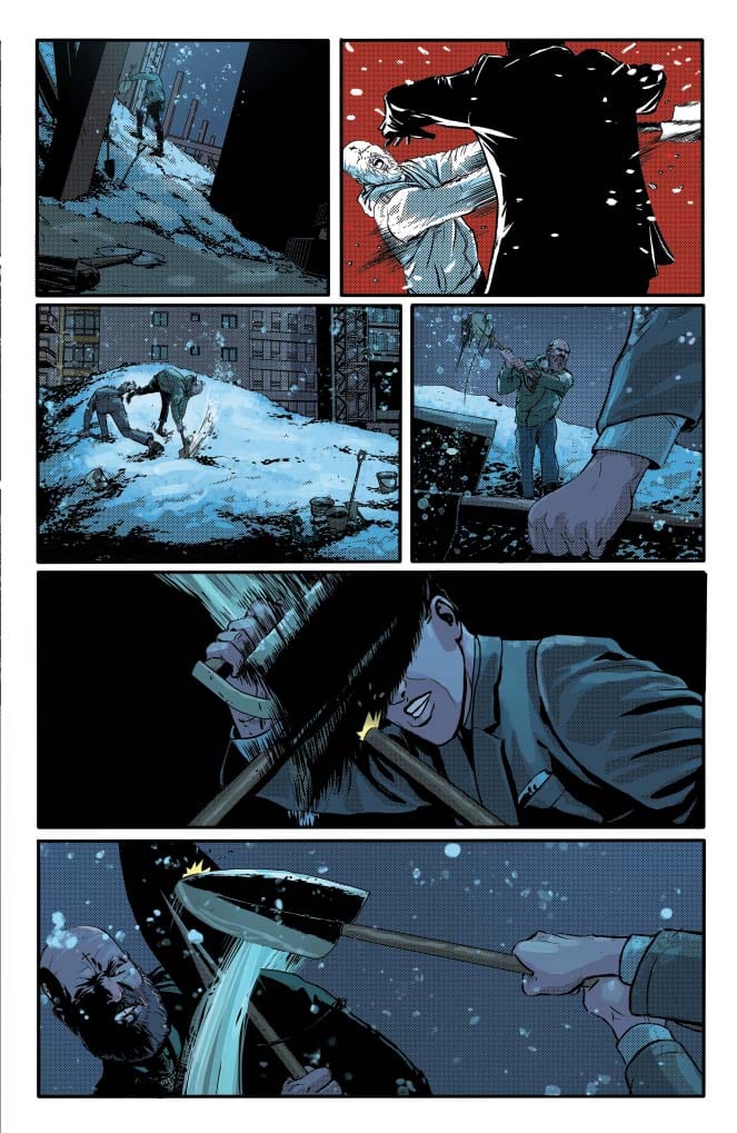
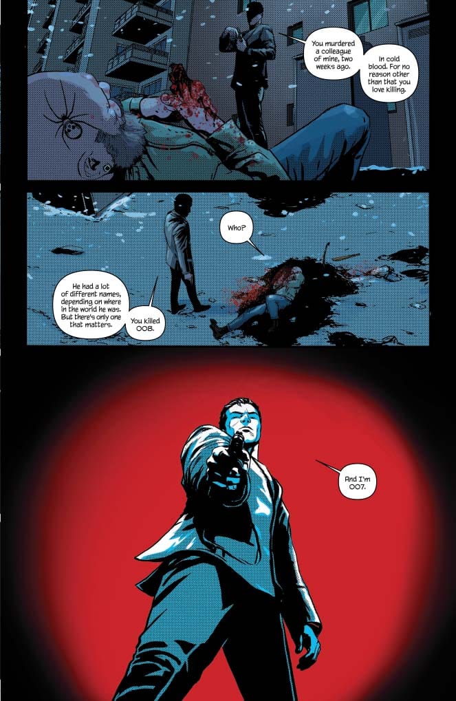
JAMES BOND 007: THE WARREN ELLIS OMNIBUS, available today from Dynamite, is Warren Ellis’ take on the legendary super spy. The Omnibus is a collection of two story arcs: Vargr and Eidolon. In each arc, Bond encounters a bevvy of dangerous enemies and colorful allies, all in service to Her Majesty’s Secret Service. With decades worth of source material and pop culture iconography, does Ellis’ version of the titular character hold up?
Writing
Let’s just get this out of the way. In these collections, Warren Ellis has written peak James Bond. Bond is charming with a touch of scoundrel when interacting socially; deadly accurate and ruthless when facing the enemy. He’s a smart ass and yes, to use an old-fashioned phrase, he’s very much a ladies man. To put it simply, Ellis has taken all the best characteristics of Bond from the books and films and merged them into a dynamic and engaging personality.
In Vargr, Bond is assigned to hunt down the maker of a designer drug that’s killing it users. Bond eventually discovers the plot is bigger and more twisted than a simple drug dealer with bad product. The villains in Vargr just barely skim the line of cartoon-ish, but the action is tight, and the stakes are high for the entire island of Britain. What I appreciate most about Bond here is he takes more than a few lumps, true to his depiction in the original books. Bond doesn’t escape all attacks with perfect hair and a winning smile. when the fight scenes take place, Bond’s expertise saves the day at the cost of more than a few bruises. Excellent authenticity by Ellis.
In Eidolon, a insurgency cell connected to SPECTRE has infiltrated the highest levels of British Intelligence. Bond fights to survive assassination attempts from within his own ranks to uncover the traitors and save the agencies meant to protect Britain. There’s a bit of commentary from Ellis in this story as he raises the questions about how far we need to go for security before we trade one danger for another. Eidolon is the more paranoia-filled and tense of the two stories, and it’s imminently enjoyable as a spy thriller. The ending is not your typical smarmy-one-liner-before-he-kills-the-bad-guy ending, and big credit goes to Ellis for infusing the character with more depth than previous incarnations with the final fight.
One quick note about the female characters. Bond stories have received some criticism in the past for their depiction of female characters, either for coming across as agentless damsels-in-distress or as nothing more than a love interest for Bond. I was pleased to see that ALL the female characters in these collections are integral to the story and have complete agency when it comes to the romantic interactions with Bond. Again, kudos to Ellis for getting that bit right.
Overall, the omnibus is well-constructed, and the stories are mature without a a hint of camp in sight. This is probably the fastest omnibus I’ve ever read through. Not a single panel is wasted and the story moves.
Pencils/Inks
Jason Masters’ art in Vargr is cinematic. Every panel is rendered with enough detail as to look like a cell lifted straight form a Bond film. Masters’ realistic style lends an air of maturity to the material that keeps the far-fetched elements (an assassin with robot arms?) grounded.
Likewise in Eidolon, the realist art style intensifies the cinematic qualities of the story. Every character is distinct and well-rendered such that the art enhances the writing and dialog to create three-dimensional people, even with the lesser used side characters.
Extra kudos goes to Masters for the creation of the main villains. In typical Bond story fashion, the main villain is usually distinguished by some sort of scar or deformity. In both stories, Masters draws villains with their telltale scarring but does it in such a way as to add to the backstory of each character, giving them more depth.
Favorite Panel/Page: Part of the Bond mythos is the endless ribbing he gets over his choice of personal firearm, the Walther PPK, On page 28, Q is inflicting just such a ribbing and suggests Bond choose a more meaty weapon with an appropriate shoulder holster to carry it. Without spoiling it, Bond’s comeback had me laughing at loud because it’s just such a perfect representation of the character in all the best ways.
Coloring
Guy Major’s coloring is chock full of mood, particularly in the more brutal death scenes when it’s one-on-one. For example, the opening scene of Eidolon depicts the death of a henchman who’s gotten “sloppy”. The entire sequence is bathed in hues of yellow and orange to reflect the sunset lighting from outside, but it also paints a sickening atmosphere of malignancy that takes a simple murder to something more sadistic…and therefore, impactful.
Lettering
I mentioned earlier this was the fastest omnibus read through I’ve ever done. The writing, art, and lettering combine to practically sprint you through the pages. That’s in part to Simon Bowland’s lettering work. Bowland makes excellent use of background space to put in word balloons only when absolutely necessary. That’s also why the stories move along so quickly. In the first eight pages of Vargr, there are exactly eight word balloons, and even then, they all show up only on the last of the first eight. Sometimes less is more, and Bowland get it absolutely right by tucking in the letters in the sparsest of corners to let the stories fly.
Conclusion
JAMES BOND 007: THE WARREN ELLIS OMNIBUS is a collection of tense, taut, and thrilling James Bond adventures. The quality of stories, in both the writing and art, is on par with the best James Bond films and even better than some of the original novellas. Absolutely worth your time for the price.
Author’s Note: Local Comic Shops (LCS) are going through a tough time right now with the pandemic outbreak of COVID-19. Comics fans of every flavor that care about his or her LCS should try to do what they can. So, here’s my part:
If you’re in Northern Delaware, South East Pennsylvania, or Southern New Jersey area, please take a moment to visit Captain Blue Hen Comics in Newark, DE. Say ‘hi,’ pick up a book, order a book (they’re on Comichub.com), and let them know you support them.
If you’re nowhere near that area, please find YOUR LCS using Comic Shop Locator and lend your support.
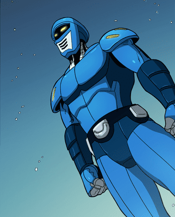
Guardian #1 is a superhero indie comic by UK filmmaker Tom Carter, available via Comixology. This passion project has been in the works since his college days.
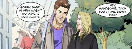
ABOUT THE BOOK: Zack West, who just graduated returns home spending time with his family and girlfriend living his normal life ever day life until a mysterious alien symbiotic crash lands on earth; it fuses with Zack and together they become Guardian, the newest superhero and defender of earth.
Guardian #1 Introduction
Tom Carter’s Guardian #1 wastes no time introducing his title character… characters? The way Carter works with artist and letterer Jang Haryadi for introductions is pretty clever. Readers assume it’s the civilian identity of Zack West until later some context from the beginning reveal that it’s him and a symbiote. Think if Venom was more technological. What’s more, Zack is an everyman who surrounds himself with quirky yet down-to-earth characters like Guardian and his family. When you get down to everything, this is the ideal viewpoint of the reader to a new universe. Empathetic enough for a reader to latch onto, but not sympathetic enough to the point of pity. That’s certainly the way for Guardian who learns through Zack that there are already superheroes about.
Building Up Future Stories
With the universe building in the background, this generates interest for more content. However, the way Guardian #1 sets up future stories can be kind of lackluster. Their archenemy Mars The Destroyer and his presence combined with the disappearance of Zack’s family friend Sean Hunter advertises itself as a mystery. But to readers who pay attention, it’s actually pretty on the nose. Guardian’s conflict with the crime lord Maverick seems more interesting, especially with his skull-masked helper.
Guardian #1 Artwork
How popular is Blue Beetle (Ted Kord) in the UK?
Jang Haryadi does a very good job with how he handles penciling, inking, and lettering. The designs of his characters in Guardian #1 are diverse enough for readers to tell everyone apart. But it’s the designs of the heroes and villains that are the most praiseworthy. Guardian’s simple design not only makes it notable, but the trunks it features are a tribute to Silver Age superheroes. Villains like Mars, Maverick, and Skull all feature designs that fit their personalities. Mars is an over-the-top supervillain with a cape who ironically watches from the shadows, while Maverick is a large intimidating man in a suit. Skull’s mask with eyes that occasionally glow purple imply a mystical nature, all while dressing in a fedora and trench coat. This is a display of Maverick trying to cover all areas of superheroics including the more fantastical aspects that have yet to show up.
This looks better if you see the panels above this picture.
However, when it comes to Haryadi’s lettering, they range from being creative to chaotic. The captions, as mentioned earlier on Guardian’s introduction is some of the best in Guardian #1. Unfortunately, some of the word balloons and captions can be out of place. When Zack is speaking with his girlfriend Amy, her opening dialogue looks like it should be in one panel or happens too late. Otherwise, Zack’s apology looks awkward when reading from just the panel it takes place in.
Coloring by Papillon Studio seems to vary. They range from relatively simple like most of the series where Zack goes about the day to highly detailed where Guardian makes his debut. The background however doesn’t get much detail unless there are trees. Otherwise, the urban architecture looks kind of dull.
The First Step Of The Carterverse
Guardian #1 is far from perfect, but it has the potential to grow into something greater. You have characters who serve as the gateway into a bigger world of superheroes instead of being the first of an epic. Sure, Guardian’s building superhero career looks lackluster, but maybe Zack’s family can be a treat. Where else can you find superhero stories that can be fun and be a means of figuring out what to do with your life? Anybody trying to find their way can relate to that. Maybe you just need to wait and see where this all goes.
What do you all think? Is this series just another attempt at reinventing the superhero wheel? Or could something come out of this? Leave your thoughts in the comments.
This Wednesday, Brian Azzarello, Maria Llovet, and Andworld Design continue their tale of Faith’s rise in stardom through questionable means in BOOM! Studio’s Faithless II #1.
It’s been about a year since the first part of Faithless wrapped up, so refresh yourself with Darryll Robson’s reviews here! Then support your LCS and pick it up.
Faithless II #1 is for mature readers, so make sure you know that before jumping in. However, you need the background from Faithless, so that should come as a given.
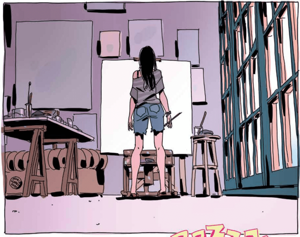
FAITHLESS II #1 AND THE DAUNTING CANVAS
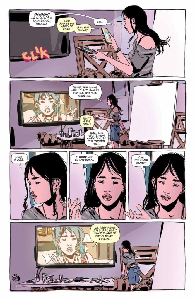
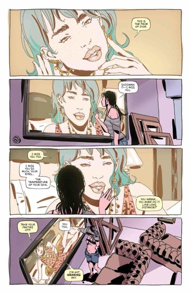
Azzarello reintroduces the cast we’ve gotten familiar with by having each interact with Faith, thus showing how they’ve progressed. Yet it doesn’t seem like it’s been that long since the previous story, as Faith is still getting called “the next big thing.” That and Faith feels like the character we left in the previous serious, still confused and not sure of herself. Instead of having her feeling confidant, she still doubts herself constantly; this is shown with a simple narrative—a blank paint canvas.
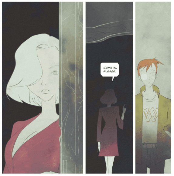
The blank paint canvas that haunts Faith throughout the first issue is great; it shows how she feels she still lacks something. Instead of skipping ahead, Azzarello continues at a slow, steady pace, showing that she is still evolving. The many changes Faith went through in Faithless was the highlight, and it seems Azzarello knows that, as she still has a way to go. Nonetheless, changes happen when Solomon enters the picture. Solomon was introduced in Faithless, yet was never delved into. It seems like he’ll play into Faith’s further transformation down the line.
Maria Llovet
A VISUAL TREAT
Faithless was a visual treat with a lot of the story riding on Llovet’s art, the same can be said on Faithless II #1. Not only does Llovet’s style perfectly fit Azzarello’s tale, but it also heightens it. This ability to take the story up a notch stems from her European art form, with uneven lines and styles of panel. Albeit her characters are emotional and her ability to showcase realistic feelings is great, her backgrounds are just as amazing. During some scenes, Llovet’s backgrounds are cluttered, showing the business of that location. While other locations are void, helping showcase the foreground. It helps that this genre is one Llovet transcends at.
However, her art isn’t the only phenomenal aspect, as her colors and fashion sense works wonders. This detail for fashion can be seen in her other works as well. Nonetheless, her colors fit the narrative quite well. Her color palette is subtle and realistic. At times Llovet will employ brighter colors, yet at no time does it outshine what is transpiring. Another neat aspect of her colors is how at times, they flow outside of the lines. In Faithless II #1, you’ll find objects and panels that include colors that aren’t in the pencils lines. It’s a small detail, yet simply beautiful.
Brian Azzarello, Maria Llovet, Andworld Design
WORDS OF PASSION
There are a few moments in Faithless II #1 where Llovet includes hand-drawn sound effects. When these occur, they look magnificent and later on help portray a great visual moment. Be that as it may, Andworld Design’s lettering is wonderful when teamed with Llovet’s art and Azzarello’s story. The word bubbles and font style seems to be more freehand then not, with Andworld Design changing the dimensions of the bubbles when needed. The font style used not only makes the story feel more realistic but is gorgeous to boot.
Brian Azzarello, Maria Llovet, Andworld Design
FAITHLESS II #1 CONCLUSION
Although there are some fun character moments in Faithless II #1 the reintroductions of the characters don’t do as well as their initial introductions. Nonetheless, Llovet’s art continues to be drop-dead gorgeous with Andworld Design’s lettering helping tell the story. If you enjoyed the first series, then you’ll want to check out the follow-up.
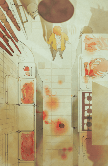
Scout Comics’ It Eats What Feeds It, written by Max Hoven and Aaron Crow, and illustrated by Gabriel Iumazark, tells a story that’s simple yet haunting. The story takes place in the Louisiana swamps. The dingy feeling and the fog in the air makes it feel like danger is around every corner. We follow Kenny, a young high school graduate who is responding to a want ad in the bayou. In a large, spooky house, the seductive Francois waits. She simply needs Kenny around to keep the place clean, keep her company, and ignore the blood splatters in the kitchen.
Writing
Hoven and Crow are building a world of characters from scratch. It’s natural to have a little bit of over-explaining, and some heavy exposition here and there. But somehow, Hoven and Crow dodge this pitfall and dive right into the story. Sure, Kenny isn’t exactly subtle. At one point he’s jumping on his bed saying “She wants me… she wants me hard!” But he’s a horny high school graduate, so the tone of his dialogue works perfectly. Hoven and Crow understand the character they’re writing. They know that if they dangle sex in Kenny’s face, they can then throw in as many red flags into the writing as they want. And so, the reader is warned with every page that something sinister is going on, while Kenny settles deeper and deeper into his dream life. This makes the tone of the comic both spooky and seductive at the same time. You’re lured into the beauty of the world they’ve created, despite that fact they’re screaming at you to run.
Art
Iumazark, in a way, takes on the role of Francois in this creative process. It’s his job to seduce us into the house, get us sitting comfortably and then scare the shit out of us. And Iumazark does it well. For one thing, much of the art seems to have a haze over it. Since this comic takes place in the Louisiana bayou, the foggy feel in the air is fitting. It’s like you can’t fully see what’s going on. It’s not clear. Iumazark is constantly shying away from detail. His minimalist approach often looks like a picture half-drawn. This brings everything into question. Are we really seeing what’s going on, or is this in Kenny’s head? It’s the uncertainty that becomes the most terrifying factor of the story. The very feeling that there is something between you and a clear picture creates a sense of panic.
Coloring
Iumazark’s coloring is where the balance of dread and seduction comes in. Somehow, scenes that are cast in a “golden days” kind of glow, don’t seem all that different from washed out scenes that suggest a coming doom. We do notice all the differences, but they’re subtle. The tinges of grey and yellow are replaced by a hint of green. But the changes are so subtle that we almost want to convince ourselves they aren’t there. Early on in the story, as Kenny first meets Francois in her dimly lit house, Iumazark’s color scheme manages to be both tempting and ominous at the same time. The dark room should feel scary, but the woman in the red dress makes it feel intimate instead. Maybe even sexual. It’s once Kenny discovers the blood and bones in the kitchen that Francois’ red dress begins to represent both sex and death. Kenny doesn’t seem to bothered once he realizes he might have a chance with Francois.
Lettering
Iumazark’s letters seem out of place at first. The sharp edges of the square word balloons clash with the soft shapes of his pencilling. But something about it kind of works. The orderly, clean letters floating above a dark and messy world. It casts more doubt over the atmosphere. Doubt that things are alright, that things are as they seem. And Iumazark’s sound effects are always a tease. The garbled “Wheck! Whreeck! Wreeck!” flying out of the window in panicked letters is just Kenny jumping on his bed. Screams that echo through the halls are cries for attention, not cries of death. And so the lettering of this story is always convincing us it’s something that it’s not. Scary looking sound effects are actually associated with innocuous acts. Tidy word balloons hide the sinister intent of the words themselves.
It Eats What Feeds It, from Scout Comics, is a seemingly simple series. But the work Hoven, Crow and Iumazark have put in is anything but simple. We have none of the insecurities one often sees with creators introducing us to a new world. Instead, this creative team is confident. And with a story like this, they should be. It Eats What Feeds It #1 is out from Scout Comics July 8th!
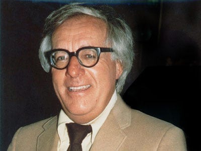
Shadow Show: Stories in Celebration of Ray Bradbury is an anthology of short stories inspired by the late science fiction author. The stories included contain references and draw inspiration from many of Ray Bradbury’s short stories and novels, and we will look at how a few of the tales are linked to the timeless author.
Ray Bradbury is best known for writing novels such as Fahrenheit 451, Something Wicked this Way Comes, Dandelion Wine, and the Martian Chronicles. He also wrote hundreds of short stories, several stage plays, and some screenplays. While mostly known as a science fiction writer, Bradbury’s short stories touch on nearly every genre imaginable, and his unending creativity inspired countless of today’s authors. Shadow Show is just one of the many ways these authors have attempted to pay tribute to Bradbury and features an astounding variety of short stories that relate to Bradbury’s works through either topics or themes. Shadow Show was published in 2015 through IDW publishing and contains a total of nine stories that pay tribute to Bradbury.
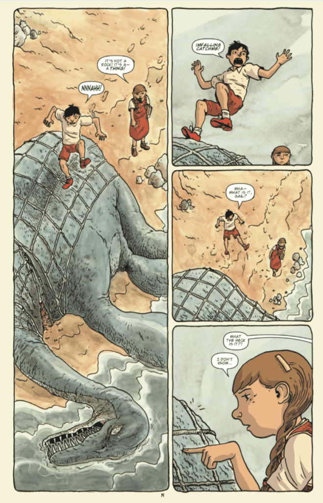
Shadow Show begins with an adaptation by Jason Ciaramella of a Joe Hill short story titled “The Silver Water of Lake Champlain.” It is illustrated by Charles Paul Wilson III and Jeremy Mohler. The story is about a young girl named Gail, who discovers a dead monster on the beach with a boy named Joel. The monster is similar to a giant aquatic dinosaur, and the children celebrate their discovery of the prehistoric creature. Those who have read the short story “The Fog Horn” by Ray Bradbury will be quick to realize that the creature in this story and Bradbury’s are incredibly similar, if not one in the same. This is clear from the foghorn noise that both creatures make. Another way that “The Silver Water of Lake Champlain” mirrors the works of Ray Bradbury is the young main characters. Many of Bradbury’s stories, such as Something Wicked This Way Comes and Dandelion Wine, feature children as the main characters and focus on this innocent time of life. It is difficult to capture the wonder of being a child in words or through art, but Joe Hill, Ray Bradbury, and everyone who worked on the adaptation to a comic book are able to do so successfully.
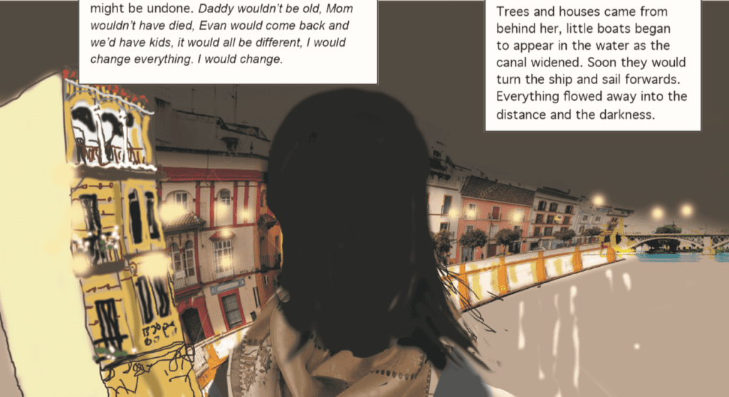
“Backwards in Seville” is a tale featured in Shadow Show that does not have a direct link to any of Bradbury’s stories. It does not feature a character from one of his short stories, an excerpt from one of his novels, or Bradbury himself as a character like other stories in the anthology do. Instead, “Backwards in Seville” relates to Bradbury purely through the themes covered in the story. “Backwards in Seville” is a story written by Audrey Niffenegger and illustrated by Eddie Campbell that follows a middle-aged woman named Helene on a cruise ship with her father and many other elderly passengers. It explores themes of life quickly going by, and how youth is wasted on the young. The story has a magical twist as well, despite most of the story appearing to be set in a realistic world. This is a staple of many of Ray Bradbury’s short stories and novels, such as Something Wicked this Way Comes. The topic of aging and growing old is also something that Bradbury was clearly fascinated with, and shows up in many of his stories, such as Dandelion Wine and “Season of Disbelief”. It would also be rude to continue without noting the beautiful and unique art style of “Backwards in Seville,” which causes Helene’s experience to seem as if she does not have a firm grasp on reality.
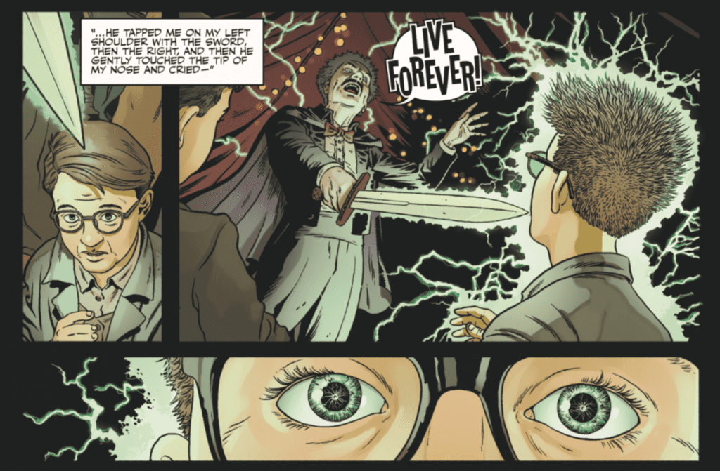
“Live Forever” is one of the most interesting stories told in Shadow Show, because Ray Bradbury himself is a character in it. Written by Sam Weller with art by Mark Sexton, “Live Forever” tells the story of a writer meeting his hero, Ray Bradbury, and talking about his history. The story almost seems it could be a real account when Ray Bradbury tells the writer a true story of when he was a child at a circus and was told by one of the performers to “live forever,” but soon after the story dips into the realm of fiction. Bradbury leads the writer to his basement, where many robot versions of Bradbury’s mentors are spending their time. These robots are indistinguishable from humans except for a very faint ticking noise, and are ripped directly from the Bradbury short story “Marionettes, Inc.” This story is a marvelous read because it helps illustrate just how deep of an impact Bradbury has had on many writers of today.
Shadow Show: Stories in Celebration of Ray Bradbury is a wonderful anthology, full of diverse topics and themes that truly capture the feeling of Bradbury’s writing. Although this article only covers a few of the stories in the anthology, Shadow Show still contains plenty of other wonderful stories that are worth looking into. I believe it would be difficult for someone to read this fantastic collection of stories and not be instantly motivated to explore the writing of Bradbury for themselves.
Are there other anthology comic books that you like? Let me know in the comments below!
In Miles Morales: Spider-Man #17, on sale June 10, writer Saladin Ahmed plunges Miles “Outlawed,” in which he’s a fugitive. From Miles’ confrontation with a governmental task force to a question-raising cliffhanger, Ahmed offers plenty of discussion points with this latest installment. But the most promising development is Miles demonstrating the true legacy of Spider-Man.
Miles Morales: Spider-Man #17
Writer: Saladin Ahmed
Penciler: Carmen Carnero
Color Artist: David Curiel
Letterer: VC’s Cory Petit
For teenage superheroes, there’s a lot going on in the Marvel Universe. Even if you ignore each defender’s individual responsibilities, “Outlawed” is making their jobs more difficult than ever. Thanks to Kamala’s Law, teenage heroes can’t operate without supervision. This legal restriction might put a damper on adolescents hoping to follow in the footsteps of icons like Iron Man and Captain Marvel. That’s why it’s so encouraging to see Miles Morales take the next step in his evolution and truly become the friendly neighborhood Spider-Man.
In this week’s issue, Miles isn’t letting the chaotic world bring him down. Penciler Carmen Carnero and color artist David Curiel show Miles happily swinging through Brooklyn on a beautifully sunny day; few clouds invade Curriel’s peaceful baby blue sky. When Miles finds Kenneth, a troubled boy who has been beaten up by bullies, he kindly helps his fellow Brooklynite. Miles instantly sympathizes with Kenneth and reminds him that there’s still some good in the world.
By offering Kenneth a sympathetic ear and complementing his fashion sense ( the bullies’ target,) Miles acts as a guiding light for the young boy. “That jacket is pure fire, by the way,” Miles says, putting a smile on Kenneth’s bruised, frowning face. Miles goes above and beyond in his interaction with Kenneth. While the duo walks through Brooklyn, Miles gushes over Kenneth’s fashion sense and calls him, “the Reed Richards of fashion.” Miles even gives Kenneth a web-slinging ride through the city and delivers a video message on Kenneth’s social media: “You have beef with Kenneth, and I have beef with you.” Carnero and Curiel show Brooklyn soaring by behind the duo as they swing through the streets, capturing the importance of the neighborhood to the Spider-Man character. It also bears mentioning that Kenneth complements Miles; both characters represent the diverse society we see in real life every day, which is a refreshing sight. Ahmed doesn’t come right out and say it, but he subtly shows us why Miles and the new neighborhood are a natural fit. Kenneth is bullied for his nonnormative appearance and Miles both comforts and praises him for it. While Peter Parker may have embodied the ideals of the society in the past, Miles might be the perfect character for the modern world.
It’d be easy to focus on Miles’ tense confrontation with C.R.A.D.L.E., a task force who seek to stop all unauthorized teenage vigilantes. Or we could dig into the issue’s cliffhanger, which makes the reader feel as if they’re having double vision. There will be plenty of time to analyze “Outlawed” as the event progresses. Instead, let’s credit Ahmed for elevating Miles to the level of a genuine neighborhood Spider-Man. Now, Miles feels much closer to the greatness of his predecessor.
What’d you think of Miles Morales: Spider-Man #17? When it comes to “Outlawed,” whose side are you on?
Check out your local comic shop to see if you can pick this issue, and any others on your list, up there.
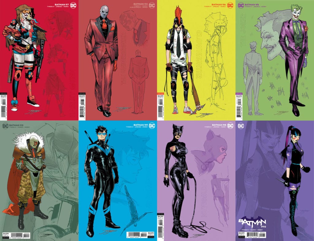
With the new “Joker War” storyline getting closer, DC Comics has revealed a group of Batman #92-100 covers by series artist Jorge Jimenez.
Here’s the official word from the publisher, along with the covers:
James Tynion IV, Jorge Jiménez and Guillem March’s Batman run has introduced novel new characters to the Batman mythos, and one of the most anticipated moments lands today in Batman #92, as Punchline comes face to face with Harley Quinn!
With “The Joker War” approaching, fans will meet even more new characters created by Tynion IV and Jiménez. Punchline, the Designer, the Underbroker, Clownhunter and more—new characters created for “The Joker War” by James Tynion IV and Jorge Jiménez—join Batman’s most famous friends and foes on 1:25 card stock variant covers of every issue from Batman #92 through #100! Each cover features Jiménez’s design work, showing off his process of crafting Gotham’s newest residents, or his distinct interpretations of its familiar faces.
The 1:25 covers feature Jiménez’s illustrations of the following characters:
Batman #92—Punchline
Batman #93—the Designer
Batman #94—the Underbroker
Batman #95—The Joker
Batman #96—Clownhunter
Batman #97—Harley Quinn
Batman #98—Catwoman
Batman #99—Nightwing
Batman #100—to be revealed!
Each cover is available to comic book retailers who order at least 25 copies of Batman #92 through #100, the climactic final issue of “The Joker War.” Batman #92 is on sale now, and “The Joker War” starts in July’s Batman #95. Check out the store near you to see what covers they’ll be ordering!
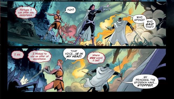
DEJAH THORIS VOL. 3, #5, available from Dynamite on June 10th, confronts Dejah and her crew with giant cave spiders and crawling brain bugs on her hunt to find Kurz Kurtos. Written by Dan Abnett and drawn by Vasco Georgiev, this issue boasts plenty of action, strong art, and a solid introduction to a new character.
Cover Art
Lucio Parrillo’s cover art immediately elevates the quality of any book. Dejah Thoris’ pose is both sensual and deadly. And despite the impossible design of her iconic outfit, Parrillo’s realism style gives the concept of “gravity defying” a whole new sense of believability.
Writing
Dan Abnett’s story has a lot going on with one main plot and two sub plots, but the issue doesn’t feel rushed or complicated. Dejah and her crew battle an army of cave spiders when they encounter an unexpected ally that has a telepathic bug for a head. It sounds weird. It is weird. And yet, it blends right in with the world Abnett has constructed.
Abnett’s writing is strongest when projecting a sense of urgency. Every character is either running away from something or running towards something; constantly confronting danger. That urgency keeps the pacing high and the tension tight, making this issue a fast read.
If there’s one area the writing doesn’t quite work, it’s in the dialog. Llana’s speaking style is so contemporary American that it doesn’t match her Martian warrior persona, and Morokh’s words read as determined or impassioned speeches in direct contradiction to his emotion-less character. The latter could be a result of the lettering, but the end result is a break in the story where it’s not intended.
Pencils/Inks
Vasco Georgiev’s art is excellent. It’s an even-handed mix of detail that’s pulp without looking cartoonish. Georgiev showcases the art well by intermixing a wide array of camera angles for each panel to keep the scenes moving when characters are sitting/standing around and simply talking. This issue is a great example of taking static scenes and giving them movement with an unexpected perspective.
Favorite Page/Panel: For the favorite, I’ll point to a collection of panels that span pages 10 and 11. Let’s call it the “mounting” scene. Morokh’s brain crawls along its synth body and mounts itself to address Dejah’s group. It’s creepy, a bit gross, and well executed.
Coloring
Dearbhla Kelly’s coloring is remarkable for imagining what hues look like on an assortment of characters in a dark cave lit by pink (yes, pink) flame. Kelly adjusted skin tones, armor reflections and hair shine to match the ambient hue of pink flame. It must have taken a great deal of trial and error to match the flame colors with the lighting and surroundings without crating an ugly contrast.
Lettering
Simon Bowland’s lettering is as imaginative as Kelly’s coloring, in the sense that there’s no precedent for what kind of balloon to use when a bug brain is speaking telepathically. Bowland devised the right combination of bubble border color – again, matching the pink flame – and line style to help the reader suspend disbelief. The interesting use of colors really elevates Bowland’s lettering.
Conclusion
DEJAH THORIS #5 has dynamic art, urgent and tense story pacing, and imaginative visuals. Strongly recommend you get this issue…unless you’re deathly afraid of spiders.
Author’s Note: Local Comic Shops (LCS) are going through a tough time right now with the pandemic outbreak of COVID-19. Comics fans of every flavor that care about his or her LCS should try to do what they can. So, here’s my part:
If you’re in Northern Delaware, South East Pennsylvania, or Southern New Jersey area, please take a moment to visit Captain Blue Hen Comics in Newark, DE. Say ‘hi,’ pick up a book, order a book (they’re on Comichub.com), and let them know you support them.
If you’re nowhere near that area, please find YOUR LCS using Comic Shop Locator and lend your support.


 Shadow Show: Stories in Celebration of Ray Bradbury is a wonderful anthology, full of diverse topics and themes that truly capture the feeling of Bradbury’s writing. Although this article only covers a few of the stories in the anthology, Shadow Show still contains plenty of other wonderful stories that are worth looking into. I believe it would be difficult for someone to read this fantastic collection of stories and not be instantly motivated to explore the writing of Bradbury for themselves.