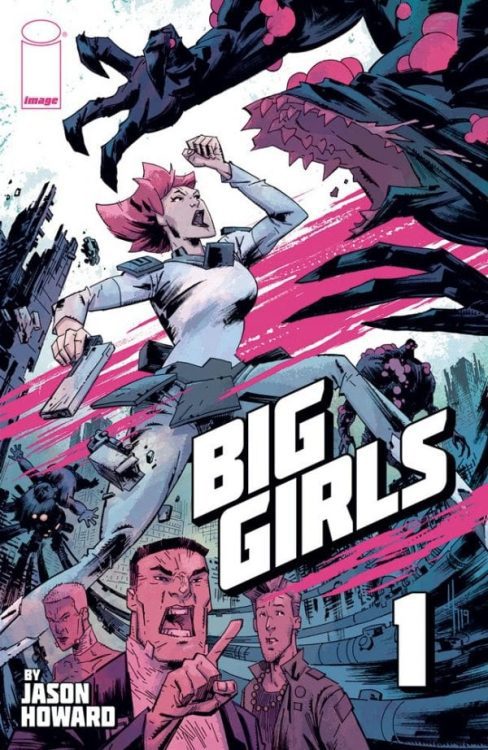
BIG GIRLS #1 hits your local comic book shop on August 12, but thanks to Image Comics, Monkeys Fighting Robots was able to chat with the artist and writer of the series, Jason Howard.
About the book:
When men become giant monsters hellbent on destroying the world, only girls can stop them—BIG GIRLS. Meet Ember—she writes poetry, loves to read, and she’s a 300-foot-tall full-time monster killer! She and the other big girls are all that stand in the way of our world’s complete annihilation!
BIG GIRLS #1 is insane in all the best ways, check out our advance review BIG GIRLS #1 is a Colossal Good Time and OPED article BIG GIRLS And Relatable Monsters.

MFR: In the first two pages, you establish the back story of BIG GIRLS, how much world-building was involved to flush out the story and characters?
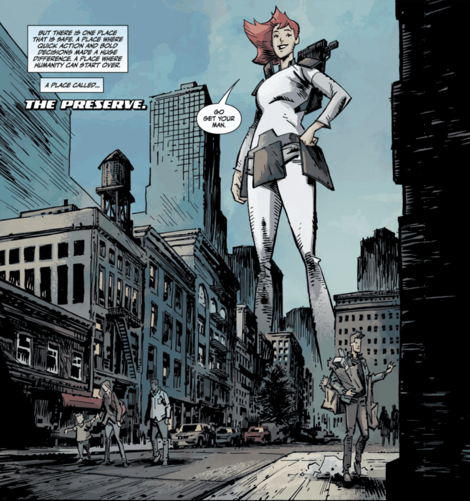
HOWARD: Quite a bit. I developed the whole backstory and how the world became as it is. Early drafts had more of this backstory, but I cut most of it as the story I wanted to tell was not HOW the world became this way, but rather to use the setting to explore a character living in this kind of world. As the series continues, more of the history might be touched on, but just like real people don’t always know the reasons how or why the world is the way it is, the characters in Big Girls don’t necessarily know everything.
MFR: What was the process like creating the monsters of the BIG GIRLS Universe?
HOWARD: A tried several directions for the look of the monsters, so the process was mostly a lot of sketching and then swearing when things didn’t turn out right away. Eventually, I swore my way to a look I was happy with from a design place and would be something fun to draw. My goal was to find a look that contrasted against the design of the Big Girls. So while the Girls’ uniforms are based on square shapes, the monsters’ design theme is a circle. Keep it simple!!
MFR: BIG GIRLS is a book that the reader can go as deep as you want with thematic elements and meaning. How do you balance keeping the book genuine with a message and not becoming too preachy?
HOWARD: I don’t know. For me, it’s been about balancing my artist and writer sides. As an artist, I really just want to draw cool stuff! So giant women battling monsters and huge destruction satisfies that. But from a story place, I want to have a little more meat and meaning, so asking questions about some of the bigger issues in the world satisfies that. I try to bring it all together in a satisfying way, and my hope is that a reader can enjoy both parts of the story. But ultimately, this is a comic book first and my intent to entertain!
MFR: I have twins that a little over two-years-old. After reading page 11 of the first issue, I wanted to punch you in the face, not really, but you made me angry. When you set up a compelling scene like that, do you think about the reader’s emotional impact?
HOWARD: Sorry… It was a tough scene to write. I do think about the readers, but my main concern is with the characters’ emotional impact. I hope readers connect with the story, but if I second guess story choices too much, I don’t think I would be able to write honestly. Some of my favorite stories have bad things happen to characters, and the appeal to me is not that a bad thing happened, but how those characters react and the journey those big events set them on.
MFR: When you deal with large scale characters, how does that change your panel design?
HOWARD: That was a big appeal of this idea for me as an artist and a fun aspect of drawing the book. Trying to find a way to use the size of the characters to make events feel big is something I try to bring to each page. It affects the panel design because I want every page to be a double-page splash! I didn’t do that, but I do try to use my big panels and splash pages in a way that takes advantage of the characters’ size.

MFR: I didn’t realize how much I would notice the sky in BIG GIRLS #1, the blue sky transitioning to a red/orange sunset worked really well. Can you talk about the color palette for the first issue?
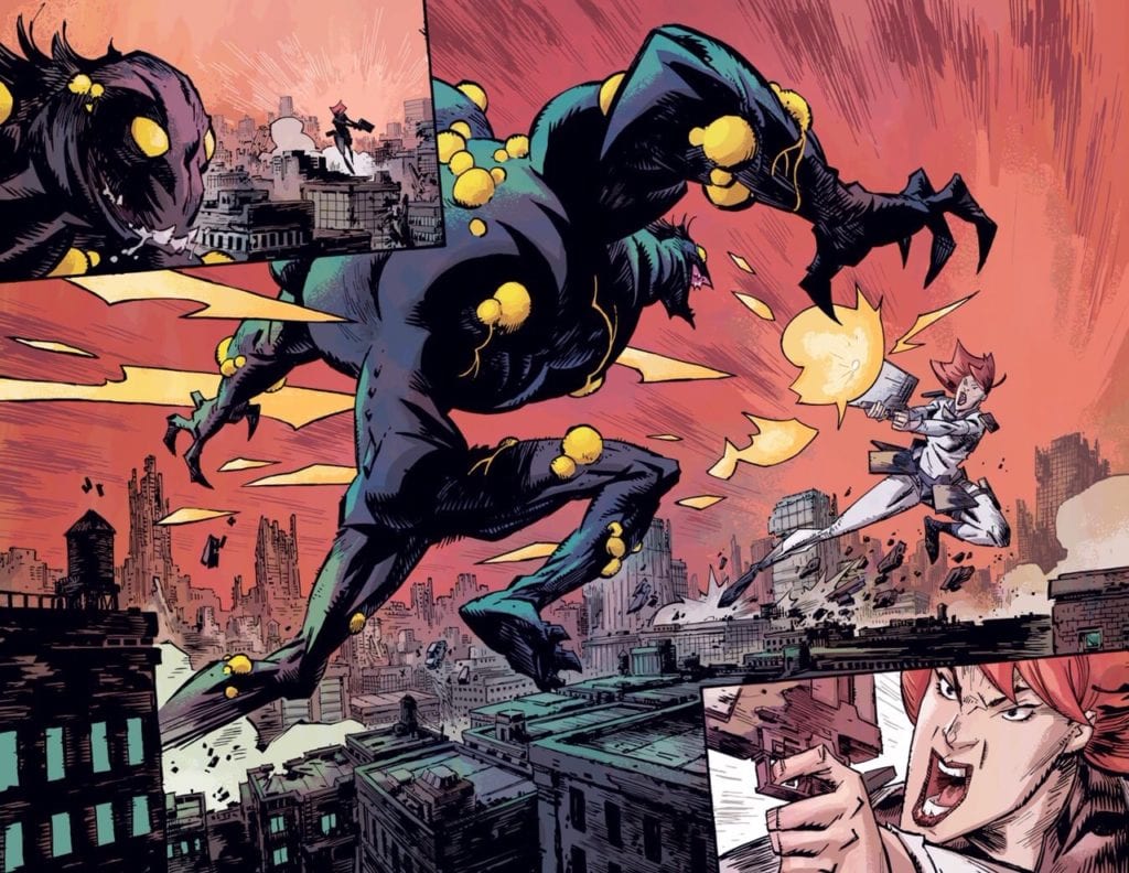
HOWARD: Thanks. Color design is something I’ve always felt is important; I’m glad it worked for you. Color is a big part of storytelling, and it can really create a sense of place and mood. For example, when the colors shifted to the red/orange scheme, I wanted to show two things. First, to give a sense that some time had passed since the events previously in the issue. Second, because we are moving into an action scene, I wanted a color combination that felt more dynamic and energetic. I dislike the dull, ‘realistic’ coloring that is sometimes used in comics. I much prefer coloring that prioritizes design, mood, and storytelling.
MFR: My favorite page from the first issue is the double-page spread battle scene; there is movement and emotion. What techniques did you use to make that happen?
HOWARD: I wanted that spread to represent the visual hook of the series, a giant soldier woman fighting a giant monster in a ruined city. So capturing the energy of their fight and scale was my priority. And if you like that spread, just wait for issue 2!

MFR: There are so many options fighting for our entertainment attention, how important is it to hook the reader with the first issue?
HOWARD: Pretty important!! Let’s be honest; if no one buys the book it will make it hard for me to continue telling this story. 🙂 As a life long comic book fan I feel a responsibility to do the best work I can, I think this is a series that has a lot of surprises and will be an exciting, entertaining book. Probably everyone should just cancel their Netflix today! Big Girls has you covered!
MFR: Your panel design goes back and forth with white borders and full-bleed. What message are you trying to convey with the white space?
HOWARD: Often, it’s more about the visual impact that the bleeds can have. Really I just try to have fun with the layouts, and I like to use white space to make things pop, and the bleeds to give the impression of density or things “too big for the page.” Or I might use them if a location changes within a page, anything to help the reader feel like they are in a different place.
MFR: Godzilla is mentioned in the marketing material for BIG GIRLS #1, what is your first memory of Godzilla and how much of an impact did it have on you?
HOWARD: Godzilla has always been a favorite, but what I really loved was big robot animated shows like Voltron, Transformers, Robotech, and Evangelion. While there may not be giant robots in Big Girls, those visuals and ideas are built into the stuff that I find to be cool, and a definite influence on the series.
MFR: Thank you for your time and best of luck with BIG GIRLS #1.
Will you add BIG GIRLS to your pull list? Comment below with your thoughts.


