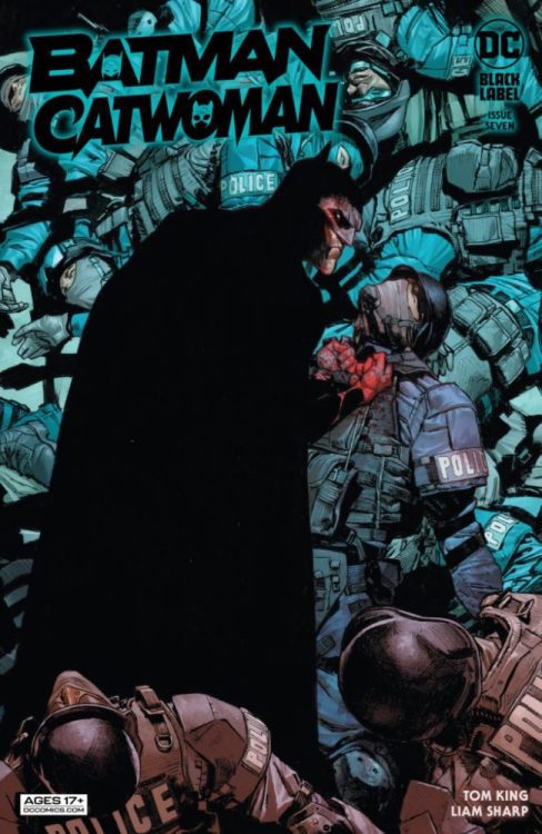
DC Comics’ Batman/Catwoman #7 sees a few changes to the series. In place of artist Clay Mann and colorist Tomeu Morey, the brilliant Liam Sharp provides art and colors. Tom King pens a complicated but riveting script, Sharp delivers mesmerizing visuals, and Clayton Cowles ties everything together with his brilliant lettering.
Writing
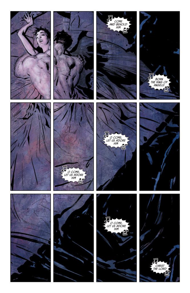
There’s an intensity to this issue that we haven’t yet seen in Batman/Catwoman. It’s almost as though King specifically wrote the issue with Sharp’s gritty style in mind. At times, the script feels a little confusing. King jumps between timelines often. And while the distant future, with an older Catwoman and an adult Helena Wayne, has clear distinguishing factors, others appear quite similar. Yet, the whole issue is tied together by violence. Even when Bruce and Selina make love, it’s with violent passion. King is sowing the seeds for darker times in this series, and it’s the perfect time for Sharp to jump on board.

Art & Colors
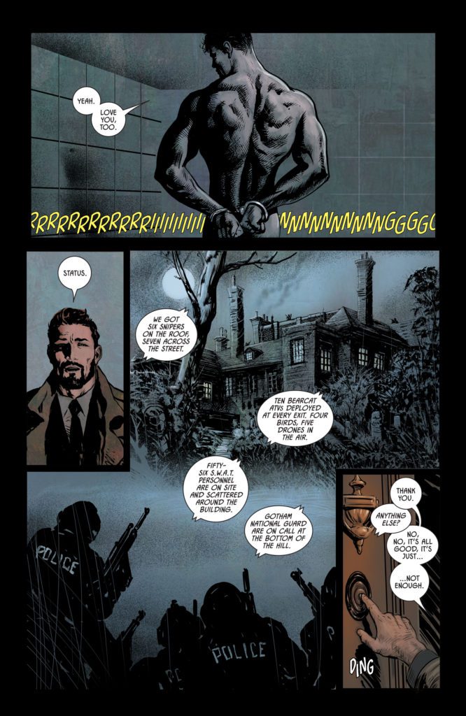
One major thing feels missing in this issue, and that’s the visual rhythm. Though Sharp is a fantastic artist — every panel is breathtaking — readers have gotten used to the subtle visual cues of Mann and Morey. Whether it was Selina’s haircut, or the slight tints Morey assigned to each timeline, readers could tell from a glance what time period a panel was happening in. Batman/Catwoman #7 requires a more careful reading. Not to say that there isn’t Sharp’s own visual rhythm, but that it’s different and new to readers.
Yet all of this is actually a result of something quite exciting. Sharp makes no effort to copy Mann or Morey’s style. No, this issue is unmistakably the work of Liam Sharp. His gritty style and his colors that almost seem to glow are all welcome additions to this series. And we get a different side to the characters. Where Mann’s old lady Selina was regal and refined, Sharp’s feels like the danger is bubbling just beneath the surface. And so, even the weaknesses to this comic’s visual storytelling are its strengths. Readers may take a while to get used to Sharp’s subtle cues, but once we do, we’ll have two of the best artists in the industry, each telling this story in their own uninhibited style.

Lettering
Cowles’ lettering is simple but brilliant. He pushes word balloons into the far corners of each panel, not only giving room for Sharp’s figures but for his atmosphere as well. It makes the characters seem powerful. There’s a margin around them, nothing dares go near them. But it also makes them seem lonely. Even as Bruce and Selina grab ahold of one another, the dialogue in the scene keeps its distance, making an intimate scene also feel like a desperate grab for attachment from two lonely people.
In one scene, Gordon describes a grisly crime scene that involves a chimney. Brilliantly, Cowles stacks each word balloon, one on top of the other. It makes Gordon’s dialogue look like a chimney too.
While Batman/Catwoman #7 does feel like a bump in the road in some ways, it’s also an exciting new chapter for the series. This issue suffers from some of the normal growing pains of a series taking on another artist. Yet, many of these issues are also a result of Sharp working unapologetically in his own style. Which, for everyone reading this series, is very exciting news! Batman/Catwoman #7 is out from DC Comics September 7th at a comic shop near you!


