Maria Llovet’s blood filled story of Eva’s slow descent into a world unlike her own maintains a rhythmic heartbeat that’ll keep you on your seat until its final page in BOOM! Studios’ HEARTBEAT #2.

Make sure to check your heartbeat with our review of the previous issue. Or if you’d fancy a look at the next issue, here’s an exclusive preview.
A Heartbeat That’s Slow And Steady
Llovet’s style of storytelling in Heartbeat is different them most other comics out there. Being the storyteller and the artist gives her the freedom to plot out her story at her own speed with however much dialogue she wants. Using this to her advantage, Llovet puts a heavier emphasis on her visual elements, expecting it to carry the brunt of what’s happening. That’s not to say it isn’t heavy with dialogue at points. But, when Llovet adds dialogue, she does for the furtherment of the plot, not just to hit a word count.
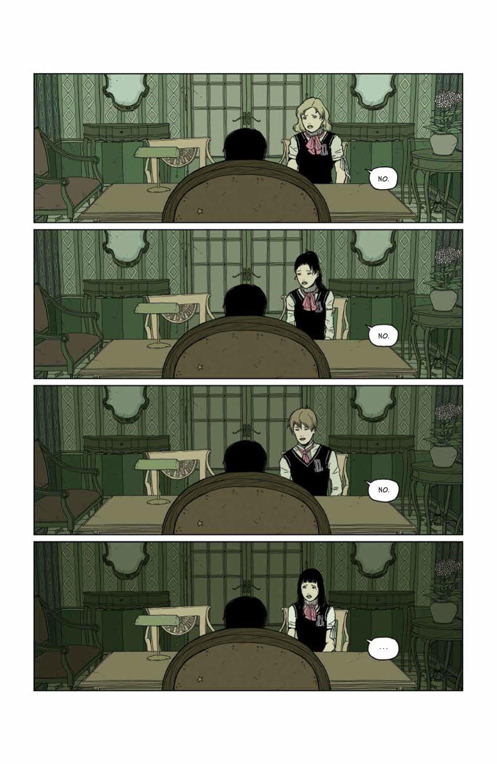
Heartbeat’s storytelling can feel slow to some, but to those who enjoy a slow burn, Llovet achieves said burn perfectly. A scene that perfectly encompasses this is when the detective who is at the high school questions the kids. Instead of having a few pages consumed of the Detective questioning multiple kids, Llovet joins the conversation towards the end. By starting this segment with the end of the interrogations as the Detective asks if the students have anything else to add.
Furthering the point of keeping only what’s necessary on the page; Llovet only shows four students answering, besides Eva — thus giving the reader the feeling that these characters might be as crucial as Eva, or factor in later on. But that’s not all. Whereas the other students give a hard one bubble “no,” Eva’s response differs. This small studder may not seem like much, but with this, Llovet elegantly shows how far Eva has strayed since we met her in Heartbeat #1.

Passionate Art
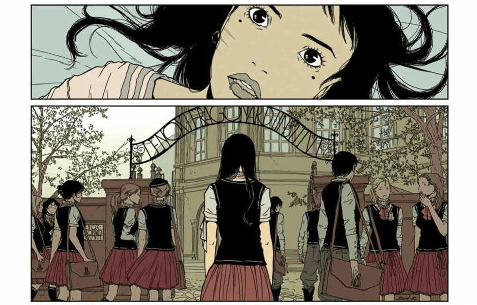
In Heartbeat #1, we spoke on Llovet’s panel rhythm, as she kept the pace with same-sized rectangular panels while adding in varying sizing to “beat” faster or slower. This heartbeat panel structure can be seen during issue two, with its inclusion helping amplify the tension. Much like the writing, no panel feels wasted when it comes to adding to the overall story. In some instance’s Llovet includes Eva just wondering around, but during these moments, the silence/inaction says a lot on her character.
The pages seen throughout Heartbeat #2 show how Llovet’s range of palette works in tremendous harmony, with most pages mirroring colors from the real world. Some instances are bright, yet never too bright, while the same can be said on the opposite spectrum of colors. This sense of realism helps the haunting story being told in Heartbeat by making the images that much more eerie.

Written in Blood
Llovet’s Heartbeat was originally in Spanish and translated into serval different languages later. With this in mind, BOOM! Studio’s English version needed a translator, that being Andrea Rosenberg. It’s hard to say how true to the source it is, as I haven’t read the original release. But, in no moment does anything seem off in a translation sense. As Heartbeat #2 relies more on visuals than dialogue, it helps that AndWorld Design remains on lettering. In the previous issue, AndWorld Design was able to maneuver the dialogue bubbles around what was transpiring in the panels. Luckily they can do the same in the second issue.
A Heartbeat That’s Slow, But Not Bradycardia (Conclusion)
Much like its first issue, Heartbeat #2 is hard to recommend to just anyone walking into the shop. The themes presented throughout are known and shown in western media, yet in a manner that’s more mature and can be hard to process. Those themes and the fact that Llovet takes her time to tell her story may shy readers away. Yet, if all those sound like your cup of tea, then you’ll have one mighty fine drink (comic) in your hands!
Time To Check Your Heartbeat
Have you enjoyed the slow-paced tale of Eva that Llovet is crafting so far? Let us know down below!

