

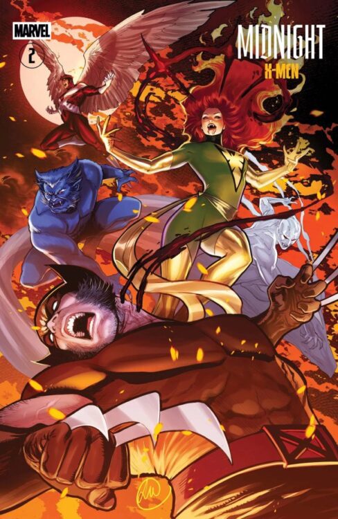
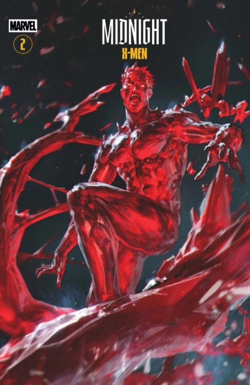
Acclaimed writer Jonathan Hickman and artist Matteo Della Fonte continue their grim, blood-soaked new take on Marvel’s beloved mutants with Midnight X-Men #2. Featuring color art by Arthur Hesli and lettering from VC’s Cory Petit, this 2nd chapter shows us how the new mutant vampire plague began – and the sins Scott Summers committed at its beginning. With a stellar romantic and gothic-inspired script and beautiful, atmospheric visual work, this second issue escalated this series with immense emotional stakes and a sense of dreadful, romantic horror.
“Eat. Prey. Love.”
Writing & Plot
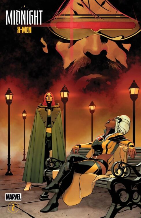
After introducing us to the fragile peace among vampires, Empyres, and mutants in the first issue, Jonathan Hickman takes us back to how this cold war began in the pages of Midnight X-Men #2. There’s no way to get into the meat of the plot itself without talking about spoilers, so just know that a legendary vampire from an ancient line is involved, and Scott Summers has *so* much to answer for. Hickman is one of the only writers who could take a concept as gimmicky as “what if the X-Men became vampires?” and not only play it dead serious, but make it one of the most compelling comics on stands right now. Hickman mixes some of the best elements of great vampire stories – the sense of ancient longing, seduction and temptation, and that classic gothic romance – and blends them into the world of the X-Men beautifully. This issue in particular focuses on Cyclops’s place in this cold war among mutants, vampires, and Empyres, and what happens feels especially fitting for his character. There’s a sense of woeful helplessness that he’s placed under that isn’t his fault, but is still infuriating to watch. You know, like a lot of Cyclops moments in X-Men comics. Hickman instills a sense of tragedy and hopelessness in so much of this comic that take it to the next level of being a legitimate horror story; just one with iconic Marvel characters. Hickman’s scripting here is some of the best work he’s done with Marvel in terms of creating an atmosphere and a tone. His dialogue hits hard and leaves us with a constant impression of loss and pain. I would love to see this guy write an actual standalone gothic horror tale.
Art Direction
Aside from Hickman’s storytelling, the element that truly makes the tone of Midnight X-Men #2 is the visual work of Matteo Della Fonte’s pencils and Arthur Hesli’s colors. Della Fonte’s designs feel like proper Giant Size X-Men presented in the modern era, with a sort of smooth cleanliness in the modeling that is absolutely stunning to behold. This is genuinely some of the best X-Men art is the history of the characters; especially Storm and Jean Grey. His sequential direction, with the way his careful panels depict the moments of horror and betrayal really sells Midnight X-Men as a horror story, and help drive home that feeling of loss being presented in the script. The gothic horror tone is perfected by Arthur Hesli’s painted, watercolor-looking color art. He sticks to a palette that reminds me more of art I’ve seen in Vatican City more than what I see in comics – which is fitting since the Catholic Church has a big place in this story’s plot. The pair’s use of darkness and foggy, off-kilter lighting is reminiscent of great vampire films such as Coppola’s Bram Stoker’s Dracula and Robert Eggers’s Nosferatu, but still with a distinct vision. Midnight X-Men is an absolutely incredible looking comic.
Verdict
Midnight X-Men #2 is a phenomenal piece of gothic horror, and the perfect stepping up of the game for this “What If?” series. Jonathan Hickman’s script is both darkly beautiful and tragic, taking influence from great vampire storytelling and mixing it perfectly with the characterizations of these mutants we have known and loved for so long. The visuals from Matteo Della Fonte and Arthur Hesli are gorgeous and tonally spot-on, pulling readers into this mist and blood-filled universe of horror in the Marvel universe. Be sure to grab this 2nd chapter, available now!
