The next big title in the Energon Universe is finally here: G.I. Joe #1 from writer Joshua Williamson, artist Tom Reilly, colorist Jordie Bellaire, and letterer Rus Wooton takes every bit of setup from the past year and ties it together for a new beginning. Where Void Rivals handles the cosmic side of the universe, and Transformers working to tell the story of the Cybertronians, G.I. Joe pivots to tell us the story of what exactly the humans and US government are doing to combat these changes to their world.
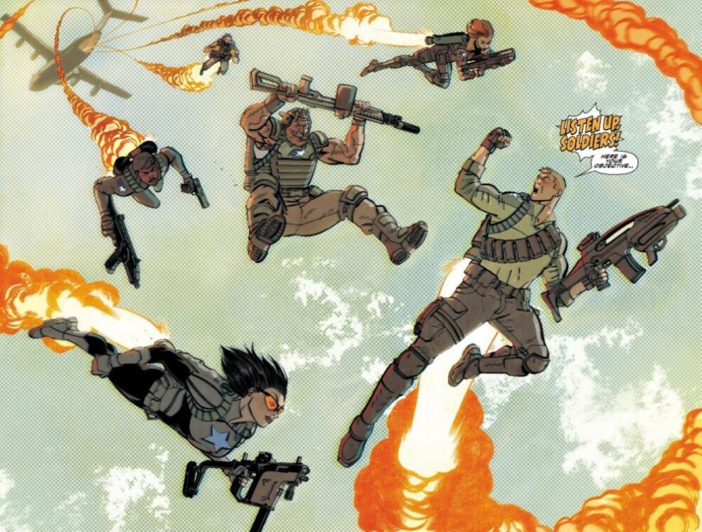
The issue starts with a quick introduction of G.I. Joe. The team consists of Duke, Baroness, Stalker, Rock ‘n’ Roll, Cover Girl, and Clutch. They run a training exercise, but quickly realize that if it weren’t a simulation, they’d be completely and totally outmatched. On the Cobra side of things, we have Destro rallying troops while Cobra Commander tests out the new Energon powered weapons that Cobra has developed. Duke is given a pep talk from Hawk, the general behind the team. He tells him that the team may be outnumbered and outmatched, but says that as long as each member is the best version of themselves, they can succeed. This fires Duke up, and they go to be debriefed on the team’s first mission.
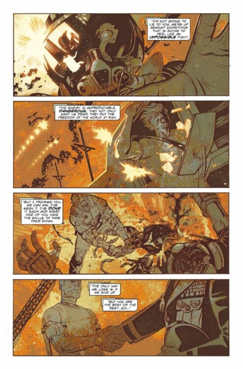
WRITING
A few miniseries have released this year leading up to this issue. There’s been Duke, Destro, Cobra Commander, and Scarlett. Each had a fairly self-contained story that ended on a cliffhanger, leaving the door open for something big. G.I. Joe is that something. It’s impressive how Williamson was able to take most of those loose threads and not only create a self-contained first issue, but also respect the events of each series listed, acknowledging right off the bat that they happened and were crucial to this series’ story.
Every single character is properly introduced as though this is the first we hear of them, but Williamson uses the history crafted by himself and others to enhance everyone. This can be your first interaction with Duke, and he’s presented as a leader with a rough past. However, Williamson puts the issue together in a way where if you have read Transformers and Duke, everything his character does and has been through with his supporting cast feels like it reaches a strong new level that can only grow from here.
It’s a very well-written first issue. All the cards are on the table, it’s well-paced with some fun action, and it poses a couple of questions to be answered later. True to form, it almost has the pacing of a Saturday morning cartoon. We start with a fun action scene used to introduce each individual character with a little bit about their past, and then move onto the nefarious opposition in the form of Cobra with some other shenanigans taking place throughout. Williamson understands what this comic should be. He’s catering to older fans while not alienating a new potential audience. It’s a status quo that feels fresh for old fans, and exciting for new ones.
ART
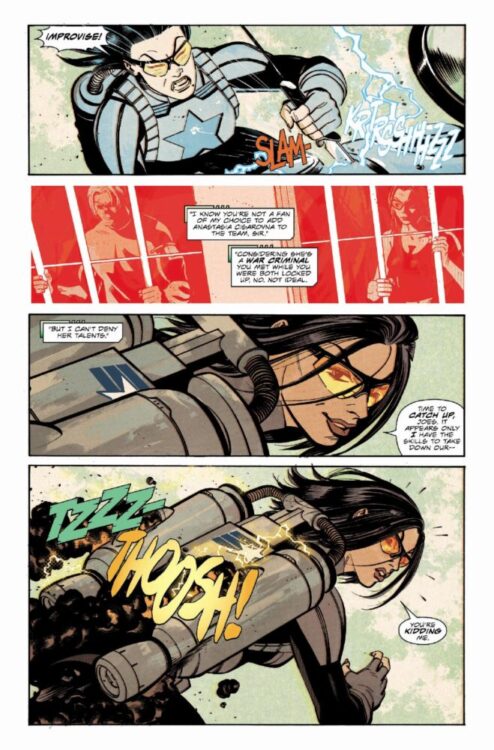
If Williamson sets up the issue as a Saturday morning cartoon, Reilly helps in cementing that look. The art gives the impression that the book is serious in tone. It’s incredibly detailed, and the characters convey a lot through facial expressions and body language. Reilly also adds an animated layer to that. The characters feel expressive, and like they were pulled from an episode of a G.I. Joe TV show. The issue’s action is no exception to this. There’s one part where Duke jumps off a building to grab onto a helicopter, and the entire sequence from the buildup of the run to the action leap carries a suspense that defines the issue. Every sequence like this evokes some emotion that keeps you itching to turn the page.
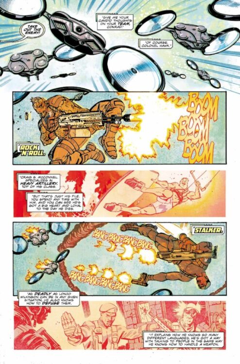
The paneling is also really well thought out. More action-oriented scenes are choppier with smaller panels, while scenes featuring weighted conversations have taller and wider panels to give each character more space. It really helps connect us to the characters, because it feels like there’s room for the reader to really understand this team. A really clever thing here too is that when new characters are introduced, there’s a panel or set of panels after that establish the character or show a glimpse of their past. It helps in immediately connecting the reader to them, as well as instantly showing what part of their whole deal is.
COLORS
One specific fight scene about halfway through the issue really stands out, featuring a new character named Risk. He gets into a club and starts a fight, and then is called to retreat by some higher power. What makes it interesting is that it’s completely done in yellow and purple coloring. The placement of every color felt really special, and Bellaire uses that to immediately tell us something about this new character. The purple parts seem to represent what is in Risk’s control—what he anticipates and what he is determined to do. The yellow represents uncertainty. While it could probably just pass off as the club’s strobe lighting in-universe, the panel placement of each color felt very intentional. When Risk is searching for someone, it’s yellow. When he fights, it’s purple. Near the end of the scene, the yellow fades to a softer shade as Risk gets the message on his watch to leave, which is the only thing that appears in red. The entrance of a third party. It tells us right off the bat that the character is meticulous and collected, but can be impatient and caught off guard.
Bellaire also does a great job creating parallels between G.I. Joe and Cobra. There’s this great specific double page spread where Duke is on the left with blue shading covering him with a stripe behind him. On the same page on the right side stands Destro, covered in red with a red stripe behind him. It’s a simple contrast, but easily introduces us to the opposing forces, clearing up and questions about it.
LETTERS
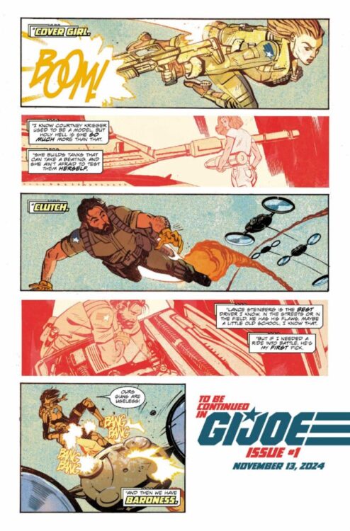
The issue’s lettering really tops off the aesthetic. Wooton puts extra work in to give that cartoony feel, introducing each character with their own logo, regardless of their importance comparatively. The Joes all get logos in the same font, with Destro and Cobra Commander getting special ones reminiscent of their series logos. It keeps everything simple to keep track of doesn’t leave anyone out, no matter how small.
The onomatopoeia placement this issue is also very well done. In the scene with the helicopter mentioned earlier, there are sounds coming from above and below the chopper. The sounds above are the blades spinning, and those below are from the machine gun attached to it firing. The effects are placed accordingly, and strongly differentiates what exactly is doing what. It’s a very clear vision that Wooton executes well.
CONCLUSION
The issue has a clear mission and completes it efficiently. It has to introduce you to a new band of characters while not alienating those who already know the franchise inside and out. It has to sell you on a story that feels important enough to be told in the same universe as giant robot aliens and space wars. The team involved in making this checks every box here and impressively displays a debut issue that feels like a necessary and welcome addition to Skybound’s Energon Universe.

