Kate Bishop is one or Marvel Comics’ most charming characters. She’s always in over her head, yet also seems to constantly have a handle on things. She’s confident and terrified. In a nutshell, Kate Bishop is a great example of a truly human character. She’s a ball of paradoxes and contradictions, all delivered with a wink. Luckily for Kate Bishop fans, Hawkeye: Kate Bishop #1 writer Marieke Nijkamp, penciller Enid Balam, inker Oren Junior, colorist Brittany Peer, and letterer Joe Caramagna understand her character. They bring us a delightful first issue, diving right into the quirks that make Hawkeye so relatable.

Writing
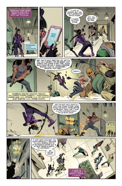
We open on Kate Bishop texting, as she’s investigating the headquarters of a shady operation she’s been tracking. Throughout, Nijkamp has Kate talk to herself, pretending it’s a two-way conversation with the henchmen she’s putting down. Normally, all the information Nijkamp is conveying would feel like an exposition dump. We learn that Kate is thinking of heading back home to New York, that she feels nervous yet like it’s the right thing for her. We learn all about her friends’ various responses to her delaying the trip. But Nijkamp packages all of this information in such a funny way, that it all comes through so smoothly. Because every line is delivered to a goon with a fist in his face, we take it all in with a chuckle.

Art
There’s so much that is done well in Balam and Junior’s artwork. They capture the jokey-yet-sincere nature of every scene. But, at one point, Nijkamp’s script jumps around in time, mid-page. Balam and Junior give no visual indication in their page layout that these scenes are different. As a result, some pages are quite confusing and take a couple reads. But this doesn’t take away from the actual beauty of the scenes they create. Their characters feel big, body shaking emotions, but then devastate the reader with their quiet, subtle dismissiveness instead. Balam and Junior joyfully oscillate between the theatric and the understated.
Coloring
First, Peer shows us how much Kate stands out in the world of private investigations. She’s a bright purple figure against a grey background. But when we see Kate go to the Resort Chapiteau, everything changes. The whole scene is lit up in vibrant colors. The transition between the two makes us feel like the lights have been turned on in a dark room. Peer makes us feel like Kate, exposed and out in the open. When we get our pages that jump around in time, it’s Peer’s coloring that acts as our one cue that these scenes are different. The past scenes have a yellowish tone to them and an orange background. When things kick into gear in the present, the same orange background pops up. Peer shows us that these characters have a rhythm that they fall back into around each other.
Lettering
Hawkeye: Kate Bishop #1‘s script is chock full of wild sound effects. And whether its the “FWOOOSH” of an arrow, taking us from one panel to the next, or a “SWEEP” sound effect that almost seems to push a henchman over itself, Carmagna delivers. The story involves a lot of texting. We see caption boxes throughout that are part of a group text that Kate is a part of. With all the characters, it could get confusing quick. But Carmagna color codes each caption box to each character, and places their name in small grey font at the top, every time a new character joins the conversation. It’s a simple way of keeping the reader focused and on the same page.
Marvel’s Hawkeye: Kate Bishop #1 is tons of fun. This creative team captures the “goofy yet capable” nature of their main character. Pick up Hawkeye: Kate Bishop #1, out from Marvel Comics November 24th, at a comic shop near you!

