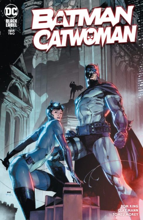
There’s an aspect to DC Comics’ Batman Catwoman #2 that might feel predictable. But that’s because writer Tom King, artist Clay Mann, colorist Tomeu Morey and letterer Clayton Cowles place good storytelling over “shock and awe.” There are definitely moments that’ll shock readers, but so much of this script is the inevitable next step of the explosive first chapter. This issue is hard to talk about without spoilers for Batman Catwoman #1, so be warned, some spoilers ahead for the first issue of this great new series!

Writing
Just like the first issue, Batman Catwoman #2 is more about Joker and Catwoman than it is about the Bat. In fact, Batman is a small player. He’s the eye of the storm, as Joker, Phantasm and Catwoman bring down chaos all around. We’re seeing the fallout of Andrea Beaumont coming to town and Selina stealing Jimmy the Lion’s necklace. King has us following everyone but Batman. Batman appears only to try and piece together everything we’re seeing all the other characters do. This isn’t a script with secrets. At least not secrets kept from us. It’s one where King gives us all the information so that we can watch Batman clamber around in the dark.
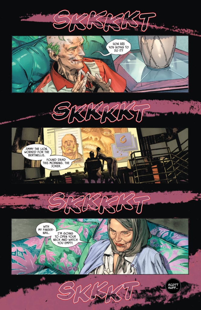
And with Catwoman and Joker’s conversations in the future, everything has some distance. When Catwoman and Joker talk about the night they almost killed each other, she says “I knew you’d make it.” “You say that now,” Joker replies. “You can say anything when everything was so long ago.” That’s the purpose of these scenes. It feels like two people returning to the scene of the crime. It somehow minimizes present day events while also creating a mysticism around them. What changed them so much? So much that Catwoman and Joker would meet back up, years in the future, still talking about it? That’s what Batman Catwoman #2 begins to do: show the chaos that’ll leave scars for decades to come.

Art
Much of the mysticism of Batman Catwoman #2 comes from Mann’s depiction of characters. It’s incredibly rare in this issue that we see characters straight on with their faces unobscured. We either see half their face, see them in profile or their faces are blurred by shadows or windows. This is particularly true of Catwoman and Joker. It’s as though they’re scared to look at the reader. Like they’re guilty for everything that’s happened in the previous issue. And Mann continues to draw a connection between these two. One moment where we see them both, face on without anything in the way, they look nearly identical. Selina looks crazed and scarily similar to the Clown Prince of Crime.
And Mann’s depictions of Bruce look almost identical to one another. He’s got the same set jaw we see under the cowl, even if he’s just eating dinner with Selina in civilian clothing. Through this, Mann shows us that Bruce is beginning to worry about Selina. He’s still got his guard up around her. So, while the cowl might come off, the suspicion in his eyes never does. He’s always on the job in this issue, never taking a break.

Coloring
The first issue had a color scheme of purple, green and red running through it. Morey continues that color palette but adds in a few more symbolic hues. We still see the kinship between Catwoman and Joker. Old man Joker’s home is covered in greens and purples, and old lady Selina is wearing a light purple cardigan. In fact, Selina is often shown garbed in different shades of purple. In the future, old man Joker is wearing a red shirt, like the years of violence that hang around his neck, but in the present he’s gleefully sucking on a red candy cane, drinking the violence in.
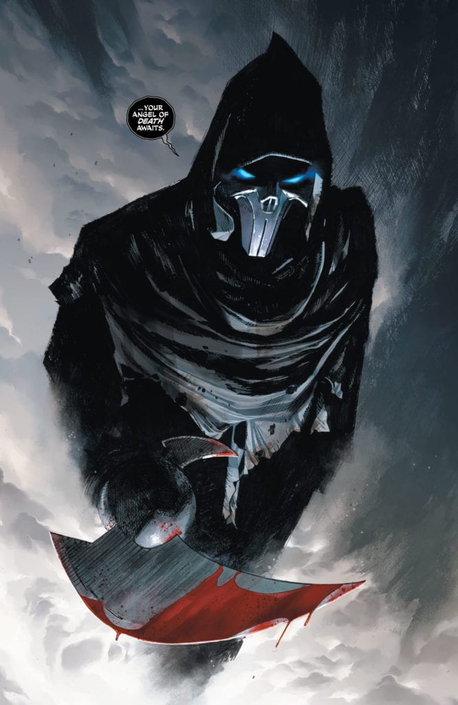
But Morey also throws in shades of blue and orange. A blue moon covers the page in its light. Batman and Phantasm’s eyes glow blue. And all of the major plot devices are depicted as orange or yellow. Jimmy the Lion’s gold necklace, the bright light of Batman’s signal, the orange hued scene of a fateful night at a bar. These are all the things that drive the plot forward. Morey hones us in on the most important scenes and the most important objects. Morey is creating a work that could have a key or legend for it. Every color is there for a reason, steeped in storytelling relevance.

Lettering
Cowles brings so much rhythm to this script. He breaks up every line into small portions. It gives room for the art, but also adds a sense of silence. We hear the pauses between each sentence and the quiet that surrounds their dialogue. It’s as though each thing said is piercing through a layer of silence. And the sound effects don’t jeopardize the silence of the issue either. The “PWFF” noise of bullets hitting a chair is colored similarly to the upholstery. And while the “AAAAAAAAHHHH” of someone being stabbed stands out in yellow, it’s small enough on the page to look muffled and distant.
Cowles also attains a sense of silence by hollowing out his sound effects. Some are just outlines. The “SKKKKT” noises across the page don’t get in the way of the splash of purple blood. As big as the letters are, their transparency makes them still seem quiet. This way, noises can catch our eye but still feel restrained. Overall, Cowles gives the issue a tone of spookiness. It’s subtle, the quiet sizzle of the fuse before the bomb goes off.
DC Comics’ Batman Catwoman #2 might be predictable, but it will still keep you on the edge of your seat. It’s no less chaotic for its predictability. King, Mann, Morey and Cowles are writing a love letter to comics and they’re not letting twists or tropes get in the way. They’re writing a quality story that takes its own consequences seriously. Pick up Batman Catwoman #2, out from DC Comics January 19th, at a comic shop near you!


