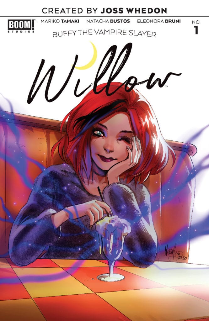
Buffy the Vampire Slayer: Willow #1 out this week from Boom! Studios takes the beloved character on a new path, while also giving an amazing portrayal of loneliness and feeling lost.

Buffy the Vampire Slayer: Willow Story
Buffy the Vampire Slayer: Willow #1 follows Willow Rosenberg after the Hellmouth 2019-2020 event, and as she attempts to distance herself from what happened in her past. She goes on a semester abroad to England and must deal with the feeling that there is no one she can talk to. Written by Mariko Tamaki, illustrated by Natacha Bustos, colored by Eleonora Bruni, and Lettered by Jodi Wynne, this issue does a beautiful job of capturing the essence of loneliness. It allows for an wonderful insight into Willow’s character before her new adventure kicks off.
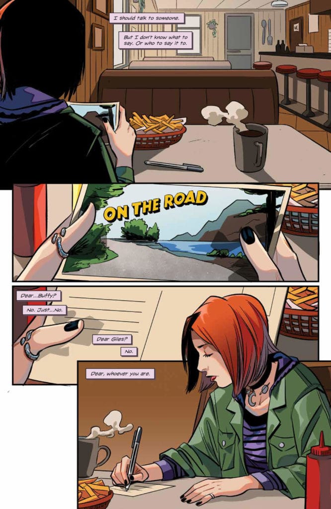
Buffy the Vampire Slayer: Willow #1 features amazing internal dialogue from Willow that captures her feelings of loneliness and distance from others after she had recently suffered a great loss. Mariko Tamaki strings together sentences that flow easily and make Willow’s character clear to the reader from the very beginning of the issue. The pacing is slow enough to thoroughly develop Willow’s character, but not so slow that it bores the reader. The book picks up towards the end of the issue to excite the reader for what is to come.

Art
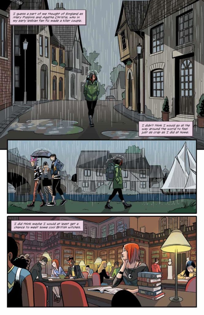
The pencils and inks are the most outstanding part of this issue, because of how Natacha Bustos frames the panels. There are several instances where Bustos takes advantage of the left-to-right reading nature of western audiences and how they observe panels. Many panels have people socializing in groups on the left side of a panel, only to have Willow by herself on the right side. This technique may go unnoticed upon a first read, but going back over the panels it is clear that Bustos intended for readers to observe everyone else in groups around Willow and use that as a contrast to her being alone once they eventually see the main character. This technique results in some truly outstanding images that emphasize the loneliness of the main character even more than most of the internal dialogue of Willow.

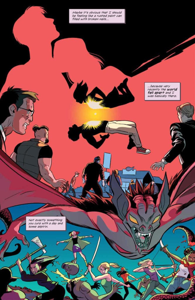
The pages of Buffy the Vampire Slayer: Willow #1 is filled with a large variety of colors making the pages pleasant to look at and adds to the wonder of this fictional world in a few instances but does not offer anything notably spectacular. The colors are done very well, but nothing done by Eleonora Bruni necessarily makes the reader pause in appreciation. That being said, there is a very beautiful splash page near the end of Buffy the Vampire Slayer: Willow that exhibits the raw talent of Bruni, but the rest of the issue fails to have any outstanding moments that rely heavily on the coloring.
Jodi Wynne does a fine job of lettering the issue, allowing the pace of the story to flow as intended. There are no odd choices in lettering that would cause the reader to pause, but there is nothing especially noteworthy about the lettering that would give it a high rating. However, the lettering still does a wonderful job of complementing the rest of the issue, and allows it to come together to be truly enjoyable read.

Conclusion
Overall, Buffy the Vampire Slayer: Willow #1 is a thrilling start to the new journey Willow is embarking on. It raised questions to be answered, used framing techniques to tell parts of the story non-verbally, and had a wide variety of colors on nearly every page. These all came together to form an impressive issue that anyone who is a fan of Willow should definitely read.

