Maria Llovet’s 2015 Spanish comic about a dark high school filled with bloodthirsty kids, and titled moral codes – elegantly dubbed HEARTBEAT – hits your local comic shop this Wednesday in English from BOOM! Studios.

Art With Rhythm
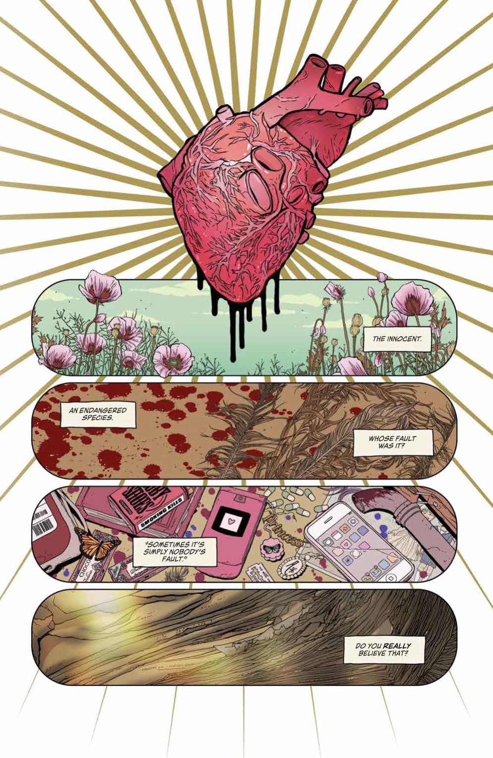
Heartbeat #1’s opening page (seen below) showcases Llovet’s great sense of panel rhythm and foreboding imagery. A large heart covers the top third of the page with motion lines spilling out from the middle, giving the enlarged organ a certain beat; a “heartbeat” if you would. The panels that follow show quick shots of things that have happened or may. Each panel that follows the heart feels as if it’s in tune with said organ.
Throughout Heartbeat #1, Llovet keeps the panels rectangular, varying the sizes for certain moments. But for the most part, she keeps this panel scheme to portray a slow build-up. That is until the end, where she picks up the pace with smaller rectangle and square panels, simulating a higher heart rate that Eva feels as she runs from a particular scene.
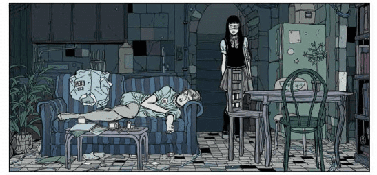
In addition to art, Llovet does the coloring for Heartbeat #1, which features scaled-down bright colors. At moments these colors pop, but never enough to draw the attention away from the art that adorns the page. Llovet’s art style is extraordinary. Be it busy pages that include a ton of miscellaneous items in the background, or clean backgrounds; she makes both look phenomenal. The style she brings is reminiscent of Manga, as is the story.

Steady is The Tale
The trend of being akin to Manga continues with Heartbeat #1 story, as it takes its time to slowly build the world and main character. This slow build-up of Eva’s daily life, and the world help crescendo the life-altering moments that transpire. Throughout the narration filled panels, we learn of her day-to-day struggles and the relationships she has with fellow classmates. These moments further the impact of events that will happen later on, giving the chest-pounding last few pages more weight.
At first, this slow-paced storytelling feels like the first steps of another slice of life, Manga. Especially with the schoolgirl outfits, and our main character is sporting an eye patch. These clearly being a nod towards a multitude of Manga/Anime. Yet this pacing matches the rhythm she sets with the paneling throughout. Granted, this “take it slow” approach could be a deterrent for readers that went in expecting a blood bath, or something near that idea. But, for the story Llovet is telling, it works gracefully.
Lettering comes courtesy of lettering studio—Andworld Design. Heartbeat #1 is never too heavy with its dialogue, plus Llovet keeps enough space in her panels, making the placement of dialogue bubbles/narration boxes easy. If a single panel has only one bubble/box, the placement of the next panels box will be on the opposite side, essentially helping guide the reader’s eyes across the page.

A Heartbeat Away
Llovet’s story of a high school with a dark secret, love, horror, death, and the moral dilemmas Eva has to choose is a hard comic to recommend. Is it because Heartbeat #1 is bad? Hell no. As you can see above it’s amazing. Alas, the slow burn, the use of some haunting images and the twisted story being told feels as if it’s for a niche group. If you’re part of said group, Heartbeat #1 will get your heart pumping.
Translation Notes: Heartbeat #1 was originally published in Spanish with a French and an Italian version following. The English translation is handled by Andrea Rosenberg. As a frequent reader of Manga that has seen a varying amount of good and bad translations, Rosenberg’s work falls under the great category. No sentencing, wording, or punctuation seemed off, nor did what anyone was saying not translate well.
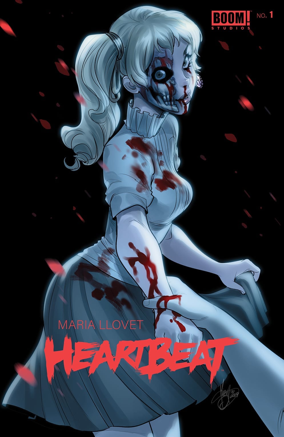
Cover Story: Llovet’s cover is amazing for its simplicity and design. But I’m a sucker for Mirka Andolfo, who did an amazing cover! Well, you could call them two different covers. But the statement remains, they’re awesome!


Dear Reader
Did you read Heartbeat when it originally released in 2015? Or is this your first time reading it? Either way, let us know below!
If you want more of her art check out BOOM! Studio’s Faithless.

