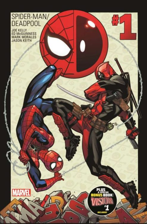
SPIDER-MAN/DEADPOOL #1, originally released on January 06, 2016, began one of the best team-up series in recent comic history. Written by Joe Kelley and illustrated by Ed McGuinness, Mark Morales, and Jason Keith, this inaugural issue pits the unlikely bedfellows in an unfortunate locale: the pit of Hell. The two find themselves pressed against once another in Spidey’s own webs, held captive at the mercy of Dormammu. We invite you to kick back, relax, and enjoy the hilarity as they maneuver their way out of this sticky situation.
Story
It isn’t every day that one finds themselves in the grasp of a extradimentional overlord, but then again, Spidey and Deadpool aren’t your everyday superheroes. Our arachnid friend is pretty annoyed at having to work with someone he believes to be morally depraved, but the mercenary couldn’t be more thrilled.
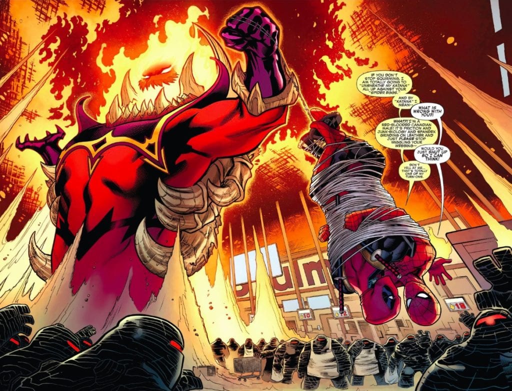
Using a combination of wiggling and bickering, the two heroes manage to break the webbing with one of Deadpool’s knives. But with an army of Mindless Ones behind them, it looks like the unlikely pair will have to work together despite their differences.
As the kick-off for a Spider-Man/Deadpool team-up book, Kelley does not disappoint. We’re treated to one of the funniest interactions between the two motormouths. The issue, while not offering up a super strong storyline, provides much-needed humor and sets the foundations of the heroes’ ongoing collaboration in the issues that follow.
Artwork
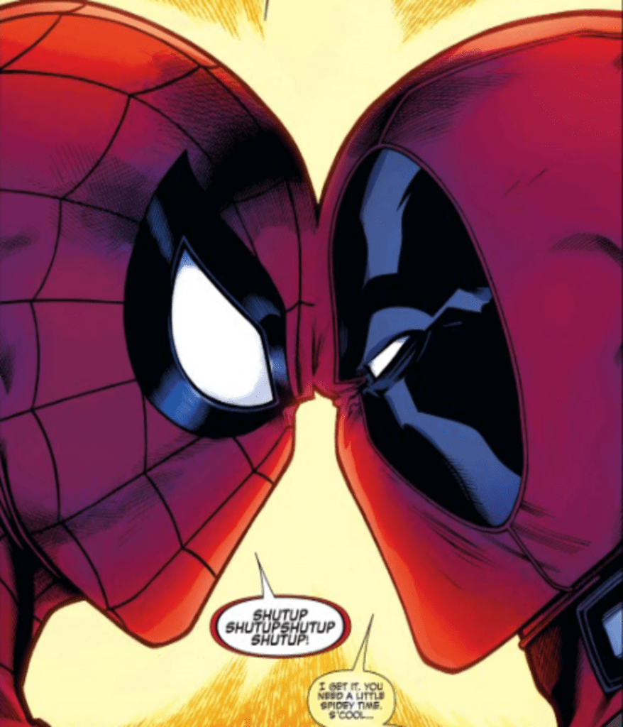
McGuinness’s penciling, along with Mark Morales’s ink work, Jason Keith’s coloring, VC’s Joe Sabino’s lettering were each integral parts of this issue’s amazing artwork. The characters are highly detailed in this issue, from the webs on Spidey’s spandex to the realistic blade on Deadpool’s weapons. The coloring uses impressive gradations in the reds on our heroes’ suits to give readers a sense of texture.
The lettering is particularly entertaining. Using various colors and sizes for the squabbling heroes, readers can almost experience the annoyance Spidey feels at having to work with the mercenary.
Comic Cover
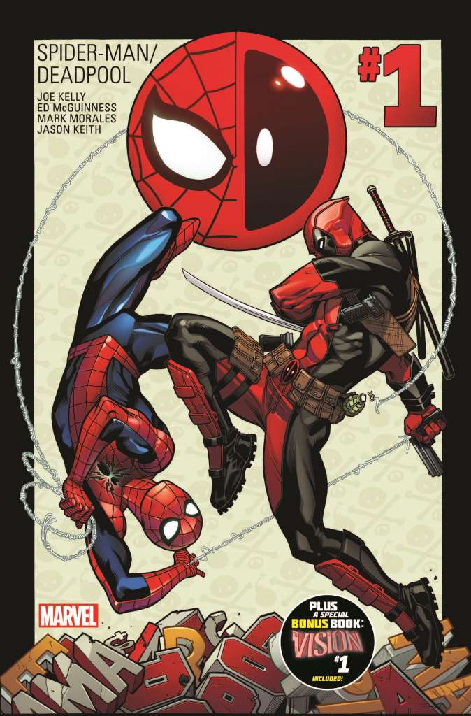
The main cover for the comic features a symmetrical illustration of the two heroes. It’s an image that reminds one of the Yin-Yang symbol, which perfectly expresses the twosome’s relationship.
Conclusion
SPIDER-MAN/DEADPOOL #1 is a fun issue with plenty of laughs. We encourage you to revisit this book during this time.
What did you think was the funniest part of the issue? Let us know in the comments below!

