Nightwing Annual #3, out this week from DC Comics, tells a Nightwing story that longtime fans will love, in that it tells a tale set 18 months in the past before the infamous “Ric” storyline began. This is Dick Grayson at the height of his powers. Dan Jurgens, as a writer, shows his worth as perhaps DC’s most underrated scribe, always sent into course-correct stories that have spun away from the core of who the characters are. He is joined here by artist Inaki Miranda, colorist Nick Filardi, and Andworld Design on Lettering. Together, they weave a tale that thematically touches on a number of the stories told about Dick Grayson over the last decade, including the Court of Owls, crimefighting in Blüdhaven, and involvement with international spy agencies.
Writing
Fans who have missed good ole’ Dick Grayson will love this issue. Jurgens gives us the Dick we’ve all missed since he was shot in the head by KGBeast. This is the fun, wise-cracking Nightwing, confident in his own skin and in who he is. It begins at the Condor base with the Condors watching footage of Condor Red’s encounter with an amnesiac Ric in Nightwing issues 67-68. The issue is mostly a glorified flashback to the Condors’ attempt to recruit Nightwing into their organization 18 months beforehand. It ends with their realization that this amnesiac man in the Talon outfit from Nightwing 67-68 was in fact Nightwing.
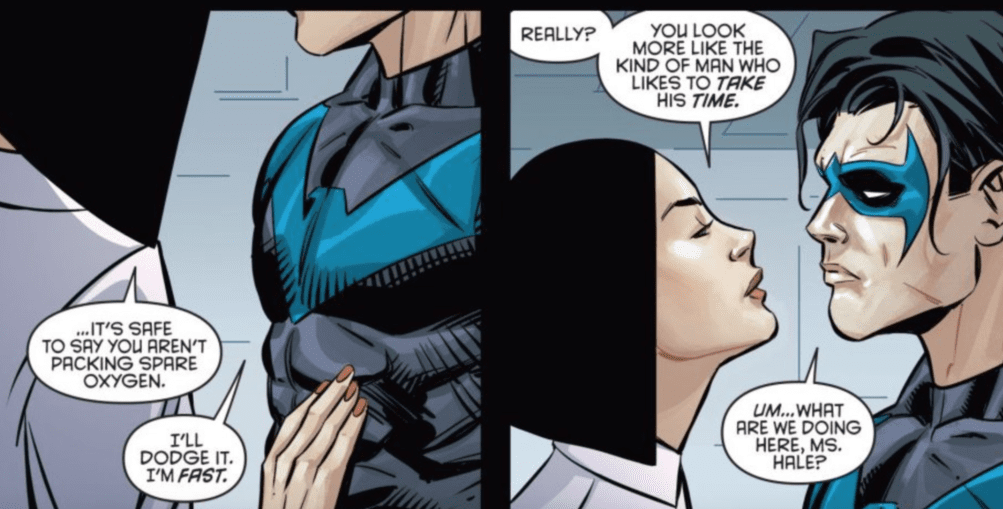
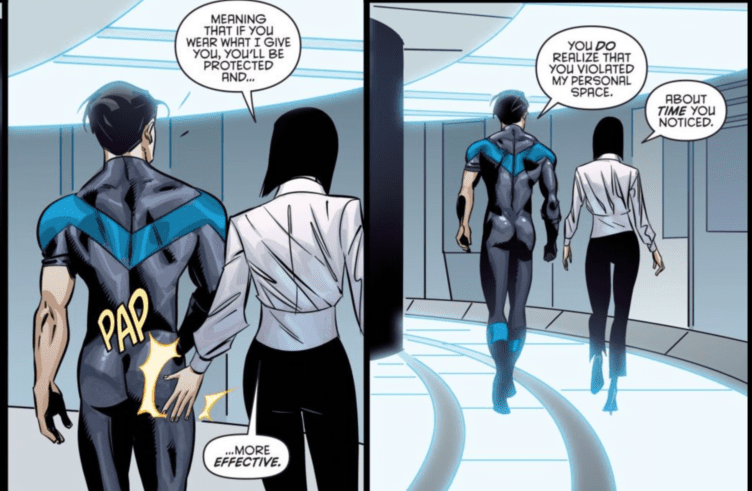
Jurgens can’t help himself, though, when it comes to playing up the sexual objectification of Nightwing, specifically the obsession with Nightwing’s ass.


I mean, what in the actual hell? Nothing like some humorous sexual harassment in the age of #MeToo I suppose.
Art
The art in this issue captures the energy and action of this issue. Miranda conveys the quickness of the characters’ actions and appropriately fits the high octane nature of what a Nightwing book should be. Whether it’s Nightwing’s acrobatics, the Condors flying through the air, or even the fight with Blockbuster, the art helps to capture the fun, action-packed nature of each scene.
Coloring
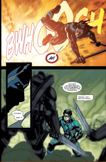
Filardi’s colors are solid in this issue. Any page featuring Dick and Condor Red really “pops” with the contrasting blue, black, and red from the characters’ costumes. Filardi can capture the nuances of the various background colorings needed to convey Nightwing stuck in a cloud of poisonous gas or Nightwing caught in an explosion.

Half of this comic is actually just panels of either of those things, with a brief interlude at the Condor base.
Lettering
The lettering does a good job not only allowing each character’s voice to come through but more importantly, it helps to communicate the action and sound effects (as indicated by the lettering for the explosion above). It helps to shape this issue into a fun, action-adventure (exactly what Nightwing should be) with every “ugh!” and “gyahhh!”
Conclusion
Nightwing Annual #3 was an overall fun and action-packed issue, albeit a bit “by the numbers.” Again, it was good to have a story with the Dick Grayson we all love and miss. It seems to be setting up a future confrontation with the Condors, so I’m imagining Jurgens may be paving the way for stories with Dick being involved in a world of intrigue and spies.

