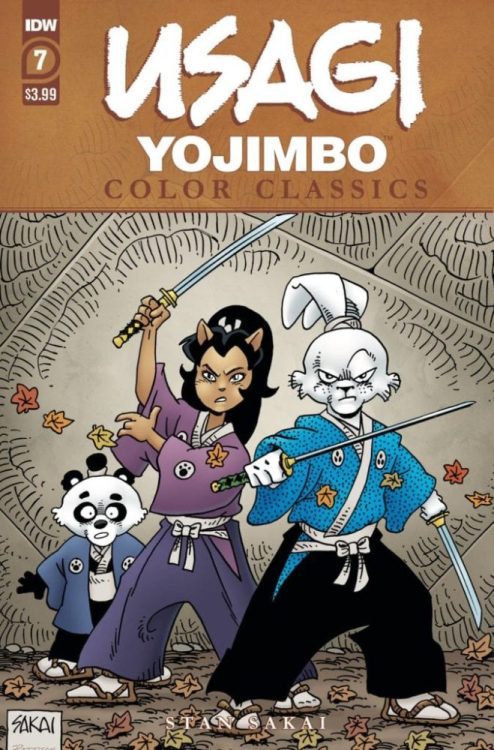
Usagi Yojimbo Color Classics #7 is this week’s finale to IDW’s republishing of the very beginning of the franchise, as Stan Sakai’s original story gets a dynamic recontextualization with Ronda Pattison’s colors.
Usagi Yojimbo Color Classics #7 On Pacing
Unlike the last issue where two separate stories are necessary for the reader to get an idea, this time, only one is okay. Featuring the debut of semi-regular character Tomoe and her lord Noriyuki, their appearance at an attack shows how dire this issue is unlike others. This fast pace is to the point of being in the background where some villagers don’t even notice the fleeing pair. Fortunately, their encounter with Miyamoto Usagi allows them levity. When Tomoe takes the time to explain their circumstances to Usagi after attacking him, it’s an expert use of slowing the pace to care about these characters. Not to mention when Usagi helps Tomoe and Noriyuki out, the reader sees his motivations considering who wants to kill Noriyuki, the killer of Usagi’s own master, Lord Hikiji.
Art
Stan Sakai certainly presents himself as a highly capable storyteller in Usagi Yojimbo Color Classics #7. In addition to his above writing, his artwork, when it comes to action sequences, is of high quality. There’s a genuine sense of both movement and point-of-view throughout the pages. Thanks to great use of both panels and layouts, there is consistency in how the characters interact. Despite the moving panels, it doesn’t feel like a camera is switching from one point to the next. Rather the changes feel natural as they represent where a character is standing. Even when another panel comes up, it feels like the characters did not move. Not to mention the action sequences have a real sense of speed and weight, as shown when Usagi swings his swords.
Ronda Pattison, meanwhile using coloring to make some of these actions have even more weight. The usually stilted faces of Stan Sakai’s early artwork designs are given more definition thanks to this. This allows them to look more expressive than they normally are. Another appears in a crucial battle; the background features a gradient that changes from a calming blue to an alarming yellow to signify a higher intensity. Still, when it comes to the lettering, the colored wordmarks can blend in without the outlines.
Usagi Yojimbo Color Classics #7 Is Kurosawa-Style Cinematics
Usagi Yojimbo Color Classics #7 retains its sense of urgency in pacing with an enhancement in action. This issue lives up to its name of “Classics” by ensuring its sense of urgency with color to further express this. Readers might look a little disappointed by a different art style, unlike the cover, but they’ll still get something out a samurai story evoking the classics like Akira Kurosawa – one that will leave audiences satisfied for future stories in IDW.


