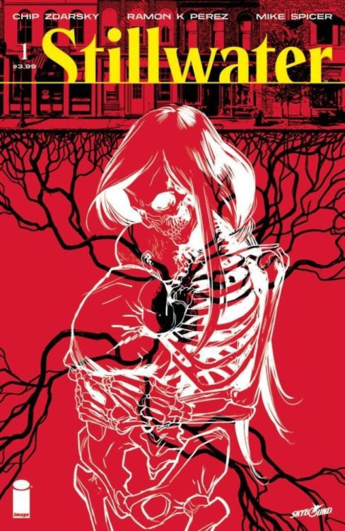
STILLWATER #1, available from Image Comics on September 17th, begins a new series about a down-on-his-luck stranger answering the call to a mysterious town where death has taken a permanent holiday. Written by Chip Zdarsky, this new story feels right at home as a potential Twilight Zone-esque series with a harder edge.
Cover Art
Ramon K. Perez’s cover gets right to the point with the contrast between a snuggling baby and a matronly skeleton meeting at a black heart. The positioning of the characters symbolizes a continual relationship between life and death that permeates the town’s foundation—Perez piles on enough symbolism to make this cover a conversation starter for hours.
Writing
Zdarsky’s story centers around the main character, Daniel, who has no shortage of anger issues, frequently leading to violence. After being fired for inappropriate conduct, Daniel receives a mysterious letter summoning him to a mysterious town to receive an inheritance. As the previews have already revealed, nobody can die in Stillwater, and that revelation puts Daniel at odds with the townsfolk desperate to keep their secret.
The story is well written, well structured, and well-paced, and the characters feel like real people. That said, the main character is wholly unlikable for his angry, violent demeanor, and the plot of the mysterious town is, in a word, unoriginal. Granted, this is the first issue, and the cliffhanger reveal at the end has potential, but anyone who’s been exposed to SciFi anthologies of the last fifty years, ala The Twilight Zone or The Outer Limits, will see this as very familiar territory. Overall, it’s a well crafted story, but it’s generally disappointing for lack of originality.
Pencils/Inks
Perez’s art is hit or miss throughout the inaugural issue. Where the art is the strongest is in the close up scenes when the characters are interacting in an animated fashion. The fistfight between Daniel and Deputy Ted is the most potent example of solid anatomy and dramatic tension through action.
Where Perez’s work doesn’t quite work is in the long shots. The wide panels with detailed backgrounds tended to be very rough and unpolished. To be fair, that can be an artistic choice, but it only works if it’s applied consistently throughout the issue. I’m interested to see how Perez’s art settles into a rhythm in subsequent issues.
Coloring
Mike Spicer’s coloring captures light and shadow very effectively. There are several venue changes throughout the issue, from a neon-soaked night club to a lonely forest road to a harshly bright office. Spicer makes handy work of the transitions that lead characters through each setting and uses the color shading to push Daniel’s mood further than the facial expressions can do on their own.
Lettering
Rus Wooton’s lettering is solidly executed throughout the issue. As you can imagine, there’s a ton of indirect exposition as the townspeople react to Daniel’s reaction about the town’s secret. Hint dropping and confused surprises pepper nearly every page, and Wooton keeps the dialog moving so as not to bog you down with unnecessary explanations.
Conclusion
STILLWATER #1, available from Image Comics on September 17th, is a familiar story with generally passable art. There’s potential for the second issue based on the ending, but it’s too soon to tell if this series is a winner.


