

Image Comics’ JULES VERNE’S LIGHTHOUSE #1, available April 14th, is an adaptation of a classic piece of fiction history. Far out on the edges of the galaxy exist a crew. Their purpose is to maintain a supercomputer that helps navigate ships through wormholes.

Jules Verne’s The Lighthouse at the End of the World was originally published back in 1905. Though ironically, the piece was not published until after he had passed. Much of the story itself is based on real events (piracy in the South Atlantic), though the adaptation takes this theme a few steps further.
Jules Verne’s Lighthouse is not set in the South Atlantic. It’s not even set on earth. Instead, it is set at the edge of the galaxy. Here a crew of people (not all entirely human) works to maintain a supercomputer designed to help spaceships through wormholes.
MFR ON YOUTUBE (latest video)
Help us reach 5K Subs!
It’s safe to say that the core of the premise is the same, just taken to a new extreme. Science fiction helps to add tension and interest in Jules Verne’s Lighthouse #1. All while leaving plenty of room for the famous thriller elements.
Writing
Jules Verne’s Lighthouse #1 is the first of a five-part miniseries written by David Hine and Brian Haberlin. If you read The Marked or Sonata, those names will likely sound familiar right about now.
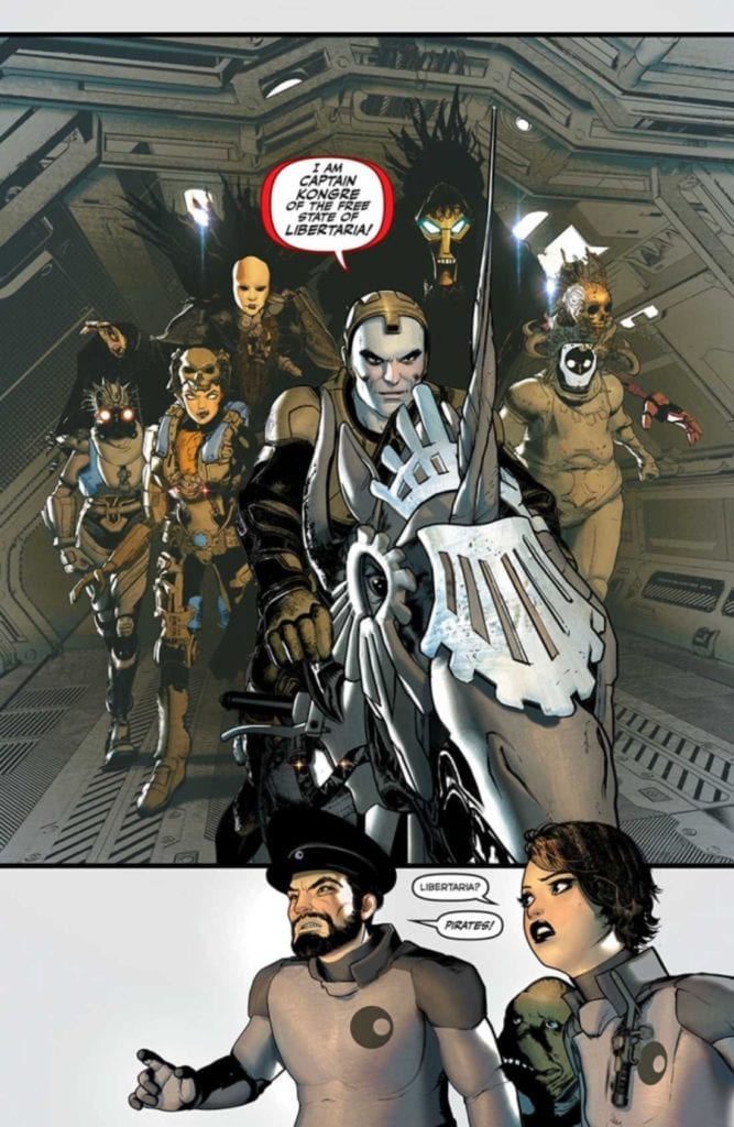
Space pirates have been a concept for about as long as real pirates have been around. When humans dream of space, we just can’t help but imagine all of the horrible events that could occur way out in the galaxy.
It’s what makes this adaptation feel so organic, despite the heavy science fiction inclusion. It doesn’t take long for this story to kick-off, throwing the characters into a battle for their lives as a pirate crew invades.
In fact, the story actually begins before readers really get much of a chance to get to know the characters involved. However, the relevant backstories do come out over the course of the first issue, with hints of more to come.
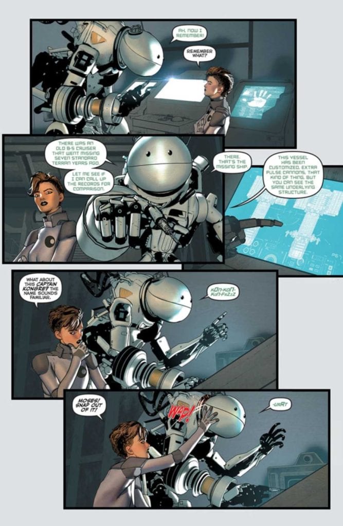
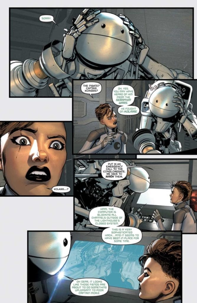
Ironically, one of the more humanized characters isn’t even a human. They’re not even organic – they’re a nanny bot, but their motivations are clear. Their presence has already helped to drive the story forward, and I look forward to seeing what they’ll do next.
Artwork
Jules Verne’s Lighthouse #1 is full of that trademark style that Brian Haberlin is so well known for. The backgrounds are stunning, naturally – full of images of space, stars, and other eye-catching details.
Meanwhile, the characters have a detailed yet harsher design to them. One that fits in nicely in a world of science fiction. The tech around them feels appropriately futuristic while still giving off the impression that it could all use a good tuneup. Out of all the characters, the nanny bot stands out the most, and I imagine many Hitchhiker’s Guide fans will appreciate the overall design there.
Geirrod Van Dyke’s colors are a fascinating combination of bold and muted. When light pops into a scene, it’s dazzling. Yet, there are many panels that feel like they lack light, implying a darker setting and tone. It helps to set the scene and makes those stunning backdrops all the more memorable.
Francis Takenaga’s lettering shines in this first issue. Moses’ (the nanny bot) voice is distinct from the rest – but it’s more than that as well. Moments of dissonance are made painfully clear through subtle tweaking of the letters.
Conclusion
Jules Verne’s Lighthouse #1 is a daring start to this adaptation. In some ways, it feels so very different from the source material. That’s not a bad thing. The creative team has successfully added new life to a classic tale.