

Writer and Say Anything vocalist Max Bemis (Polarity, Crossed: Badlands) teams up with artist Eryk Donovan, colorist Cris Peter, and letterer Taylor Esposito to craft “Heavy” #1. This brutal mix of gallows humor and over-the-top action has some original elements, but it’s painfully grim tone and inconsistent plotting make it a bit of a chore to read. Some unique ideas and fantastic work by the visual team however make this likely to be a worthy pickup to fans of this kind of sardonic and bloody affair.
“Bill may be dead, but he’s got a job to do. Welcome to the Big Wait, where folks who don’t quite make the cut go to work off their debt. Everyone in the Wait’s got a job. Bill is a Heavy, whose job is policing the multiverse, making sure bad eggs get what’s coming to them. He’s on track to earn his Climb and reunite with the woman he loves… until he meets his new partner: the worst dude of all time.”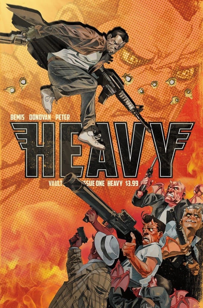
Writing & Plot
I have to hand it to Bemis for coming up with a uniquely twisted take on afterlife mythology in “Heavy” #1. Bill’s job as a multiverse-traveling hitman trying to rack up enough karma points to get into heaven is delightfully cynical, reminiscent of something out of Garth Ennis’s Preacher. Then there’s of course the bleak, brooding nature of our protagonist. Bill’s manner of murdering his way through the grief of losing his wife and hating every moment of existence that he isn’t eviscerating someone is always somehow endearing. He’s very obviously inspired by the likes of Frank Castle or Sin City’s Marv. I keep comparing this comic to the comics that obviously inspired it, but what separates this issue from its predecessors is that this issue doesn’t quite nail down its signature style the way these others have. What makes these other comics so memorable is not only the stylistic signature they craft, but the intimate relationships built with the characters within them. Thus far, “Heavy” is not only a cookie-cutter comic in comparison to its inspirations, but it’s also tonally inconsistent. It tries mixing the bitter seriousness of Ennis’s Punisher MAX run with the absurdity of Preacher, but it never quite gels. There are also some plot events that make the rules of this particular universe a little iffy. Even the most absurd of fiction needs it own set of rules to get the audience familiar with how a fictional world operates, especially before you decide to break said rules. The narration and dialogue both are sometimes overstuffed with massive gobs of exposition that take up half a panel, but don’t offer very much to the story. All of these critiques could very well be first issue headaches, as the setup for the next chapter is very promising. This is a comic that could easily be one of those that takes a few issues before it really starts exploring its themes and characters, and it has enough promise to keep a reader interested in what comes next.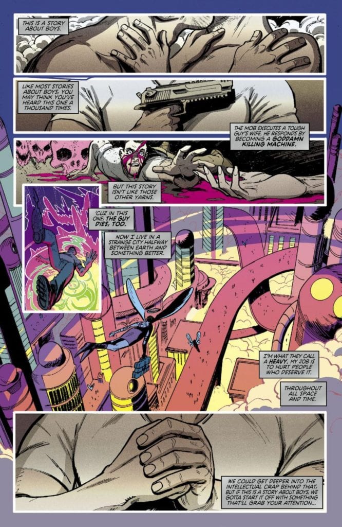
MFR ON YOUTUBE (latest video)
Help us reach 5K Subs!
Art Direction
The storytelling element that really does this comic justice is the visual work of artist Eryk Donovan and colorist Cris Peter. Donovan’s use of heavily textured and shaded details give everything in this book a grimy sheen, from the characters themselves to the mock heaven they reside in. The panel layouts and direction are lightly cinematic, with roaming visual cues that often build tension for our bloodthirsty protagonist’s own arrival. Donovan’s style is a perfect match for the tonal shifting this comic pulls. His drawings swing from a sort of light-hearted and cartoonish weirdness in the lighter moments exploring this universe’s cast and main setting, to the dour and staunch visuals of Bill’s lone brooding. A major component in pulling this aesthetic together is the coloring from Cris Peter, whose palette is just as all-over-the-place as Bemis’s script. Neon-tinged purples and golds blend into the deep blacks in Bill’s memories and the dirty fluorescent whites in his bathroom mirror. The lettering from Taylor Esposito does a solid job of carrying the reading experience, delivering pretty standard fonts and bolds to each dialogue bubble, and italics for Bill’s internal narrative. It’s nothing special, but with how much lettering Bemis’s script forces at times, he doesn’t have a lot of room to work with. Donovan and Peter’s visuals tie this comic together in ways that the script honestly sometimes fails to.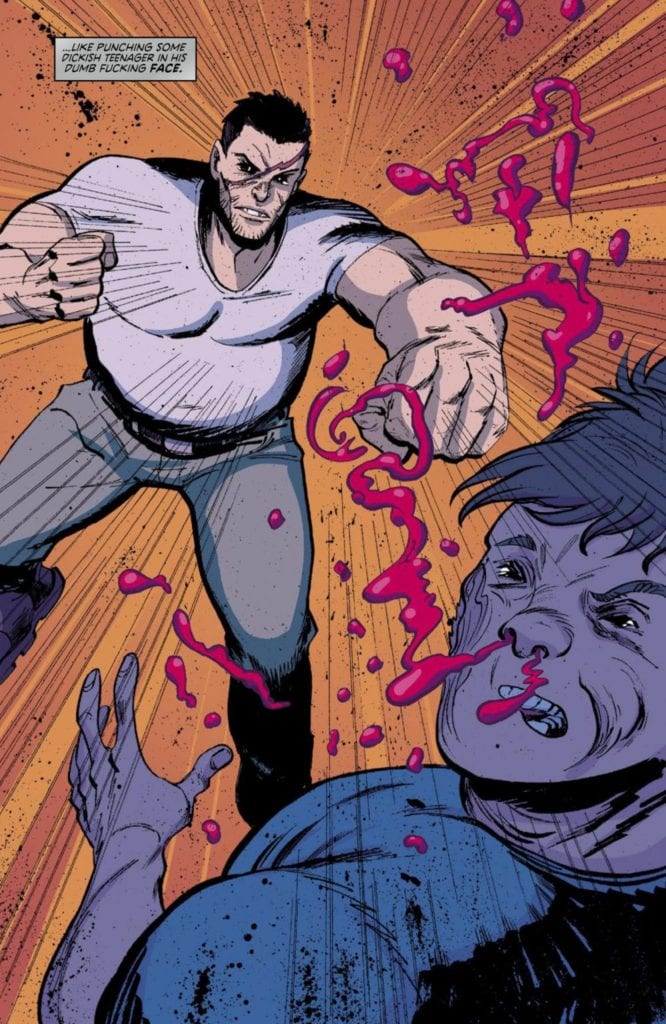
“Heavy” #1 offers the potential for a thematically rich and absurdly over the top series in the form of a messy opening chapter. The inconsistent tonal shifts, overwritten dialogue, and mishandled world-building are saved by a genuinely unique and enticing concept bolstered by a stellar art team. Again, while I think this issue is a bit of a mess in terms of writing, the visuals are great and there is a ton of potential for this to turn into a great comic over the course of its future issues. If this interdimensional bloodbath sounds like your kind of ride, pick up this debut issue from your local comic shop on 9/15!